Indie game storeFree gamesFun gamesHorror games
Game developmentAssetsComics
SalesBundles
Jobs
TagsGame Engines

Off the Cuff - BDSM Visual Novel - Game Complete!

A topic by AlexisRoyce created Sep 27, 2018 Views: 8,223 Replies: 16
Viewing posts 1 to 9
Submitted (5 edits) (+2)


Off The Cuff: game page here!

Heya! I'm Alexis, and I've always wanted to try my hand at making something pretty risque. Trying to shake off feeling embarrassed about these sorts of things and just GO for it! I'm planning on making a short, BDSMy visual novel, where the main character is locked up and has a bunch of conversation options with the captor, trying to trick him into giving you the means of escape. (Or, you could, you know, just sit back and enjoy. Main character's a bit of a freak. )

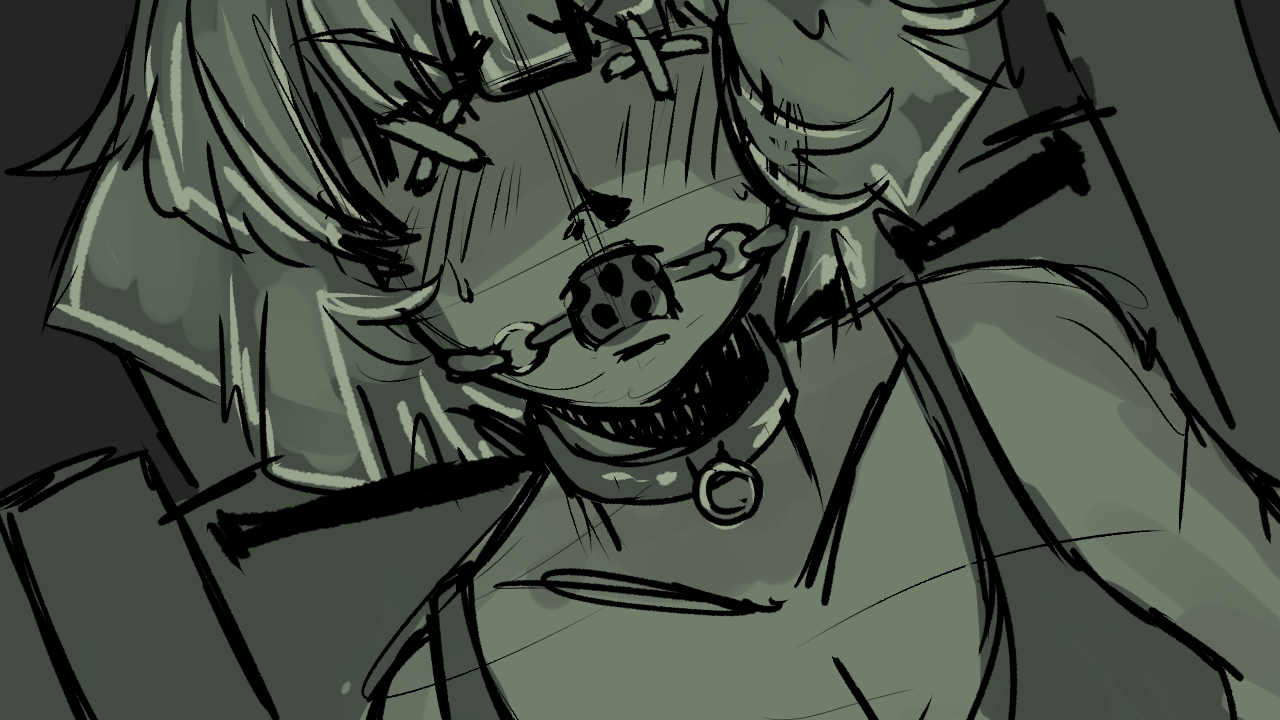
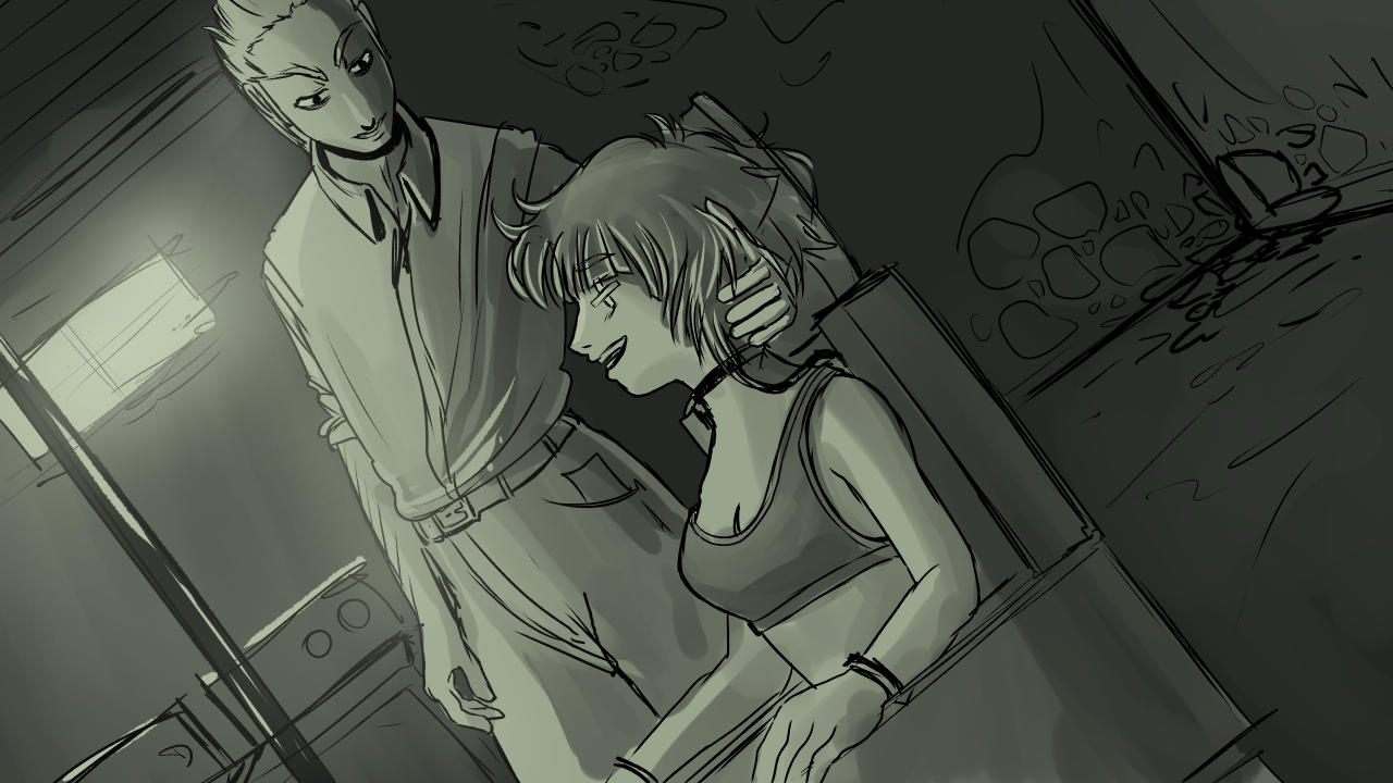
Edit: Adding some WIPs for the CGs up here, where they're easier to see:


----------------------------------------------------------------------

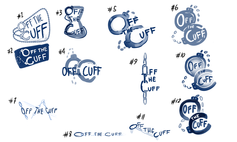
I'm deeply terrible at branding the things I make, so I've been playing around with logo concepts this morning. #9 and #12 are my favs, but I'm totally open to crit!

If you can do art there should be people around who can do the code, like myself. As long as your portraiture is on the same level as your drawings here and you can do the standard reaction faces you should be fine.

Submitted

Thanks for the morale boost! I’ve already made a short VN and posted it on it on itch.io before, though. I can code in Ren’Py, and I did some fun bits with the code last year, but I’m planning on keeping it pretty simple this time ‘round. Maybe. :3

(+1)

Great concept. Looking forward for your game! =)
My favorites were #2, #9 and #12; in that order.
Even though #2 is the most aesthetically pleasing one, imho, it doesn't seem very fit for a main logo, but I can see possible usages for it as a secondary icon, like in loading screens and submenus or any situations in which a traditional main logo wouldn't be appropriate.
#9 is the one with the most unique identity to it and could look great depending on positioning and even more awesome with some simple animations, like making the name 'go up and down' the chain it is attached following the cursor (or the currently hovered or focused element).
#12 is the one that stands the most on its own; it is simple, readable, conveys the message and fits the theme.
#7, #8 and #11 also have a similar cool style that could replace #2 as a secondary icon if #9 gets selected as the main one.

Submitted(+1)

Oh my word, I hadn't even considered that I might be able to use or need secondary logos; thank you for the idea! And you're right, animating #9 might look really good. Perhaps I could use #12 for the cover and itch.io page, and an animated version of #9 for the title screen. By then, people will already know the name of the game, so legibility might not be so much of an issue? Thank you again!

Submitted(+1)

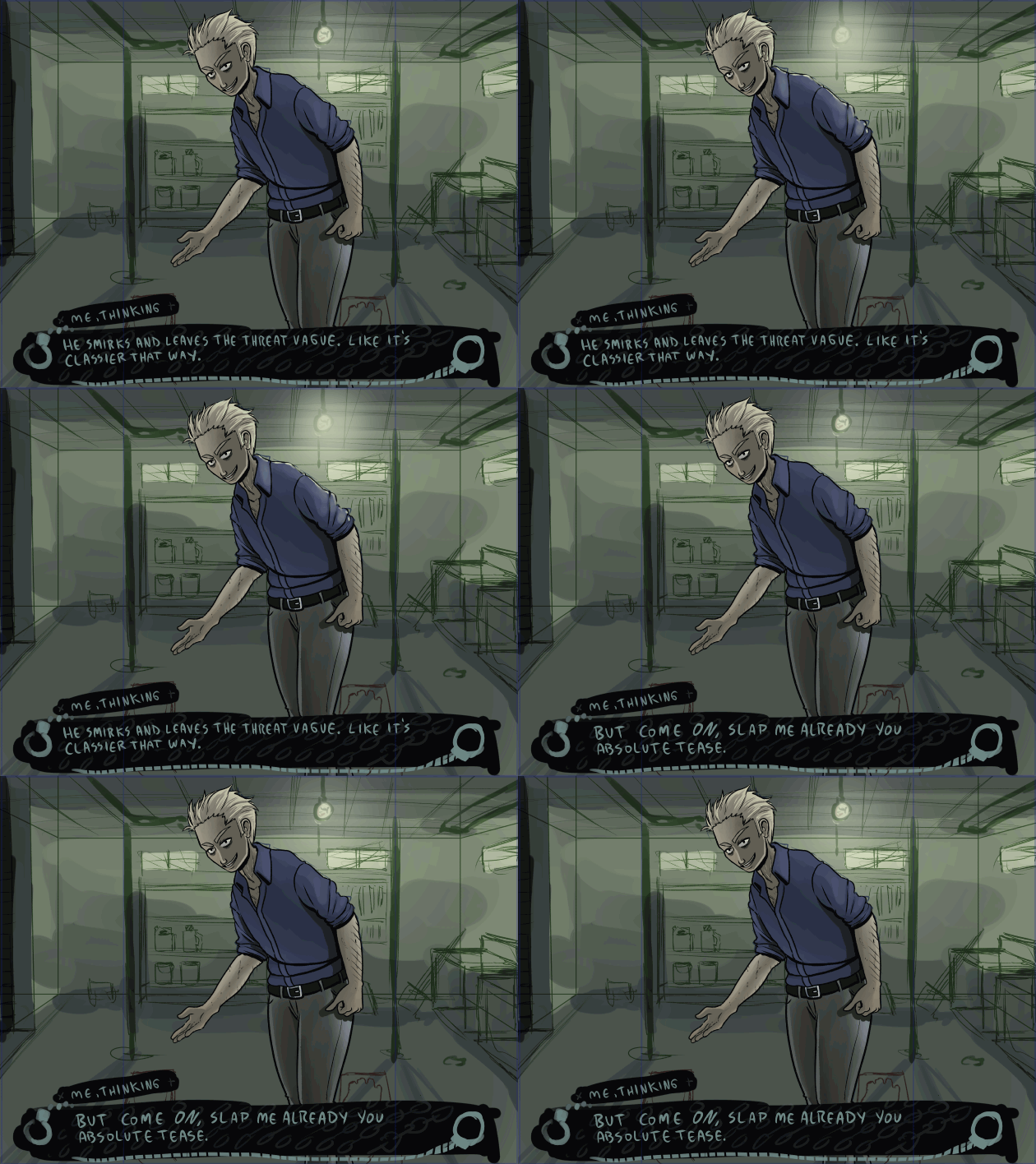
I'm a little over a thousand words into writing the script, and I've started work on the assets! Got one of the base poses for the Antagonist done, as well as roughs for the background and the textbox. I think I'm going to go with a greenish color palette. I want it to feel dark considering the subject matter, but I don't want to go too grimdark. The protag also has bright red hair, so I think that element of her design will pop nicely.

WIP:

(+1)

Great artwork I like your style, also I need to look at my color palette... actually need to think about having one...lol

Submitted

Thanks! It can be really hard to nail down things, like a color palette and themes, because choosing something means losing everything else. But when you choose something, your project gets an identity, and narrowing your focus can open up your mind in a really cool way!

(+1)

Your reply feels obvious yet profound, ellugant if you will. Where do I find more people like you, to engage with on a daily basis?

Submitted

Awww, thank you! I'm pretty terrible at being part of communities, though. Joining this jam is kinda my attempt to branch out a little bit more; we'll see if I got back into social hiding afterward. XD But I guess that's it, then, huh? Maybe we just gotta be that type of person if we want to see more if them? I dunno. As always, still working on it!

Submitted

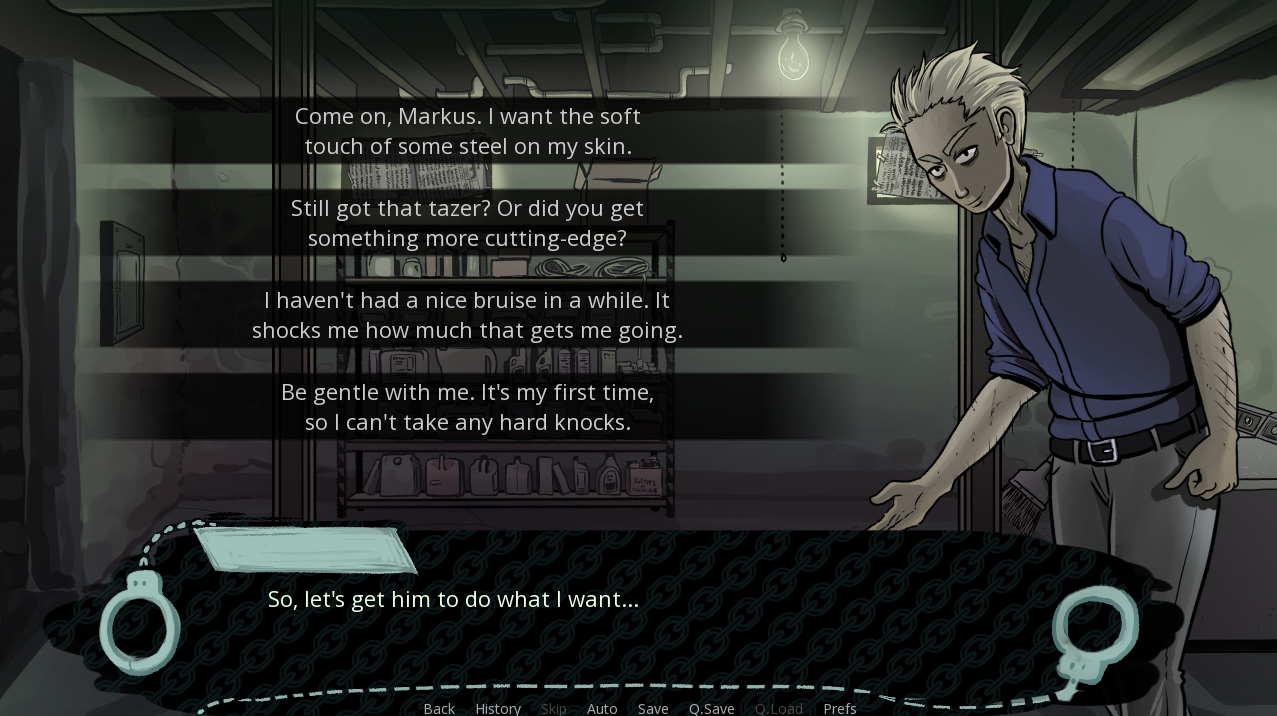
I'm well over seven thousand words in. And hey, might as well share a handful of them:

Interesting. I notice it is never mentioned what engine you are using. Is it Ren'Py? Or maybe one of the adventure game engines, maybe something custom made?

You definitely have a direct approach, that is nice; got to work fast. Been spending my fist 15 days just getting my engine ready.

Submitted(+1)

I hope things go well with your engine! I am indeed using Ren'Py. I've played around with other VN engines, but Ren'Py is, in my eyes, still the most versatile.

Submitted(+1)

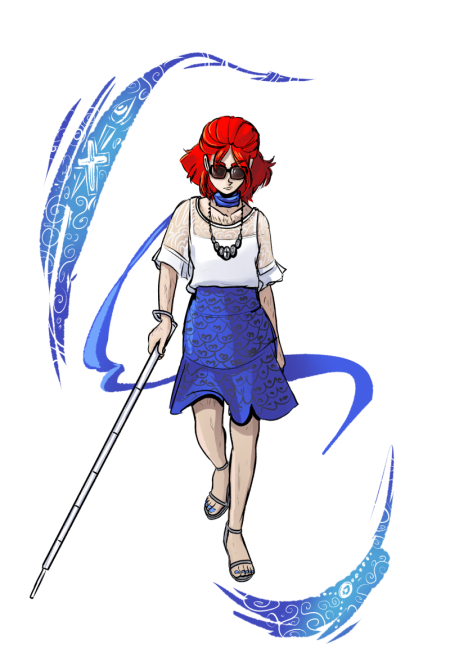
New devlog! Game's passed 12k words. Man. Exit has taken a lot of damage, and dealt out even more sass. Gotta make sure that my Sass to Damage ratio is right. Also tossed in some images of our protag, master of escapes Dea "Exit" DeLus. Here's a preview of one of them, though this classy outfit will not be making an appearance: 


Submitted(+1)

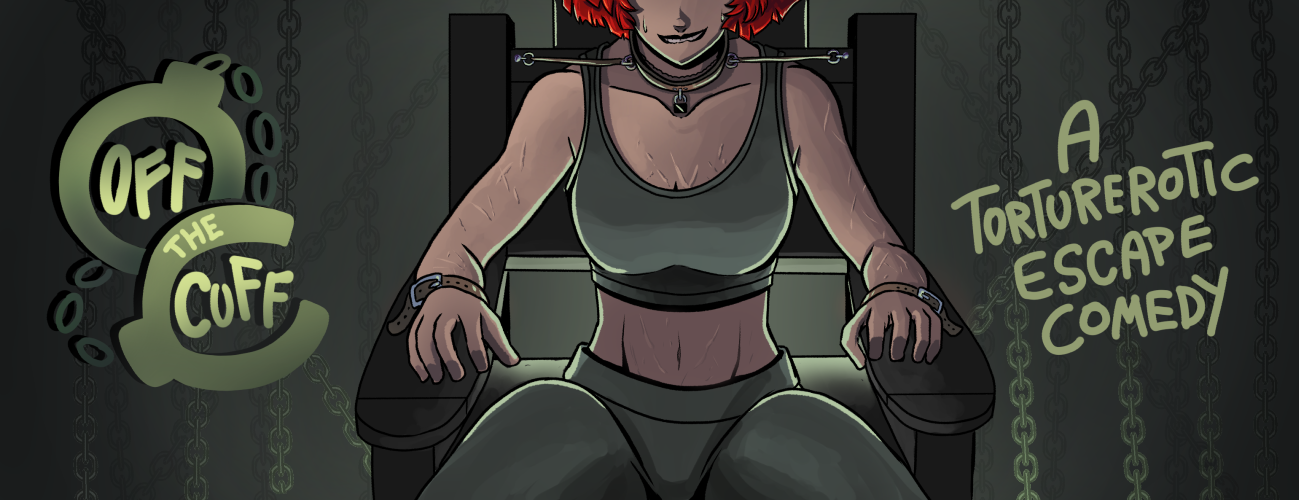
Still trucking, with another update, and a mini audio drama! https://alexisroyce.itch.io/offthecuff/devlog/53944/this-game-has-a-sound-check I'm also gonna edit the top post and put the artwork for the finalized baner up there.

Submitted (2 edits) (+1)

And with a word count of 23,000, done with the bulk of the text! Looking for playtesters, now. Update here: https://alexisroyce.itch.io/offthecuff/devlog/55893/this-game-needs-playtesters

Submitted


Playtest build ready! If anyone would like to play it and give feedback, now is the time, and it would be much appreciated! https://alexisroyce.itch.io/offthecuff/devlog/57236/playtest-build-ready