Play game
Pixel Warp's itch.io pageResults
| Criteria | Rank | Score* | Raw Score |
| Theme | #110 | 3.611 | 3.611 |
| Innovation | #202 | 3.000 | 3.000 |
| Art Direction | #240 | 3.056 | 3.056 |
| Overall | #256 | 2.933 | 2.933 |
| Fun | #328 | 2.500 | 2.500 |
| Game Design | #334 | 2.500 | 2.500 |
Ranked from 18 ratings. Score is adjusted from raw score by the median number of ratings per game in the jam.
Leave a comment
Log in with itch.io to leave a comment.


Comments
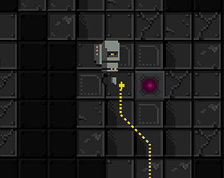
Good level design and well thought out mechanic. The restricted controls gave me the sense I was in a low gravity environment and connection sounds worked well for the atmosphere. The art style was really good and the gameplay was fun.
Cool game and I love the aesthetic. Looking through some of the comments I won't be adding anything new, but the camera was too close for me and the movement too slow and floaty without any real reason for it to be that way to my knowledge. Good game good vibe, nice work!
I like idea and cool pixel art! Good work!
Thank you! Check the description for the links to the pixel art. None of it (except the electric lines and two small circles) is my own. There's some really nice stuff on itch.
Video Commentary:
Hey, thanks so much for making a video! That's such a nice thing to do. It was fun to watch you play the game! I agree with all your observations. There are many aspects of this that can be improved to make it more playable. There's an interesting consensus developing among the comments: low contrast of the important parts of the game, difficulty perceiving color differences, floaty movement, and too close camera, to name the main ones I remember. Thanks again for playing!
Super interesting idea which has a lot of potential to be developed further! Some colors were hard to differentiate and in some instances the generators were blending in with the background. That being said tho, super fun and cool game!
Hey, thank you so much for playing my game! Totally agree with the issues you've identified. I might flesh it out a bit more. The levels generate based on the final image and colors, so they should be easy to set up. (...... *Should* be easy.... Lol!)
I like this as a puzzle mechanic. Some of the colors are a little too close to be clear (magenta/purple).
Thank you for paying the game! Agreed--there are very few color pallets that don't have similar colors. To make this game good, one would need to be very careful about color choices.
Nice game. I think the collision is not so good but it's a good game!
Thank you for playing it!
Reminded me like those connect the point type games, but I liked your take on it much better. There was a couple times when I was about to connect the wire and the character froze unable to do anything. So I dunno what that glitch/bug was.
Thanks for playing! This game is pretty much just one of those connect the colored line games. Its a fun mechanic and it just kind of happened when thinking about the jam theme. The player movement and collisions just isn't implemented right and there is at least one terrible bug in which the player can get stuck when it really seems it should not. That may be what you ran into. Or maybe you found another bug! :)
Hey great game, the art style is really cool. Concept is fun. Think it needs a couple tweaks to really shine, for example the physics based movement as snap to grid would make it easier to focus on the puzzle rather than navigation. The monitor colors are a little small, may want to make them easier to differentiate as the camera hides a lot of important information. I would also add an undo button. I think you have a great concept in the works, keep it up!
Thank you for the nice comment and suggestions! Yeah, the floaty movement is not ideal, at least the way this project has gone so far. Making the color of the monitors more obvious is on the list of improvements that didn't make the deadline! I also agree about the camera. This is my first HTML5 build and window came out pretty small. I was too tired at the time to worry about it. :) Thanks again!!
Regarding the art: it's all from free pixel art sets on itch.io. I've adjusted the sprite color in Unity. The only things I drew are the wire and color highlight marks! There's links to the pixel art in the description.
Pretty interesting mechanic with the wires that you can't move through (I learned it the hard way) :D I also think it was pretty cool with the large "Canvas" that is created when you connect the devices. I wasn't a fan of the floaty movement and would have prefered snappier one that matches with the grid and art style. I also think a camera that shows the whole level might have been better so you don't have to walk around and find all components before you can figure out what to do.
Thanks for playing the game! I also was thinking that grid based movement would be good, given that everything is happening on a grid anyway. ... But I got stuck with the first thing I implemented. :)
This game is a fun concept. It's a nice touch making the player unable to walk over wires, this makes the game feel more dependent of the player and makes the player think. This game would be amazing with some added polish.
Thank you for the kind words! And thank you for playing the game!