Nice game! I really like the relaxing design of the game. It was simple and easy, yet I tried challenging myself trying to use as little parts as possible. Think I did level 4 with just 2 pieces, which I enjoyed ^^ The car was spawning at quite random locations which was quite cumbersome, and the driving sound keeps playing after finishing the level. Apart from that I didn't have any issues. Great job! :)
SokiSouler
Creator of
Recent community posts
This game felt really nice playing. Controls were simple and the game didn't need any introduction for me to understand how to play it or what I'm supposed to do. I think I would prefer a bit shorter time on the rooms to have better pacing, but might just be my preference. I really liked when I got cornered into a wall and just tried my best to stay alive. Really well done! :)
Fun game! A bit tricky as well, which I like. There's a lot of fun you can do with that type of mechanic. I also didn't run into any bugs. There were some things I could comment on. My main problem was the controls. I think it would have been better to keep space bar as the jump button for all shapes. Since it's one of the main buttons you use to move around, it gets a bit messy in the head trying not only find the right buttons to change shape, but also to jump. Another one were also that some parts it would be nice if you could either move the camera down manually a bit, or if there are some placed out "camera zones" where the camera will move automatically to let the player see below better, because when I needed to drop down, I didn't really know what was there and kinda had to fall first time in order know what to do.
I think the level was good. When I got to the point where I needed to figure out which shapes to use in what order I felt challenged and really wanted to get past all the obstacles, which is great. I think I got the point where there was a collision error and couldn't get further, otherwise I would have kept going and try finish the game. Great job on the game! keep it up :)
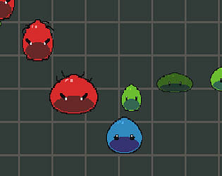
Thank you for your feedback! I agree that it would need something more interesting (and better balnace) like upgrades. It gets kinda one sided pretty quickly. I'm glad you liked the mechanic with picking up the "blobs" from the eneimes, even though it can be a bit messy to notice. Was one of the things I spent some more time on trying to get it to work like I wanted (or at least sort of). Thanks again for your feedback and for playing my game ^^
Was that after you restarted? I realised bit late that the game bugs out after restarting and didn't have time to fix unfortunately. I was thinking about a menu but prioritized other things. It would be very easy and quick however to do a simple menu for a game like this with restart and quit function so will think about that to next time. Thank you for your feedback!
Thank you so much for your thorough feedback. I agree with everything you say about the music and pretty much everything else you said. the music was made by one of my friends but didn't get much time to make a longer track, and I added it like an hour before deadline, so didn't get time to do something like that.
It would be really cool if you could make other things orbit around a star and make it sort of systemic. That would however be way to big scope but something I would really want. I'm however not very good at programming and this project I mainly focused on improving my programing skills, so the design became quite terrible with no meaningful gameplay or goals. I really appreciate your feedback and your tip and that you took the time to play the game!
Thank you so much! Ye the game is very unfinished so there isn't really any goal so far. Might work on some more later to add some actual gameplay/game loop. Good to know that the atmosphere is relaxing as that was one of the things I wanted to achieve^_^ I'm quite happy with how the visuals turned out since I'm not an artist and had to find ways to make it look decent.
nice game. Managed to play it through. I like the look and the atmosphere of the game. was quite relaxing. The sounds was a bit harsh for my ears I would say, but not a major issue. I've noticed a lot of people mentioned they wanted to fly up with the tornados so I'm gonna add myself to that statistics as well ;D the jetpack was a really good feature. took the game to another level. Well done!
Very good job. Was bit confused in the beginning about what I was doing but as I kept going I started to enjoy it and was very nice when I realized the impact it had on the UI and audio. The balance thing was the best! xD would have been nice with an indication that you complete a "level" (sound/visual effect) but otherwise I really enjoyed it.
Nice game! Think was pretty well done. I didn't understand at first why the "health" bar went down, but once I figured out I thought it was quite interesting. I wasn't a fan having to start over when dying but at the same time, I kinda liked using my previous knowledge to figure out the best path to take. I liked to visuals and the music worked pretty well. very good entry.
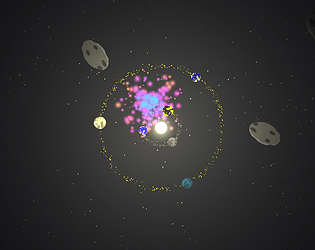
Thank you so much^^ there isn't really anyway to progress in the game due to lack of time and bad planning. The main goal designwise was, however, to make a relaxing game so I guess I at least managed to achieve that :) And yes, although it's supposed to be asteroids, when I put them in the game I realized it looked like huge space cookies xD
Thank you so much for the feedback and playing the game ^^ I wanted to add some clear goal to the game and especially some sort of "tutorial" explaining the basics, but I stupidly left that part to the last day, which unfortunately got occupied by trying to solve lots of game breaking issues. So the game is pretty much fly around aimlessly and build some planets. I mainly wanted to focus on learning programming better for this game so I made some decisions that took quite some hits on the design and scope because I wanted to do what I felt I could learn most from in terms of programming. The points you're bringing up would however been good to focus on to make add some actual purpose and clarity. Again, thx for the great feedback!
Got some time before I got the hang of it but I like the concept and I think the game looks quite nice. However, the green and blue obstacles became quite pointless for me since it were very easy to fix the robot. I also think it would be better to know all, or at least some of the other objectives in some way so the player can more freely do their own planning and try optimizing the pathing.
Pretty interesting mechanic with the wires that you can't move through (I learned it the hard way) :D I also think it was pretty cool with the large "Canvas" that is created when you connect the devices. I wasn't a fan of the floaty movement and would have prefered snappier one that matches with the grid and art style. I also think a camera that shows the whole level might have been better so you don't have to walk around and find all components before you can figure out what to do.
It was fun! Stoped playing after geting 100 connections, but could probably played for a little bit more if I had time :) Was very simple and easy to play. Really enjoyed when the tempo increased and got more intens. I did get confused sometimes which face I was supposed to look for when it was going a bit faster, so I would have made the difference between the caller and reciever a bit more clearer. It would have been nice also if you could cancel after clicking on someone so you're not forced to fail a connection for that. Well done!
Good game! It was easy to get into since the mechanics and controls very simple. I think it has a very clear design and a coherent art style. The biggest problem was lack of information. When the cars follows a specific direction you want to have some way to know how to line up the roads. Otherwise it becomes a guessing game, which becomes quite frustrating when you can't restart the level :P There were also some issues with roads lining up weirdly. Sometimes the cars seamed to be able to pass through things that they shouldn't (visually at least) and sometimes there were straight roads that had to be in the correct direction. Overall though, great work!


