Play game
MOVERE's itch.io pageResults
| Criteria | Rank | Score* | Raw Score |
| Audio | #28 | 3.917 | 3.917 |
| Overall | #103 | 3.604 | 3.604 |
| Gameplay | #104 | 3.250 | 3.250 |
| Authenticity (use of resolution) | #138 | 4.000 | 4.000 |
| Graphics | #143 | 3.250 | 3.250 |
Ranked from 12 ratings. Score is adjusted from raw score by the median number of ratings per game in the jam.
Leave a comment
Log in with itch.io to leave a comment.


Comments
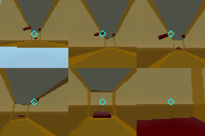
Love the Solar Sands type music, you really nailed the Mirror's Edge 1 soundtrack vibes. The gameplay seems fun, but it's quite hard to tell what's killing you because of the resolution, so I kept dying when coming into contact with the invisble (at 64px) edge of a brown floor. Also, the immaculate surfaces are very Mirror's Edge but it would have been nice if they were a bit more scuffed, (or even tiled) because it's very hard to extract any movement information from them at the low resolution. Finally, there's a bug where the cursor is not captured unless you pause the game and hit resume.
I did beat the game, and there were definitely sections (especially swinging between the red poles at the end) that were a lot of fun and felt a lot like the Mirror's Edge "flow state" you get into when freerunning.
Overall it definitely has its moments and lots of potential, and the sfx and music are stellar, but it's hampered by poor level readability.
The section with pipes sticking out was a lot of fun, building on that and adding way more sections where you can only grapple onto contrasting red bits and pieces of stuff that is sticking out from the plain walls would make for a very fun update. But please remove the killboxes and replace them with fall damage! They're very unreadable at the 64px resolution.
In summary: it would greatly improve the game if all the surfaces had non-uniform textures (or there were more red "grapple points" added in, it's easy to deduce movement when you have points to track) and instead of the yellowish killzones there were endless chasms fading to black that killed you with fall damage. The gameplay mechanics are a lot of fun though, and the music and sfx are awesome. Please update this game!
Thank you for playing! Really appreciate the detailed comments.
Made it to the end. A+
It's amazing dude
Thanks!
Hi, I actually like the controls (reminiscent of old quake/cs mods) but I couldn't figure out where to go after the first platform. It looks like the ceiling opens up, but every direction I travel just teleports me back to the start. The graphics seem pretty easy to read so I am not sure what I am doing wrong. The music is a good choice for the gameplay with its relatively unobtrusive composition and instrument choices.
Very hard controls! It took me up to 10 minutes to jump the first gap)
It would be nice if the game was less difficult at the start, but maybe it's just me )
Made it to the end!! It was a little difficult at first getting awareness of my surroundings, but it ended up being really fun. Also, thank you for having mouse sensitivity settings! I don’t think I could have played without making the sensitivity higher.