Indie game storeFree gamesFun gamesHorror games
Game developmentAssetsComics
SalesBundles
Jobs
TagsGame Engines
A jam submission

SerendipityView game page

They were meant to meet!
Submitted by PeaQueueAre, Anthony, accessednull — 23 minutes, 58 seconds before the deadline
Add to collection

Play game

Serendipity's itch.io page

Results

CriteriaRankScore*Raw Score
Use of the Limitation#14.6254.625
Concept#14.3754.375
Overall#123.8133.813
Enjoyment#173.1253.125
Presentation#243.1253.125

Ranked from 8 ratings. Score is adjusted from raw score by the median number of ratings per game in the jam.

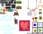
128x128 sprite sheet
https://lospec.com/i/xgil

Team members
PeaQueueAre, andrewoid, SirPython

Software used
Unity, Marmoset Hexels 3, Soundtrap

Ice cream eaten
1 Pint

Leave a comment

Log in with itch.io to leave a comment.

Comments

Submitted(+2)

Really, really great intro music. I was listening to it in the background because I got pulled away when I pulled up the game and was thinking, "Damn, that's some good music."

The graphics were really cool and the concept seemed interesting, but I didn't really understand what was happening. After I placed the triangular thing to stop people, it said I lost.

Developer(+1)

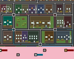
I'm glad you like the music! This is my first time working with a musician, and SirPython makes some great stuff. We were running low on time and saved the tutorial for last, so I'm sorry it wasn't clear enough on the objective. Each level shows two potential lovers with a colored path on the map representing their current route. Your goal is to use the tools on the right side of the screen to interrupt their paths such that they are forced to walk into each other, thus meeting up and falling in love! You can use the timeline at the bottom of the screen in order to get a more accurate time representation of where the two lovers will be and when. I hope this is more clear, and that you try the game out again!

Developer(+1)

Thank you!

Submitted(+1)

I think the immediate next path should be more visible compared to the rest/end of their path lines, like a bold line until their first target build and then after that just a thin line. It was hard to see their path when lines crossed. Maybe even hint the build they want to go so it is easier to find, as with the limitation they all blend too much it is hard to see which is which.

Developer

Hey Bruno, you actually perfectly describe one of the design issues we were trying to work around! The timeline at the bottom of the screen was implemented as an attempt to fix the issue, since it would show all of the lover's destinations in order. The background color of each icon in the timeline would determine which specific building they were going to next (e.g. coffee symbol with green background means that they are going to the green coffee shop). Your bold line idea is a good one though, and we'll try it out to see if it helps. Thanks!

Submitted(+1)

I liked this game XD
The puzzles is interesting and enjoyable. All of the levels in the game is well designed in my opinion XD
My only problem is detecting which couple I need to pair.
Maybe you can highlight the couple using yellow outline etc so they are more noticeable.

Developer(+1)

Thanks for the feedback! Highlighting the required couple sounds like a good idea

Submitted(+1)

interesting idea but its too small that i need to restart 2 to 3 times to know where they are moving

Developer(+1)

Thanks for the feedback! I'll update the game with larger character sprites :)

Submitted(+1)

yes the limitation.
I could not stop until I completed all level.

Submitted(+1)

Very creative puzzle, the different tools to hold people are very well thought

Developer

Thank you! I'm glad you enjoyed it