Play game
ExterminationCommand's itch.io pageResults
| Criteria | Rank | Score* | Raw Score |
| Visuals | #88 | 2.236 | 2.500 |
| Audio | #96 | 1.565 | 1.750 |
| Originality | #103 | 2.124 | 2.375 |
| Overall | #107 | 1.453 | 1.625 |
| Fun Factor | #109 | 1.006 | 1.125 |
Ranked from 8 ratings. Score is adjusted from raw score by the median number of ratings per game in the jam.
Is your game a video game or a physical game?
video game
Was your game made solo or in a team?
team
Did you use any third party assets, if yes what assets did you use?
Hovl VFX assets
Did you choose from one (or more) of the optional secondary themes?
no
Does your game contain 18+ content (Nudity, Gore, Language)?
no
Leave a comment
Log in with itch.io to leave a comment.


Comments
Interesting start to a top down hero shooter. Sound effects are too loud and high pitched and happen way to often in the beginning. I was super lost for a good couple minutes. I didn't know I could tell the units to move. Could use controls added to game description. Experience/points bar would be really good. Maybe only one character at a time so players can learn the style and get used to them rather than 4 all at once. Could use some music and sound effects for shooting and damaging enemies.
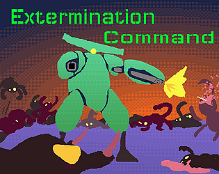
The title/key art is very attractive and pushes me to understand it, but I couldn't figure out the gameplay ! Can you record a small youtube video to add to the itch page? like a tutorial?
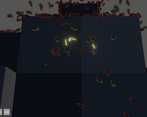
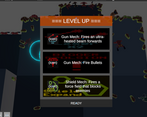
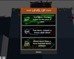
Was generally pretty confused by the gameplay, the menu for upgrades (?) kept popping up every few seconds, but looked like some cool stuff was happening in the background with different weapons and whatnot. Agreed with others that some kind of tutorial/onboarding would be handy, or even some controls listed on the itch page, all I could figure out was moving the camera with WSAD.
The art as a whole is nice, I like the thumbnail and the mech/bug designs, they look neat. Gameplay wise, it could use some work. That level up screen appears way too much at the start so for a bit there I was just not sure what was even going on, and it was very loud for me at least, had to lower my audio.
And besides that, its just hard to really understand what's going on. I'm not sure what the controls are, I don't know if we even have health, are there four characters? Its pretty hard to understand and maybe a bit of text at the start could help out.
But honestly, there is potential and I'm curious to see what can be done with this game!
A little confused by the gameplay the little menu kept popping up. Love the variety of bugs and the key art for the game. Full screen would be a real plus too! :)
Cool entry!
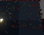
I think the visual effects look nice, and it's cool that you got so many entities to run pretty well in a web build. I also liked the perspective, and how you can see another chunk of the planet further down that has more bugs on it. It really gives the game an invasion feel, which I think works really well.
I think the game could benefit from having some sort of onboarding, even if it's just a text box at the start. This could be extended to making the bugs appear more slowly at first, and the game ramping up over time. I was very confused (and I think I'm still kind of confused) because I don't think the game explains very well what's going on. I didn't really get a sense of how well I was doing, or what was happening. For example, I didn't know what the different bugs did (at the start I was very confused as to what I was looking at), I didn't really get what the upgrades did or how powerful they were, I didn't know if I was winning or losing. I think this could be a very cool game with some more work on the game design side of things, so that the player doesn't feel super overwhelmed and can make more meaningful choices.
It also feels like you level up way too fast sometimes, as if the different upgrades make you more powerful but the xp required to level up doesn't increase, so it felt like I was hearing the level up sound faster and faster every upgrade.
Speaking of, I wish the game had more audio! It feels like there's a lot going on in the screen, but you don't really get to feel like that because there's no music or sound effects for the actual combat. I feel like that would go a long way to sell the player on the invasion feel that you already have working pretty well and getting them invested in the game.
I hope you continue working on this, cause it has a lot of potential! Keep up the good work!