Play game
Starwatch's itch.io pageResults
| Criteria | Rank | Score* | Raw Score |
| Presentation | #3 | 4.364 | 4.364 |
| Overall | #14 | 3.477 | 3.477 |
| Design | #16 | 3.455 | 3.455 |
| Enjoyment | #20 | 3.091 | 3.091 |
| Metroidvania | #25 | 3.000 | 3.000 |
Ranked from 11 ratings. Score is adjusted from raw score by the median number of ratings per game in the jam.
Engine
Unity
Team/Developer
CookieBox (solo)
Leave a comment
Log in with itch.io to leave a comment.




Comments
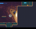
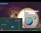
I so badly want to be Hot Dog's pal, but I wasn't able to survive long enough. The jump height seems to be pretty random, when I hold down Space I seem to jump somewhere between 2 and 4 tiles, but sometimes much higher. I like the look, but I found it hard to see projectiles and platforms against the noisy green background on Forbidulon Prime. My main difficulty was that I don't have the dexterity (or, with my left hand, sinisterity) to handle directions and jumping with one hand on the keyboard while shooting with the mouse in the other hand. A few hits starts the whole level over, including a long conversation, so I quickly got fed up. A shame because I really like what I see, I'd have liked to have gotten to the gravity mechanics I see others mention.
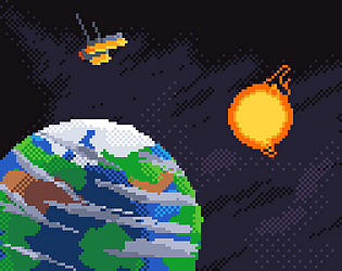
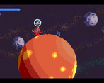
Excellent art! The gravitational mechanics of the planets was definitely what I liked the most here. I think the range of the weapon should be a little longer. Combat was my least favorite thing here.
This has the potential to be a really great game, however I think it lacks polish and a few design choices stand in the games way to be amazing.
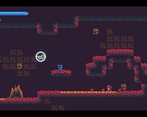
The biggest problem in my opinion is the combat. I think that everything is too small. The enemies are too small, the projectiles you shoot are too small and in addition to that everything is very fast. There is also no reason why I would every want to do combat. It's not fun, you aren't rewarded for it and doing it will almost certainly make you loose a lot of health.
That wouldn't be a problem if the combat wasn't such a big part of the game. If it was mostly exploration and storytelling with a few combat encounters and bosses I think I would have enjoyed it a lot more.
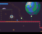
I really like how smooth you managed to make the planet gravity effect. It feels intuitive and the rotating planets look fantastic. In general the artwork is great.
Sadly the level design is also an area where the game is lacking. I think that it is very samey all the time. There were no unique or memorable segments or platforming setups. It just seemed very random to me.
I hope you found my thoughts to be useful feedback. Keep it up.
I have no idea what I’m supposed to do. I talk to a dog in a bubble who seems to tell me something about connecting planets. But then what??? Obviously I’m missing something.
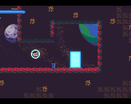
Thanks for the feedback! Clicking on the buttons that have the planets on them brings you to each of the levels. I’ll try and make that more clear.
It's crazy how trippy and almost dizzying that Mario Galaxy trick is in 2D. You got it to work really well, too.
You'll see this in a lot of my comments, but I'm just not a fan of platforming with a mouse as part of the control scheme. For some reason, to me, as natural as it is to move with keys and look with a mouse in an first-person game, it's equally as unnatural to try to move with keys and aim with mouse in a platformer. On top of that I felt like the character movement was squirrely. The jump feel hyper to me, like they're a little too quick. Personal taste maybe, but I prefer having enough time to correct my jumps if platforming is going to be a big part of the gameplay.
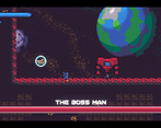
Checkpoints would be a good addition, especially near the boss. The Boss Man actually ended my play-through, 'cause I didn't have the patience to go through the entire area again a third time. >_<
Overall, I think this is decent entry. Okay controls, but fun dialog, neat Mario Galaxy effect, and solid aesthetic. Nice work : )
Thanks! I scrambled together the level design last thing so I didn’t even think of checkpoints, that would’ve been a good idea lol. Also about the mouse I just felt like it might be too crowded to add more buttons on the keyboard but I’ll consider some other alternatives.
I'm jealous of your pixel art and color choices, though you committed the cardinal sin: you rotated the pixels!
Thank you! More than half of my development time was the art and I’m glad you noticed.
I love what you did with the dialogue system, specifically the way it animates. The presentation is absolutely fantastic. The backgrounds in particular are just beautiful. I love how much detail you were able to achieve while still remaining true to the crunchy pixel art. Bravo.
Thanks! I spent a week or two extra learning shaders just for this project lol.