Well now I'm excited!
Cormorant42
Creator of
Recent community posts
Well, see, that's the thing. It was originally planned for this game jam, submitting it to the other one was the afterthought. But you're absolutely right, it's not a metroidvania in its current state. I was way too ambitious with my goals, this was supposed to be a mostly-linear intro segment meant to set the scene for a larger open world, and also a place for the player to get acquainted with their tools. Unfortunately life caught up with me and I wasn't able to get much done for the "main game" section, and it didn't have anywhere near the same level of polish as the intro, so I decided to submit it as-is.
Yeah, I've had a few bugs reported with the anhks. Thanks for your addition! You should be able to read the tablets--every "ruin" is interactable, aside from like walls and things--but you can only read them once, so maybe you read them without noticing? I know when I playtested sometimes I would use a weapon right next to one of them and then keep pressing A through the text and would miss it.
I'm sorry about getting softlocked in the respawn room! I'm guessing it wouldn't let you transition to the next room? That's a known bug (more like a developer oversight, my bad) where it forgets to load the nearby scenes when you reload a checkpoint.
Thanks for playing! If you'd like to explore more, I'd recommend thinking vertically ;)
Unfortunately those alpha holes are a limitation of the system this is designed for. Priority (which graphics have transparency and appear in the foreground) is decided on a per-tile basis, and there's technically no true "alpha" in the conventional sense. So, in order to give a convincing 3D effect, the top tiles of objects like the rocks or columns have "priority" (will be shown over the player) while the bottom tiles will not, so the player will show above them. Since the player is 16x16 pixels in size with a roughly 6x7 hitbox centered horizontally and aligned with the player's feet, this works out most of the time, but since the player's hitbox is smaller than an 8x8 tile there will be cases when you're right up against a rock or column where the player's sprite extends past the boundaries of the tile with priority and can be seen "through" the object. This is an imperfect solution but I've chosen to go with it, because the alternative is having the player's hitbox be 8+ pixels tall (which would prevent tile clipping) but that would result in more player frustration in areas which do not have a lot of space to move around in.
The hitbox issues are annoying, yeah. I haven't found a good solution to deal with those yet. The problem is that there's a lot of tools the player can use but, due to this being a GameBoy Color game, there's a finite amount of unique projectiles that can exist in any given scene. I think it's around 5 projectiles. The thrown dynamite and pistol bullets are 2, and I need to save room for potential enemy projectiles, so to be conservative both the fist and knife use the same hitbox. That being said, the hit detection is a bit wonky at times, I have no idea why. I'm looking into fixing it, but as it stands it's not a high-priority issue as the game is 100% completable at this stage.
As for the fists not hitting anything...they actually *do* hit things, and you might be surprised at their range if you ever try punching a pot or something, but they don't do any damage to enemies. Have you ever tried punching a snake? Or a bat? Or a t̴̰̲͔͇͖͗̀e̸̲̊͐r̷͔̬̮͖̩͐r̴̖̜̩͙̂̈́i̶̛̖̲̜̻̲̾͌͠f̶̺̌y̶͉̬̑̾̀͛̚i̸̙̮̕̕͝n̸̟̔͌͑̅̍g̸̬̺̼̟͐͂̅ ̴̧̆e̵̯̩͛̈́͜l̷̛͓̻͔̗̠̆̌̈́d̷͉͛r̶͓͈̆i̸̢̛̩̚ț̶̺͈̀ç̵̢̛̙̆̈́̓ḧ̴̡̛͇͇́ ̴͈̰̏̓̍h̵̪̮̃͛̉͐̓ỏ̶͚̠͗͒͋͝r̷͖͇͙̺̓͜r̶͔̮͊̽̔͌ͅȏ̸̟̲̭̂͛̚ṟ̷̎̕? Not the most effective tool, I'll tell you that. Your fists are useful for some problem-solving elements later in the demo, however, so don't count them as useless just yet!
Yeah, I've paid for Soundtrap for a few years now. Frankly, it's probably a better deal to use Logic Pro or FL Studio than to subscribe to Soundtrap, since the only real advantages it has are cloud storage, no memory requirements, and a non-audio-technician-oriented workflow, and I'll probably switch over to FL Studio at some point in the future bcuz of that, but I've been very happy with Soundtrap so far.
And thanks for the complements on the project page! My day job is a graphic designer, so I'm perhaps more aware of the effect presentation can have on the success of a project than others. It's not too much effort, mind you, but every little bit helps!
Thank you so much! Yeah, the repetitiveness is imo the biggest drawback when just listening to it. None of the tracks actually loop, however...they generally follow an A-B-A' pattern, with some differences between the final section and the first section just to keep it a little interesting, though I did have them repeat a couple measures from the opening in order to be able to properly loop them in-game.
I know it sounds like that, and I kinda like it...it's actually a riff on the second section from Bach's Toccata and Fugue in Dm, just cut off after the first bar. I then added the three repeating notes afterwards because it sounded cool, then realized why it sounded cool...
I was surprised to hear the similarities to Separate Ways (one of my favorite Journey songs), when I was actually including the Bach reference as a very, very subtle DragonForce reference...the opening acoustic guitar arpeggios in Through the Fire and Flames are also an abbreviated version of Toccata and Fugue.
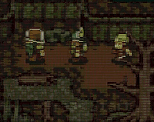
Uggggghhhhhh not another bug with the stairs! Putting those in was the worst decision I made, they are literally the most bugged-out area of the game. Yeah, the characters can blend in a little, and that's why I tried to add the colored highlights on their mostly-black heads.
I'll pass along your compliments to the musicians! I agree, I think the score complements the game perfectly--or maybe even the other way around!
Oooooh let's see. One was Speleomorph (here) -- that's the one where changing shapes is the main puzzle-solving mechanic -- and then Shapeshift Shatter (here) -- that's the one with the triangle dash.
Props to you for doing what's necessary to improve! And, again, sorry that I came off so strongly at first :/ my bad lol
Nothing's truly bad, it just isn't as creative as other submissions have been with the theme of "shape-shifting", in the context of switching between geometric shapes. There's one that's very similar to this--switching shapes to escape a cave--in which the different shapes are the main approach to solving puzzles themselves, where in yours the shapes hardly matter...platforms, gates, and walls only appear or disappear based on what shape you're playing as. In your game, you could replace the shapes with any other graphic--like playing Super Mario 64 as Mario, Luigi, Yoshi, etc., whereas in the other one the shapes themselves are an integral part of the game.
As I said--your concept isn't bad. Super Mario 64 is obviously a very good game, and that's why I used that comparison--this game could be successful if it weren't being compared to a different one.
Another game sees you switching shapes in order to attack enemies: you can move and jump as a square, but you take damage. You can only dash forward as a triangle, but you deal damage to enemies and walls. You have to alternate between them in order to complete levels.
That game is roughly the same as yours except for one key aspect: the logic for how different shapes alter the game. In yours, the different shapes themselves act as "keys" to various "locks", except you only have to switch to a different shape in order to "unlock" that shape's gameplay. There's another step of interactivity in the other one: if you just switch to a triangle at a random part in the level, nothing happens--you dash forward, and then turn back into a square. You need to target your dashes at breakable walls and enemies in order for them to be effective. It's not an automatic change, it's one that the player has to do themselves.
So that's why I said that other games have done better with this theme (granted, I was also exhausted from a long day at work at the time, and in hindsight I probably shouldn't have been as harsh with it). Does that explanation make sense?
Also be aware that these are my own personal evaluations of the games in this jam. Anyone here can disagree with me, and that's okay.
I tested it multiple times in one of the middle rooms--one of the first where dashing over spikes is a main part of the layout. I could jump and dash normally when there were no spikes underneath, but if I jumped, moved over spikes mid-air, and then tried to dash across them, the dash input would be eaten and I'd fall on the spikes.


