Play game
RUSHOME's itch.io pageResults
| Criteria | Rank | Score* | Raw Score |
| Enjoyment | #22 | 3.059 | 3.059 |
| Metroidvania | #25 | 3.000 | 3.000 |
| Presentation | #26 | 3.235 | 3.235 |
| Overall | #26 | 3.029 | 3.029 |
| Design | #33 | 2.824 | 2.824 |
Ranked from 17 ratings. Score is adjusted from raw score by the median number of ratings per game in the jam.
Engine
Unity
Team/Developer
Prameet Aglave (solo)
External assets
Various Open and Free Assets have been used or referred to and tweaked according to the needs of the game
Leave a comment
Log in with itch.io to leave a comment.


Comments
I did nOT expect the jump to be THIS high.
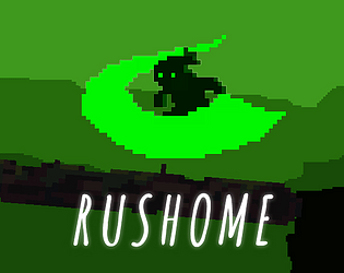
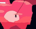
But I absolutely enjoyed it anyway. I love the colorschemes and the black sprites on vibrant backgrounds. Looks really aesthetically pleasing, probably my favourite visuals this jam.
I loved the colors and the scenery. The mechanics that involve basic character movement and physical attacks are quite frustrating. I don't understand why he's kind of anti-gravity. On the other hand, the ranged attack mechanics and the grapple system are very fun.
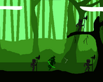
This has a lot of potential for a bigger game. The grappling hook and kunai were super satisfying to play with (I didn't realize how much I wanted mouse aiming in my game until now) and the forest artwork was simple but compelling and the music helped set the mood.
Some feedback:
- The grapple was sometimes used to hook things off of the screen, so it wasn't always clear where to go. This game was short so it wasn't too big of a problem, but knowing screen transition boundaries in a bigger game could be an issue.
- The character controls are pretty floaty and not always responsive. I enjoyed the mechanics enough for this not to be a huge problem for me, but in a longer game I probably would have been annoyed.
- Just some small polish things like sound effects on hitting an enemy would have helped sell the experience.
Overall I had a good time and beat the game fairly quickly. I think the grappling hook was the highlight for me on this one. Great job!
I also dig the minimalist style. The grappling hook is definitely fun, though jumping and platforming before getting it is a bit confusing, maybe because it's way too floaty. But other than that the game has a very interesting mood, and I like the camera zoom changes between the scenes. Kudos!
I like the minimalist pixel art and color choices! The attack animations are nice too, even on the boss character! The background music is pleasant, giving a somewhat oriental vibe. And the few upgrades I experience were fun - particularly the grappling hook. I wonder if there’s more uses for it - like pulling small things toward the player to collect or replenish something? Or hitting a trigger?
I won’t repeat previous feedback here, though I would second a lot of it. I think the one thing that hasn’t been mentioned is the lack of sound effects. The nice animation and actions in the game would really be enhanced with some of those.
I hope you continue to work on this! It’s pretty neat and you’ll learn a lot by trying to push a game jam game as far as it can go in a post jam release. At least I always do.
Loved the atmosphere and the color schemes. I agree with some of the other comments here about the floaty movement and the awkward key mapping. The grappling hook is the highlight of the game and feels really good. The kunai were pretty solid as well.
You've got a cool aesthetic and interesting ideas, so I'd focus on developing a good movement controller and more feedback from actions (sound effects especially) to really solidify your gameplay.
Kudos, too, for packaging what you had into a complete experience with titles, instructions, and an ending!
Cool game. gameplay and level design are very fun.
Good work.
I really like the swing feature, It pretty cool <3 the level design is good but it still short, I'll wait for your update, GG!
oh wow i love the minimalist color scheme really gives a dark feeling to the forest and the character design and matching life meter are very charming and the way he breaths is a great touch of animation love . i wish the forest tile had had parallax also the jump was a little tricky.
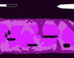
The crystal cave is great oh wow and the grapple is so much fun
you made an amazing world i would clean up the art add definition and add an jump pose.
Pretty big game for a solo dev, probs to that.
As for the game mechanics, they felt pretty clunky at times. Mostly because of the really low gravity jump that got stuck on every ledge. Luckily, once I obtained the grappling hook, there was no real need for the jumping mechanics anymore, so I really had my fun with that. Grappling hook mechanics are always great and they actually felt pretty good in this game! ^^
Only problem with the grappling hook: I can't click anywhere behind the big player health bar. I can grapple onto the health bar but not further than that.
As bugs always occur for such tight deadlines, I didn't really mind it, though. The game has its charm. Especially when it comes to art and color. The scene transitions got me a bit confused at times but the level design was pretty neat, all in all. Would love to see updates on this game!
Very buggy. Like, you pick up enemies when you run into them and it does no damage...stuff like that.
Fist off, the art is gorgeous , as well as the music.
The gameplay however has some problems in my opinion.
The controls are not good. The X and Z buttons are under WASD, so you have to take your fingers off the movement keys to access the attack keys. A much better control scheme would have been to have the attack options on the mouse buttons and the grapple hook on something like E , Shift or F.
Another thing that wasn't that good was the character controller. The player is way to floaty and the level design doesn't fit the movement. There are slopes but the character does not know how to deal with them, so it gets very janky at times.
Also why do you spoil all the abilities in the main menu ? It would have been way better to do a little tutorial that explains what an ability does when you collect it.
One thing that I really liked was the grapple hook. The animation, the physics of it and just how it feels is great.
And one last thing. It would have been great to have some more sound effects. The lack of them makes the game feel kinda flat.
But anyway, good job on finishing it. Keep it up.