Play game
Karen's New Groove [Metroidvania Jam 2023]'s itch.io pageResults
| Criteria | Rank | Score* | Raw Score |
| Presentation | #46 | 3.273 | 3.273 |
| Metroidvania | #62 | 2.545 | 2.545 |
| Overall | #76 | 2.455 | 2.455 |
| Enjoyment | #89 | 2.000 | 2.000 |
| Design | #97 | 2.000 | 2.000 |
Ranked from 11 ratings. Score is adjusted from raw score by the median number of ratings per game in the jam.
Engine
Unity
Team/Developer
Kamaleon70 - Kingdom Pots - Alexandra Dobreva
External assets
Graphic control Illumisoft - All in 1 sprite shaders Seaside studios - Metroidvania controller AisuKaze studio - Progressbar pack upln
Leave a comment
Log in with itch.io to leave a comment.


Comments
I like the art, but I think the map is just really hard to navigate because it's so slippery. You're often sliding into spikes or enemies, and you can't really see how much health you have either too. I do love the player animations though I think it looks great. Nice job :D
i don't think the game page mentioned you can press space to jump but that pretty easy to find. i did get confused in the beginning being unaware of the double jump until doing it on accident. also found C to dash by accident. there's some good stuff going on with the animations. it might be interesting to play a game with slippery controls on a map full of slopes but I'm a little sceptical that'll mix with combat well (I'm not really given much to go off of). also noticed some bugs with the physics like sliding on a flat surface and not slowing as well as being propelled off a slope that wasn't that steep
Thanks for the feedback!
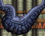
Quite loved the graphics and animations! Looks great with how the floor is shaped!
The platforming felt a bit unfair to me at some points. A few things I like to consider when working on platformers:
But I have to say, the placement of the platforms felt very natural and good!
I hope this doesn't sound to negative, I really, really liked the game!!!
Great job on this entry!
we appreciate the feedback!
Nice visuals
A promising beginning. The art is lovely. The ground layer--in most games a very ordinary affair--is quite spectacular. The player character sprite and animation are quite good, also.
Unfortunately there were many issues. The background, while intriguing (what are those ziggurats?), was out of focus in a way that somehow jarred me a bit.
When jumping between platforms, I occasionally got stuck in between the colliders and could not extricate myself.
After the game over, the cursor becomes invisible, so it's next to impossible to click the buttons; the only way to continue the game is to reload the page completely.
Quite an original map you did! Had some problems with movement (especially at the spawn point) but feel that the game has potential and just need more time :D
really nice art!!! merciless but great fun nonetheless!