Play game
Not Falling's itch.io pageResults
| Criteria | Rank | Score* | Raw Score |
| Presentation | #93 | 2.309 | 2.667 |
| Metroidvania | #127 | 1.010 | 1.167 |
| Overall | #127 | 1.407 | 1.625 |
| Design | #128 | 1.155 | 1.333 |
| Enjoyment | #128 | 1.155 | 1.333 |
Ranked from 6 ratings. Score is adjusted from raw score by the median number of ratings per game in the jam.
Engine
Unity
Team/Developer
Mwillismodeler
External assets
kenny.nl fonts and conveyor kit, Synty polygon space, ZeninLabs low poly pack scifi, Greyoxide shipyard, Quaternius ships
Leave a comment
Log in with itch.io to leave a comment.


Comments
It's very easy to get lost because the camera makes it very difficult to navigate. The goal also isn't really clear. The models and animations look nice though, and the movement is smooth. Nice job :)
I ran around the ship maybe 4 times before realizing I was supposed to go down.
Nice smoothing of the turning while running!
Somehow, north feels more natural to go in a top-view like this. Another thing to guide the player in the right direction is to actually spawn pointing in the right direction.
Also, it's very zoomed in, it feels like looking for a piece of LEGO on the floor looking through a straw :D
You are already doing some interesting work with the camera, you could perhaps let it zoom out while moving or something.
The music gives a good feeling that you're on time, but honestly I didn't feel like running around looking for stuff for 20 minutes. There wasn't enough things going on in the game to keep me interested for that long.
Nice to see some more 3D entries in the jam. Keep it up!
Things I Like:
Things I Would Change:
Broken Stuff:
Broken? If you find a sun you will have a light in the dark.
Aha, that's what the flashlight was for.
A friendly reminder to the player about using E and maybe animating the lights going out could help with that impression.
how it happened, definitely made it look like something that was broken as there was no reason to expect touching a battery looking object to turn off all the lights.
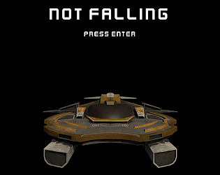
Looks and sounds great. Very nice models for the main character and all the vehicles. Nice animation and good music.
Unfortunately, it's very disorienting. The inability to see more than 4 feet ahead of the main character means that the player never has any idea where they're going! I would zoom out quite a bit more (although, sadly, that will result in less visible detail for the lovely 3D models).
I note also that Escape quits the game and Enter restarts it. A warning pop-up is needed, because players may press the buttons by accident, or just to find out what they do.
so what am I supposed to do? the level design is too big given the players very limited scope of view, and while it wasn't a bad idea given the destinations were apparent, the timer only added a layer of stress to the overall experience. The location was interesting but i think it could use some work.