Indie game storeFree gamesFun gamesHorror games
Game developmentAssetsComics
SalesBundles
Jobs
TagsGame Engines
A jam submission

Project Sophie (Demo)View game page

Add to collection

Play game

Project Sophie (Demo)'s itch.io page

Results

CriteriaRankScore*Raw Score
Graphics#33.8333.833
Gameplay#33.3333.333
Engagement & general#53.0003.000
Audio#73.0003.000
Overall#73.0333.033
Story#142.0002.000

Ranked from 6 ratings. Score is adjusted from raw score by the median number of ratings per game in the jam.

Engine
Unity

Team/Developer
Fusionist, meido, and Momo

Comments on the jam
Loved doing it. Realized a month isn't even enough when you're still learning an engine and your team members are still learning pixel art, but it was well worth it. We could only complete a prototype with a few rooms, but if you feel like it has potential, we'll definitely be expanding on this in the future.

Discord username
Fusionist#5183

Leave a comment

Log in with itch.io to leave a comment.

Comments

Submitted (2 edits) (+1)

I think it has potential. Music and character art is nice.

Main suggestions:

  • You should put some screenshots on your game page! I had no idea what to expect until I booted it up.
  • Control mapping is pretty weird. I want to be able to use my abilities while moving, so I ended up with my hands crossed over, using A/D with left hand and Q/E/space with right hand.
  • When you flip gravity in the air, your momentum also flips and you go insanely fast. I would consider making it zero out your vertical speed, or using constant fall speed, same as VVVVVV, but that might be hard to make work with jumping.
  • The rooms feel larger than than they need to be. I think it could feel less sparse and easier to understand if they were smaller

Nice job!

Submitted(+1)

Interesting concept, I like the fact that your character didn't fight directly. 

Submitted(+1)

Okay, this could be super fun, I want to see where this project can go!

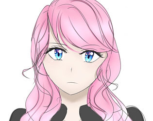
As for art, the character gooks great, the saturation definitely takes your eye to the character. It isn't too colorful, and black being a main color does fit with the levels a bit. my only crutique of the character is that her animation for walking looks more like galloping or running with a limp, an extra frame in between 2 and 3 should fix that (I would think). I love the bubble buddies. They feel kinda like punching stands from jojo's, and I would want to know why/what they are in this world of levels. The little rolling frogs are adorable too.

Level design, the levels are simple, they feel like tutorials, which works, the coloring of the levels seems a little weird. I can't place it but the tiles seem unnecessarily dark. maybe my mind is wanting them to contrast more with the background, but I still like how much the characters pop.

You seemed to put a lot of time into animating and polishing the game. This is a double edged sword. It seems like most of these game jams are either like that, or have so much game that polish is an after thought. Though polished games, like this one, feel better in my opinion, I wonder how a longer form project would be managed. My game is rough, but I basically have the entire structure planned out, fixing bugs and adding flourishes are all I have left. But in yours I can see you adding lore and levels, but I have no idea where it is going. I love what you have, but I wonder what this game truly wants to be. As you continue to work on this (I think you should!)  I hope you'll think on that, this game could be a lot of different things in it's current state.

PS: The song, it's very simple and short. I would have thought it would get grading, but It's still catchy