Not gonna lie, I have a hard time dissecting this comment, but thanks for the support. I'm gonna work on the interactions and menus especially. Hopefully I can realize the potential of this game! And maybe a "die" scene that shows the main character getting caught, not a bad idea
Direphon
Creator of
Recent community posts
Thanks for the feedback! I don't quite know what you mean by the text being off center, it's supposed to be scrolling on the wall in the background; but maybe I should have just made a dedicated scene instead. Sound effects or causing a force upwards on the player would probably help a lot with the feel of the game! That might be the first thing I try and fix, I think I was a bit blind to that bit of feedback so I really appreciate bringing my attention to that. As for the platforms, I'll mess with it a bit, I haven't played too many platformers (one reason I wanted to do this jam) and another game made me think that making all of the platforms accessible from the bottom would be a huge improvement. Maybe I will just mess with the friction of them instead, I'll find that out with experimenting. Thanks again!
Okay, this could be super fun, I want to see where this project can go!
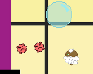
As for art, the character gooks great, the saturation definitely takes your eye to the character. It isn't too colorful, and black being a main color does fit with the levels a bit. my only crutique of the character is that her animation for walking looks more like galloping or running with a limp, an extra frame in between 2 and 3 should fix that (I would think). I love the bubble buddies. They feel kinda like punching stands from jojo's, and I would want to know why/what they are in this world of levels. The little rolling frogs are adorable too.
Level design, the levels are simple, they feel like tutorials, which works, the coloring of the levels seems a little weird. I can't place it but the tiles seem unnecessarily dark. maybe my mind is wanting them to contrast more with the background, but I still like how much the characters pop.
You seemed to put a lot of time into animating and polishing the game. This is a double edged sword. It seems like most of these game jams are either like that, or have so much game that polish is an after thought. Though polished games, like this one, feel better in my opinion, I wonder how a longer form project would be managed. My game is rough, but I basically have the entire structure planned out, fixing bugs and adding flourishes are all I have left. But in yours I can see you adding lore and levels, but I have no idea where it is going. I love what you have, but I wonder what this game truly wants to be. As you continue to work on this (I think you should!) I hope you'll think on that, this game could be a lot of different things in it's current state.
PS: The song, it's very simple and short. I would have thought it would get grading, but It's still catchy
I love the art and the Color palate, along with the music, it makes the game have a calming air. The animations look very nice too! But there were a few times where the player got stuck in crouch or the enemies quickly switched between right and left. Working on those would probably make the game feel a lot more polished.
Once when I was playing I was sent back to the beginning of the scene, as the player I thought I pressed R or some equivalent. Having just read your Itch.io page I realized I probably shot an arrow at low HP causing the scene to reload. If you are going to continue development of this game I would make sure to give the player feedback on some actions they do. Perhaps if they attack and loose health for the first time, a dialogue box saying "Ow, I should watch how often I do that" or some variant would help the player understand what is happening. I played through this game without realizing the attacks drained my health. Unless told, many players (myself included) can be ignorant of mechanics that may be core to a game.
Aside from all of that, I love the character design, UI, doors and Buttons across the map. I would have gone with higher resolution drawn elements, but that could be a design choice. Having a drawn GameJam game is impressive in its own right!
I loved it! seemingly because the AI following mechanic worked for me (mostly).
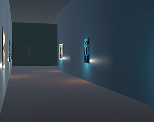
The 3d modeling is quite nice, the buildings and characters look great. if you had more time I would however add some more shadow or lighting to indoor sections as the doors can just fade into the wall of another room; maybe make a door frame that is a different color.
The animations are nice, but I do wonder if a swimming animation was worth it. I suspect you had some bigger plans for it otherwise, it's something you spent time on that might not be noticed by a good portion of players. That being said, because of that level of care for the animations I really noticed them, so double edged sword.
The AI worked for me for the most part. Early on she broke but was fixed when I came back to her. but later it took a few swings to reset her follow (somehow). If you could, it may be a good idea for the AI to wait for the player at a position, and after the path has been cleared for her, head towards the player where-ever they may be. biased on my experiences, this isn't how the AI is written, I may be wrong.
I enjoyed the play through, but I'm not sure it fit the genre. In a way you are gaining access to the map, but when I saw the 1st attack animation, I expected to get some combo by the time the game finished. If you were able to give the character some different kinds of upgrades I think this could be a great game to work on for the Super Metroidvania Jam.
very fun browser game, took about 15min to beat the first boss. This simplicity was very compelling, the graphics are nice and I appreciate the secret rooms available to those paying attention.
Combat was fun, bouncing bullets were a fun addition I wasn't expecting. Every time I died I felt like I could do it if I was better.
If you wanted to I'm sure you could make this a sell-able game, maybe traveling to different points on a map trying to combat a growing infection (the enemy force).
But honestly this was just an enjoyable experience, I didn't come across any bugs that I noticed.


