Play game
Speedy Jumper's itch.io pageResults
| Criteria | Rank | Score* | Raw Score |
| Use of the Limitation | #6 | 3.714 | 3.714 |
| Enjoyment | #25 | 2.714 | 2.714 |
| Overall | #25 | 2.875 | 2.875 |
| Concept | #32 | 2.786 | 2.786 |
| Presentation | #35 | 2.286 | 2.286 |
Ranked from 14 ratings. Score is adjusted from raw score by the median number of ratings per game in the jam.
Team members
Made by me, unne27
Software used
I used Godot engine.
Use of the limitation
The blocks that you walk on fall out of the world, they are temporary.
Cookies eaten
2 cookies if oreos count
Leave a comment
Log in with itch.io to leave a comment.


Comments
(I am now in a rush to test as many games as possible to help, so please do not mind the cursory reviewing style.)
[testing the navigator version; which is up to date? Not sure]
Controls are layout-independent, great! :) (I have an AZERTY keyboard)
Movement is a bit fast and "stiff"/unforgiving! In particular, not sure what makes the square unstick from a wall… Ah, I think this is because you have to keep moving towards the wall; you could also "stick" it, and let the player unstick with a single press (this is debatable). (Reading "The speed is in my opinion what makes the game fun.": I agree that the speed has a funny effect here, actually, but the "stiffness" of some controls, including wall jump, could probably be dealt with.)
I think some sounds would help getting the action and adding life! Such a game with simple geometric shapes would go well with sfxr, for example. :)
4th screen: I thought going to the right again, but lost!
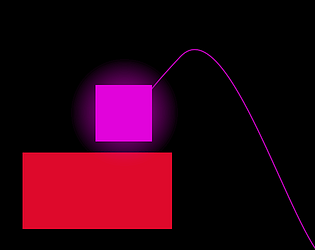
I like how you can the your trajectory (purple line). :)
Managed level 1: so, that was the green "door", got it. X)
Level 2: the two tints of red for regular and deadly platform are too close, I think!! I would either make the colours more different, or add something to the deadly ones so they stand out (a texture/drawing, or an outline, or blinking…).
Oh, and the greenish (transparent?) ones are teleporters! Reminded me of the exit from level 1; same colour-related advice here.
And what are you supposed to do next?? I managed to teleport and then get on the white rectangle, but… I am in a sorry situation!
Trying level 3: OH, you HAVE TO finish level 2 first!! <:o
Back to level 2: going right, maybe? YES! So, the white rectangle was in fact a BLOCKING WALL; I would advise making it go to the top of the screen, so that silly individuals like me not be tempted to jump on it. X) And maybe add an arrow on the right?
3rd screen: moving left makes you teleport back to the 2nd screen and lose… :s
3rd screen: really no time to think or even see if you are moving / pressing a key when entering!
Beat level 2! :) Died some times just before the end; SUGGESTION: remove the teleporting capacity of the receiving teleporter altogether. As this is apparently a game with no turning back (except if you intend such levels), it makes sense, and would spare many deaths to the player.
Beat level 3! :D Way faster then the two previous ones! By the way, what is the difference between blue and green teleporters?
Takeaway: GOOD concept, totally in line with the constraint, BUT some playability and implicit indication/understanding issues can hinder the player — the latter should be easy to solve! :) Also got better at it through
die-and-retrytraining, and found it more and more pleasable, while the very start was a bit painful! You are thrown right into the action with no time to think; a less steep difficulty curve would help, like a tutorial level, for example ("I'll add some tutorial at the start" -> so, already planned :)).This nice fast-paced concept can definitely go somewhere, it was a pleasant time. :)
My first reaction was “this falls too fast”. Specially the first times, that i do not know yet the rules and die without time to react at all. The second time i am still a bit dumbfounded and also died without knowing what i am supposed to do. Maybe the very first platform could be static and warn the player “somehow” — i do not know how — before the first falling block.
That is the point of the game; it goes fast. You can't stay in the same place, you need to move.
Right, but not when the player does not know yet what to do. For example, let a ‘MOVE TO BEGIN’ indication on the screen at the beginning of a level, and only then, let the flow have its course. ;)
Cool effects on the player and platforms! Regarding the movement issue, I think a lot of it stems from how high the 'gravity' is, which makes it so that you have to give the player a lot of jump force to counteract the force pulling down (which is what makes the jump feel 'jumpy'). As a 2D Platformer, I think my game is pretty similar to yours so feel free to check it out if you want to try out 2d movement that feels different (mine also had comments about certain movement issues but they don't seem to be the ones yours has so it might be beneficial to try it out anyways!)
I will try decreasing the gravity.
The game is pretty difficult but I managed to beat all 3 levels! I feel like the movement was rather sticky and a bit unintuitive which contributed to the overall difficulty. Sometimes it was difficult to tell the colors apart since very similar shades of red either fall down or kill you. There were also two different colors used portals. Using the same color for all portals would teach the player what those colors mean.
I thought using different colors for the portals would make it easier to see which portal leads to which, but I never ended up using two portals in the same room.
To everyone complaining about the movement, I have done my best to improve it and I am tired of hearing about it.
At the very least, tell me what's the problem and how you think I can improve it.
This is only my second released game, and I am by no means an expert when it comes to game design.
I like the idea but I feel the movement is not very refined and so I had a hard time controlling.
What was your problem with the movement?
took me a bit to realize that you needed to wall jump to get onto the next part of the first section of level 1. I had more issues with the first section then the rest of the level. maybe because I got used to how the jumping and such. The blocks do fall a tad fast not sure if that was how hard you wanted it to be if not then maybe add a little delay to them.
Since this is a fast-paced game, I think the blocks should fall as fast as they do.
I will update the game to be more clear about the wall jump.
The jump mechanic still needs more adjustment. It's a little too slippery and jumpy(?.) I was able to finish level one at least but it was just hard to move around. Maybe the blocks are falling too fast but I think it's really just the jumping mechanics. Also, often times I just don't know how I died. Other than that, I think it's a nice and simple submission that fits the limitation well. Well done submitting!
Thanks for the feedback!
I will look into the jumping, and I'll make it more clear what kills you and what doesn't.
I have now improved the jumping, making the movement less slippery and I made it more clear what kills you.
Interesting concept and use of limitation
Liked the use of limitation there. It was a bit unbalanced but can end up great if you complete it
Everything is fast here, and it is also not clear where you need to move. But not a bad bloom
The speed is in my opinion what makes the game fun.
About the clearness, I'll add some tutorial at the start and when new stuff like portals pop up, but in later levels I think the players should figure it out themselves.