Play game
catch the food's itch.io pageResults
| Criteria | Rank | Score* | Raw Score |
| Use of the Limitation | #29 | 4.000 | 4.000 |
| Presentation | #77 | 3.000 | 3.000 |
| Overall | #86 | 2.975 | 2.975 |
| Concept | #99 | 2.600 | 2.600 |
| Enjoyment | #100 | 2.300 | 2.300 |
Ranked from 10 ratings. Score is adjusted from raw score by the median number of ratings per game in the jam.
Software used
Godot Engine
Use of the limitation
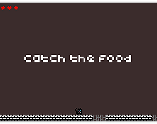
every sprite in the game is 8x8px
Cookies eaten
1
Leave a comment
Log in with itch.io to leave a comment.


Comments
The sprites are cute and the controls feel snappy. The placement of the collectables annoyed me a little, since most of the time the negative ones were placed right in front of a gap, which meant you either had to do a frame-perfect jump (if it worked at all) or just eat it and hope you're not slowed down too much. There also was no real progression in terms of ability or difficulty, which makes an infinite game get boring very quickly, so that would be one aspect to work on if you decide to develop this game further.
Good work, keep at it!
thank you for playing the game. It really felt like missing some spice in the progression side.
This shows potential for a good runner game. Having different environments for each run really adds to replayability.
I didn't find myself particularly motivated to avoid damaging pickups because healing pickups were abundant, and they were often right before holes, and jumping over them put me in more danger than simply collecting them. There's also a lot of unused space on the screen. You might consider adding some verticality to gameplay by making the player jump higher (either inherently or with powerups) to allow them to access platform pathways above ground level with other pickups and hazards.
Nevertheless, you're off to a good start.
Fine work, and good luck! :D
Thank you for playing the game.
The key was really to have a balanced diet with the cat instead of only trying to eat only the cat food, but the result wasn’t great and needed some more work to improve the fun of it.
More verticality would be a lot of fun, we’ll def keep it in mind.
The aesthetic is cool and I like the concept, though I think the controls could be tightened up (Jonas Tyroller has a good video on that) and more attention could be brought to the score the player gets each time around. I also recorded my playthrough, though I'm clearly not very good haha.
thanks for testing out the game, I really need to work on the controls, but we couldn’t start in the first day of the jam so time was too short to refine some stuff like the controls and some hitboxes. About the score, that’s great feedback, maybe I should bring it more close to the player and blink each Xm or something
really liked how you had multiple "skins" for the game, with the black cat and the one with the sword! wouldve loved to see that affect gameplay somehow, or maybe even more different cats and locations :D
thank you for playing the game. We were planning on having many more cats and scenarios (also full scenarios not just the ground tiles) but couldn’t make it in time. Maybe in an update soon =]