Play game
Rising Calamity 6's itch.io pageResults
| Criteria | Rank | Score* | Raw Score |
| Enjoyment | #30 | 2.706 | 2.706 |
| Use of the Limitation | #39 | 2.294 | 2.294 |
| Concept | #42 | 2.824 | 2.824 |
| Overall | #45 | 2.426 | 2.426 |
| Presentation | #62 | 1.882 | 1.882 |
Ranked from 17 ratings. Score is adjusted from raw score by the median number of ratings per game in the jam.
Team members
Yayousword, Bilijes
Software used
Unity, Aseprite, GarageBand,sfxr
Use of the limitation
As you take damage and your health drops to 0 you get stronger, up until you get "Too strong" basically
Cookies eaten
none but I'll change that right away :D
Leave a comment
Log in with itch.io to leave a comment.


Comments
cons -
1-Bullet lifetime is so low
2-Add some shake
3-tank bullet just mix up the background ,add color that make it stand out
4- Unity UI sucks ,use textmeshpro
not gonna lie Game is pretty fun !
The idea is good and the game is fun to play as it is, but maybe if polished it could become a lot better.
Wow that got intense! Was pretty fun!! Nice art too! Good job! :D
Overall a nice game with a fun and engaging music. The gameplay is fine enough, but this game has a higher potential if it can be polished more. Like the UI or the AI stuff. For example the map can be made a bit bigger and add some shield type thing like a building or a wall. The enemies would then have to move around the walls to shoot the player, etc. instead of shooting straight at the player. Also maybe add a bit of intentional-inaccuracy to the bullets cz the bullets are too accurate XD. This can keep the player more engaged and maybe allow them to evolve some strategies too.
Apart from the Polishing, the game is pretty good, and the use of the limitation is also nice :)
thank you for the good recommendations! And yeah I planned to add inaccuracy on the ennemy shooting but didn’t have time to do it unfortunately.
No problem, it was a nice game overall :)
Great work on this entry! I liked the music. The gameplay was pretty simple but fun. I have a bit of feedback tho
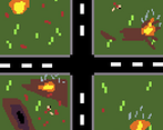
The contrast of game elements felt off, and what I mean is that the Dark bullets were hard to see and track at times. There is two ways to improve this, make the road and grass brighter, maybe a light grey and make the bullets bigger, OR make the bullets alot brighter and bigger. I reccomend checking out some free palettes on lowspec since premade palettes tend to have contrast built in. Also I think you could have gotten away with not having the player rotate.
The take on the Limit was pretty cool. Dying makes you stronger has a cool dynamic since you still dont want to get hit, but getting hit can be good for you as well.
Overall really cool score shooter. Great work!
Cool game. I liked the original graphics. (:
i like the retro feel of the game. sound fx are cool and movement is very smooth. well done!
It's a bit chaothic visually, you can't really see the tanks very well in front of that background, but it's fun. Maybe a bit too hard since you don't really have a way to cover from enemy fire, but your attacks compensate. Good job!
The game is nice but it's a bit boring and repetitive, the art and music is nice but I never found myself really using those strong stats to save myself
I agree that as is the game gets stale very fast, I unfortunately couldn't implement everything I wanted to due to a lack of time so this is something I have to work on!
Thank you for reviewing!
i love the game, and funny enough, i find myself play it for a bit.. love the idea that you actually gain additional bullet and fire rate.... the down side is, the UI block some of the enemy, and make it hard to see them.... and also the enemy has the same color as the background, so they are hard to spot....
overall, nice one
Thanks for the feedback, yeah I've definitely been struggling with the UI and was quite disappointed of how it turned out but I'm glad you enjoyed it anyway!