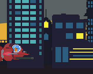
Play game
Terror in Goldfish City's itch.io pageResults
| Criteria | Rank | Score* | Raw Score |
| Presentation | #29 | 3.571 | 3.571 |
| Overall | #33 | 3.357 | 3.357 |
| Concept | #36 | 3.429 | 3.429 |
| Enjoyment | #37 | 3.143 | 3.143 |
| Use of the Limitation | #48 | 3.286 | 3.286 |
Ranked from 14 ratings. Score is adjusted from raw score by the median number of ratings per game in the jam.
Team members
Zespy
Software used
ASeprite,Unity, BeepBox
Use of the limitation
The fish is the main character of my game, and i also used the spaceship swordfish as a drawing reference
Cookies eaten
Too many
Leave a comment
Log in with itch.io to leave a comment.


Comments
Nice game, art is great, my only critique would be that it's really hard to see enemy's projectiles on such colorful background, maybe dim bg parallax some and make projectiles stand out more?
Very nice to play! I just missed more sound effects, that would give much more enjoyment!
Very fun game! Great job!
Simple and fun, I liked the artistic section, it is very beautiful. I wish I had a little more gameplay, but it's good, it reminded me of the fish from "Chicken Little" in the final scene haha
This one really cought my attention! I liked the plot and the art style! In my humble opinion, if I may, I would change a minor design choices: the little white lines, despite gives a speed sensation, lets the scene a little messy (to my taste). I would erase it and add some fire propulsor to the ship for example. Overall, nice game!
I did plan on adding more particle effects in the game, but I was very unfamiliar with the unity particle system, so i just decided to scrap the idea due to time constraints. With that said, ill try to take into account sprite visibility in my future projects. Thank you for the comment and I appreciate the feedback. Have a great rest of the day!
Really enjoyed this game. But there are some problems.
1. Enemies color is also the same as the background color.
2. There are too many enemies spawn at one place.
Anyway good game.
I appreciate the feedback, Thank you!
Really cool game. Player art is fantastic. The only problem I had was with seeing projectiles since they were the same yellow color was the passing windows and they ere mixed in with the white speed lines going the same way. Maybe there is some way to make the background and foreground more distinct. Great job.
Thank you for the feedback! I was planning on creating glowing effects for the enemy bullets to make it more apparent, but sadly I was unable to do so because I had a lot of issues with converting the game to WebGL during the last few hrs of the game jam. Anyway, feedback is always appreciated. Thank you!
There are a few vulnerabilities in the game that will make it easier to progress, but the designs
How can I not give 5/5 for this , great art work and playstyle.
I especially love the little intro at the start, really makes the game,
the only way I could see this game being improved is Leaderboards and co-op( a stretch I know but I have to critique something).
Good job mate , godspeed ;)
I just woke up, and this comment made my morning <3. thank you for the feedback, I appreciate it.
Chic style and presentation. Commander Catfish is damn good ahahhahaha.
Simple but very entertaining gameplay, with suitable music, feels good! The only thing is that I would like to feel the shooting effect a little more. Maybe you can work a little with the sound.
Thank you for the feedback :) , ill try to find time to improve the sound effects in my future projects