Play game
Whist Away's itch.io pageResults
| Criteria | Rank | Score* | Raw Score |
| Engagement | #183 | 3.466 | 4.143 |
| Overall polish | #229 | 3.227 | 3.857 |
| Overall | #248 | 3.227 | 3.857 |
| Creative use of art assets | #332 | 2.988 | 3.571 |
Ranked from 7 ratings. Score is adjusted from raw score by the median number of ratings per game in the jam.
Leave a comment
Log in with itch.io to leave a comment.


Comments
I liked the idea of fighting with monsters through cards.I didn't understand which monster was stronger but I had fun being on 1 heart and running and jubaiting monsters around corners and dashing to the ladder to go the next floor.I liked how you made themes which changed the design made it so I could play it again and again :) Good Job
Cool concept! I like the idea of having to conserve your resources when you go thru the dungeon. The How to Play was reasonably effective, but I wish the controls were shown too because I didn't know the arrow keys did anything until I died a few times.
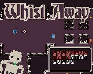
I think this game has a lot of potential! My suggestions for making the game slightly more strategic is that you can see the pool of cards that every enemy can choose from, similar to how all of your cards are displayed. This might not be in line with how you want to design the game and the choice is ultimately up to you, I am just giving ideas
I also think that it should show how many cards an enemy has left somewhere, so you can gage better whether you want to engage the enemy.
I feel like having less cards in your deck would be an improvement, because it would mean you have less cards you have to sift through and you have to be more conservative with your resources. And the dungeon sizes would need to be shrunken to accomodate, or you could pick up card packs to regenerate your cards.
Overall well done, fun game concept!
Thanks for the feedback! The game definitely needs ui and general improvements for clarity, these areas were a bit rushed because of time. As well as showing how many cards enemies have I want to show the health and who used which cards in the recently used cards box. I do want to keep if secret which cards an enemy will use though as this is more in line with the experience of playing Whist. There definitely does need to be a way of making it more strategic though as it does sometimes feel like blind luck when you choose a card. You do have less cards in the later floors too, I may add difficulty settings in the future so you can start with fewer cards, gives me the chance to add more unlocks too...
Thanks for playing!
All of the changes you suggested sound like good ideas! Some UI improvements would go a long way in this game. Look forward to seeing where this game goes!
Wow! I am really enjoying this game, it is addicting and really creative. Definitely going to finish it, I loved it but I'm still getting used to which creatures are strong and which are weak. You could definitely do something to help the player from the git go, I kept on losing way too much when I started, perhaps an easier first level.
Thank you for the positive feedback! I know what you mean with helping the player from the beginning, its definitely hard finding that balance as a solo dev when you can't get other people to playtest. I do think I erred on the side of making it a little difficult and vague in its descriptions though, since all my favourite roguelite games are build around early death being a given until you figure out how the game works, without too much hand holding. Thanks again for the feedback!
I really enjoyed the gameplay, it was unique and having to use my resources wisely added a lot of depth. My only criticisms are that enemies seem to always have high cards no matter their level, therefore I'm always using my high cards to not lose health and to show which card in the recents is a monster card and which one is a player card. I would also suggest putting a health bar over the characters head because I felt I had to disengage from gameplay to look at my health. Overall really fun though, unlockable color schemes is a nice touch.
Thanks for the feedback! I do agree that the high level monsters should have higher value cards, I think I just didn't implement this because I wasn't sure how to do this with the time constraints, so I just chose to give them other boosts instead. I will definitely implement this in an update though and take your other feedback on board. Glad you enjoyed it.