Play game
Always Fresh's itch.io pageResults
| Criteria | Rank | Score* | Raw Score |
| Graphics/Animation | #13 | 3.727 | 3.727 |
| Theme/Limitation | #18 | 3.727 | 3.727 |
| Overall | #25 | 3.182 | 3.182 |
| Music/Sound | #25 | 3.000 | 3.000 |
| Technical Implementation | #28 | 2.727 | 2.727 |
| Fun/Design | #29 | 2.727 | 2.727 |
Ranked from 11 ratings. Score is adjusted from raw score by the median number of ratings per game in the jam.
How does your game apply the limitation and theme?
Its a cooking game and your ingredients expired over time so you must buy food with cautions
Team Size
Trio (3)
Engine
Unity
Which diversifiers did you use, if any?
Infinity
Leave a comment
Log in with itch.io to leave a comment.


Comments
Wow, this is insanely ambitious for a one-week project, nice job! I think maybe you didn't spend enough time on easing the player into the game though, it's very overwhelming, and I found it hard to make any kind of profit, especially since it's so difficult to make something like a sandwich. The art style was fun, despite the odd nurse uniform.
It is a very beautiful game, really well done ( ˘▽˘)っ♨
I wasn't very good at it though, maybe just giving the already prepared food to customers would have been easier as I was rather confused lol ( ゜Д゜)⊃旦
I found the controls to be a bit difficult, enough that I couldn't stay engaged with the game. That said, I liked the idea a lot. The ability to see recipes at the store would have been nice.
Judged for the "Judges Choice" award on a Livestream from Thursday 25th. Link to vod: https://www.twitch.tv/videos/962477700 Timestamp: 56:00
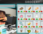
I like the block art style. I felt it was a bit overwhelming to go to the grocery store and have so many things to buy and no idea what is a good idea to buy or not. Then the clients are coming in and I really don't know how am I supposed to prepare them food. I think the game should have a natural progression of starting with a single thing to prepare and its ingredients and that's all the clients want, so you can learn how to do that, then the next day, something new and the next day something else new etc. I was overwhelmed and just gave up. It was a nice touch to add those tutorial text window, but I think the problem was mostly in the progression and the way mechanics were introduced.
I liked the art style and the game idea.
I enjoyed the game a lot.
There is quite some strategic thinking to do which kept me engaged for a while.
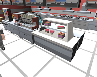
Aside from using a nurse model for the player character I really enjoyed the visuals despite not usually being fan of blocky-characters.
Unfortunately your controls were hindering my enjoyment quite a bit.
Being forced to constantly adjusting the camera manually was extremely annoying.
The player model being in the way also gave me a hard time clicking the kitchen appliances despite at least half of it was visible.
Overall really good job!
The game looks very good, but it's was hard to understand how to play.
Couldn't figure out how to play! It looks fantastic, the graphics and design are nice but it is so hard to read white text on a light pink BG.
the game suddenly blacked out for me a bit in but from what i saw this looks like a competent minecraft kitchen simulator!