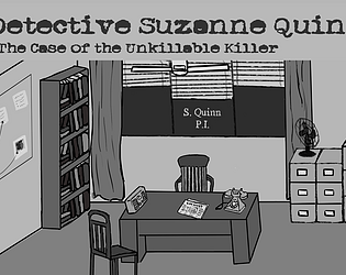
Play game
Detective Suzanne Quinn's itch.io pageResults
| Criteria | Rank | Score* | Raw Score |
| Concept | #2 | 4.005 | 4.200 |
| Audio | #3 | 3.623 | 3.800 |
| Enjoyment | #5 | 3.814 | 4.000 |
| Overall | #6 | 3.496 | 3.667 |
| Graphics | #8 | 3.242 | 3.400 |
| Story | #8 | 3.242 | 3.400 |
| Theme | #11 | 3.051 | 3.200 |
Ranked from 5 ratings. Score is adjusted from raw score by the median number of ratings per game in the jam.
Did you use any optional theme? If so which one?
Break the rules
What game engine did you use?
Unity C#
Something you wanna say? ٩(^▽^)۶ (optional)
Thank you! This was fun!
Discord username (optional)
Todd Howard#9558
Leave a comment
Log in with itch.io to leave a comment.


Comments
I had a good time with this! Fun detective story with a nice twist ending that came too soon. I loved the style of the art but would have liked to see some character animations, especially for Detective Quinn. The sound perfectly fit the atmosphere of the story. And the "singer" in the speakeasy was a great sight gag lol.
I agree with the other comments that some of the clickable areas were a little unclear, but it didn't stop me from enjoying the game. Hope you keep working on this! Great work!
Thank you for playing! I'm glad you enjoyed it!
Nice work with this game! I enjoyed the noir aesthetic, and the inventory was well designed. I wasn't quite sure I was on board with what the truth about the wine revealed.... but MAN did that twist ending change my mind xD xD Consider me intrigued.
I will say, I do agree with Kaa Snake that some clicking points are unclear, especially with moving from one location to the other, or with which places can and can't be used with the inventory. In the future it might be nice to have a bit more of a fine tuned click area or some sort of clearer indicator for that. Aside from that, I really enjoyed the mechanics, especially the ability to use stuff from the inventory both on the scenes and with other inventory objects!
Storywise, a lot of good stuff too! Really good detective dialog and building the mystery suspense! However, something that bumped me a bit was the thing about the very red wine.
Spoilers ahead for anyone who hasn't played.
So right now, there's three types of "red". Tomato, Wine, and blood. While I get what you guys are going for with that (plus the Jam theme :P ) right now, it doesn't seem like these three red "clues" are fitting together properly. Having these three variables jammed in kinda took my brain on a journey like "ok it's a tomato incident! Oh wait it's wine. Tomato wine? No tomato password. WAIT BLOOD? but a tomato incident?!" you know... the kind of train of thought that leaves the player wondering whether or not they understood everything right, as opposed to following the story clearly.
If you were to do more with this game, I'd suggest narrowing these three red factors down to two. Perhaps keep it at wine and blood. Like just that the wine is the "extra red chardonay" but in truth it BLOOD. Or... maybe it could be tomato and blood. What if at the resteraunt's basement... they serve spaghetti with EXTRA RED TOMATO SAUCE! I feel like one of these two will make that part of the story a lot easier to follow, and punch a lil harder.
Hope that helps you! Keep up the good work!
-Sasha
Thank you very much for your extensive take on our 'lil entry :D I'm so glad that you were entertained and enjoyed so much of our ideas, and some very good points to take forward for us :)
Thank you for playing! Some parts (mechanical and narrative) could definitely use some more polish, so we really appreciate your feedback!
It's actually a very nice concept - oldschool detective story, with a point and click system! I enjoyed the sudden ending twist too - very cool, shame it's short, but it happens in Game Jams.
Just a few puzzles, but well designed I'd say!
A few things to note, I'd say, are clicking points that seem unclear. Objects don't pop out of the scenery much, requiring some good "scrolling all over the screen to see where the mouse detects something"
The drawings don't seem too bad, even if slightly inconsistent. And the player might need at least a walking animation, I feel. And just a cleanup of the UI.
Good entry overall!
Thank you for playing! I'm glad you enjoyed it :D
Thanks so much for your review! :D Hopefully we're able to iron these things out for the future :)