Congratulations on your first jam game. You all did a fantastic job!!
As many have said in the jam comments, the tutorial is VERY clever. The concept is so silly (in a great way) and all the cattos and cat aliens are adorable. The music fits the vibe too, and I really appreciate the Tuna theme only playing near the tuna and switching to different themes for the combats. Well implemented dynamic sound.
The combat system is also well done. However, I think the game's biggest weakness comes from difficulty curve. The jump from the tutorial to the combats is HUGE. I did try all 3 areas to see if perhaps one of the areas is meant to be the easiest, but I found them to be all equally difficult to the point of being a bit frustrating. The area with the big lazer cat seemed the most doable, but having the two aliens in addition to homing projectiles was a LOT to manage with the health given. The UFO area required a lot of camera movement which felt extra tricky because of how sensitive the camera is. And the platforming area was really really confusing especially with the wall jump mechanic being introduced with no explanation.
If you were to expand this game post jam, I would recommend adding some more areas before these ones that are a bit easier, in order to ramp up the skills required a little slower.
And if you were to keep it at 3 levels, it might be nice if they were labeled easiest to hardest (in a silly way in the style of the tutorial :D ) and were balanced accordingly. Perhaps no UFO enemies for the lazer cat level and that could be level 1? Perhaps 1 or 2 less UFOs in the UFO level?) Additionally for the platform level, it would be neat if the wall jump mechanic was introduced safely outside of the combat zones.
Finally just two smaller things - if possible it would be great to have a slider in the options to turn camera sensitivity down. And for the intro text, perhaps some in world dialog boxes? This would both help with the text being covered by the scenery, and would also help with the white on white that happens in the walls of the great tuna area!
Hope this feedback helps you!! Congrats again on an adorable game and successful jam! Can't wait to see what else is in store for you all!!!
- S
Scoot o' Speed Studios
Creator of
Recent community posts
I liked this sooo much! I like how the music is nice and subdued. It gave a lot of space for the subject matter.
The art style is super appealing and has lots of character. Blending it with the narrative and music made for a really engaging game! I really enjoyed how there are lots of invitations to fill in the gaps in the world, characters, relationships and roles of the spirits.
The pacing of the decisions themselves has a helpful progression to it. Starting with light decisions in the beginning and gradually working up to ones with more weight was great! It helped invite more engagement and interaction as the story continued to build
Great work by your whole team!
- Josh
TL;DR. Began iterating on Skill Creation GUI. Got the basic Skill Creation gameplay loop working. Offloaded game data to Google Sheets. Spent too much time playing an MMO.
I prefer using the term "retrospective" since post-mortem implies the project is dead. Our game is nowhere near being dead and is still being created. Instead, I'm reflecting on a specific period of the project.
Intro
I (Josh), am 1/3 of Scoot o' Speed Studios. I'm our programmer and lead designer. This is reflective of my (Josh) experience in October, so I don't speak for the whole team.
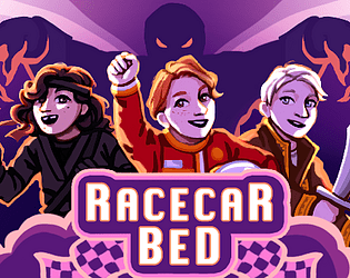
Our current project is Racecar Bed. A Social Sim + RPG with time management and a friendship system similar to Persona 3/4/5. Oh, and you can make your combat skills. My main goal for Devtober was to complete the basic Skill Creation gameplay loop.
Background
I went into Devtober with a basic turn-based combat system with health, sp (mana), party members, and leveling. What I didn't have was the skill creation system; one of the main hooks and mechanics that sets us apart from Persona.
The *rough* idea is to receive (legally distinct) toy blocks as a reward for spending your limited days hanging out with different people. The blocks can have different attributes like increasing/multiplying healing/damage, lowering sp cost, increasing target count, etc.
Using those bricks, you can piece together a unique skill that is both uniquely representative of your friendships and devastating in battle. These skills can affect both enemies and party members depending on the block placement. So there can be tradeoffs to make when making a unique build.
In September, I had started working on the GUI (Graphical User Interface) of placing blocks on top of each other in a 5x2 grid.
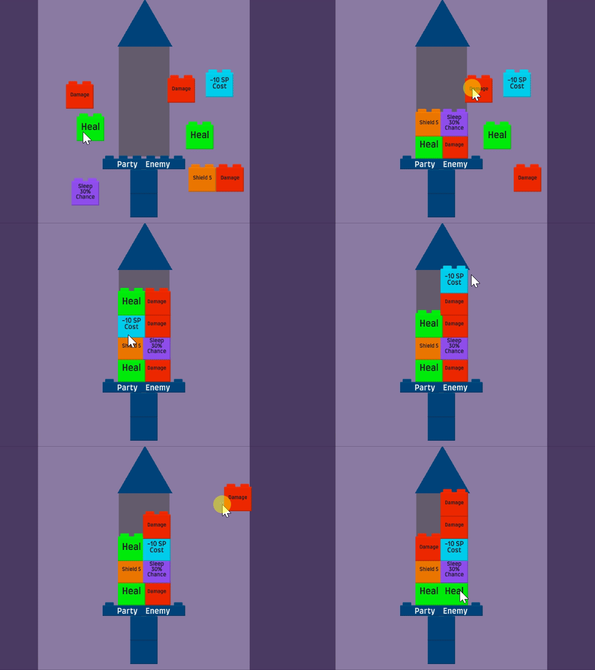
GUI
I continued the GUI work by supporting block widths between 1-n. Programming blocks to find the nearest open slot with a block below and then adjusting the rest of the block to shift over to the nearest gap was pretty difficult. I envy the children who make playing with blocks look so easy
Then towards the end of the month, I worked on polishing the GUI.
I wanted a real-time preview of what the block-built move does. I tried doing a running total of damage and sp cost next to each side of the move's blocks, but things got crammed real fast.
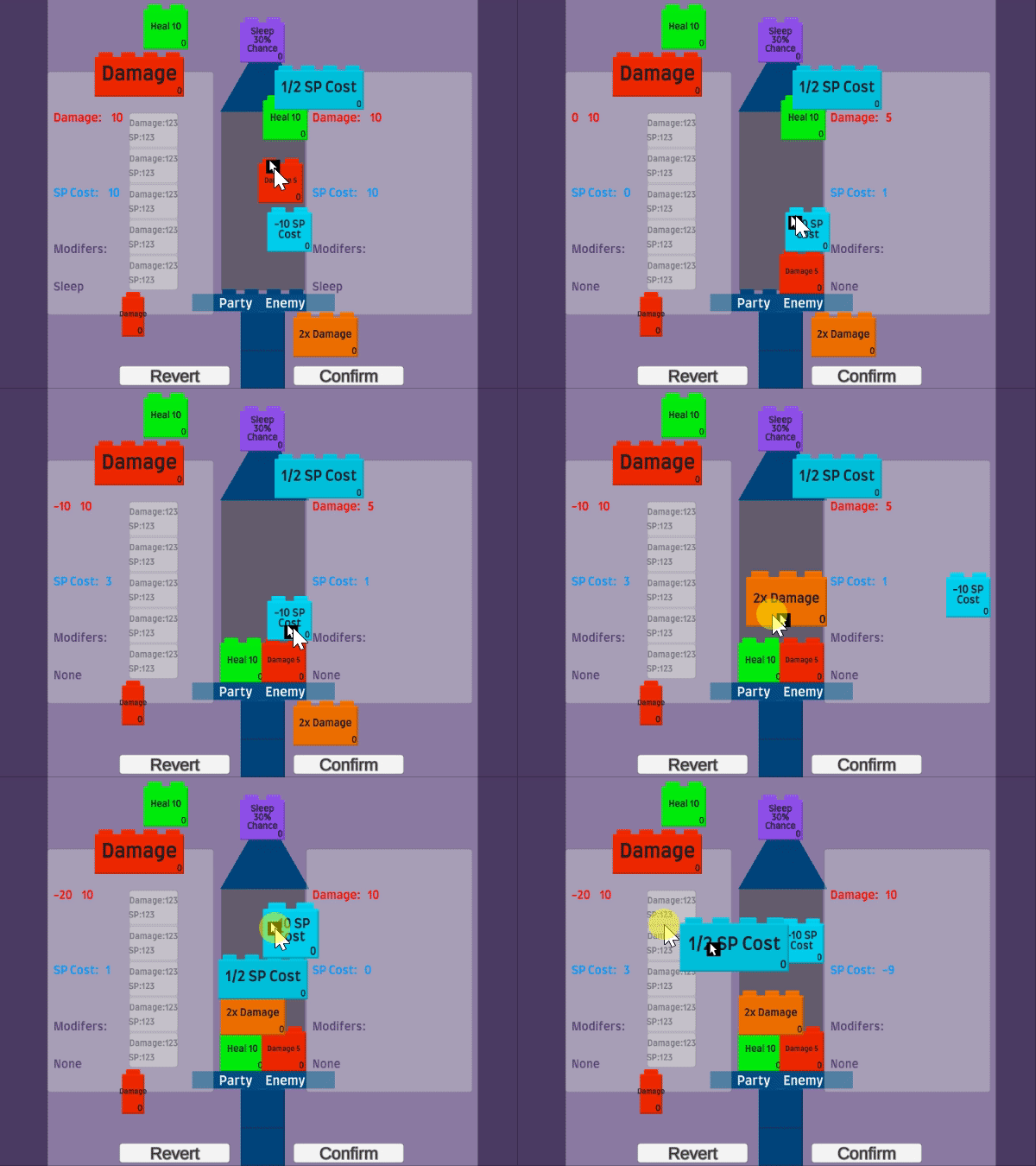
I ended up ditching the “stats per row” idea and consolidated the move’s stats to the left 3rd of the screen. Since I’d like a similar panel to show up when hovering over the move in combat, I figured this would help bridge the gap between the two. So less time for a player trying to imagine what it would look like in combat, and more time building it.
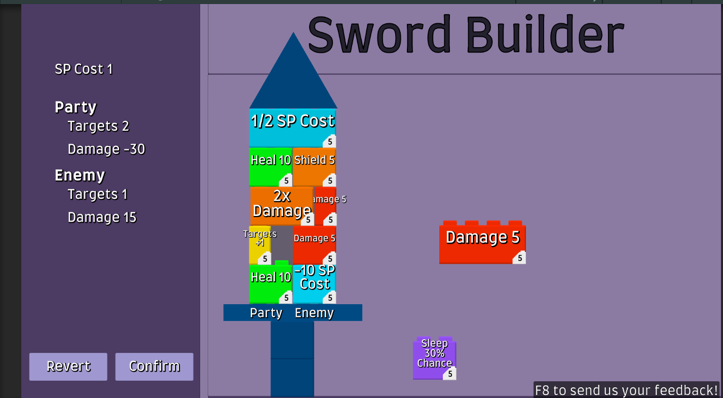
Each block has an associated sp cost, so I started experimenting with showing that. However, this version looks cluttered. Especially with all the block text. I pivoted to icons instead of move names. As for the sp costs, I’d like to be able to hover over a block and have a tiny panel the length of the block showing how much it costs. But I’ll do that later.
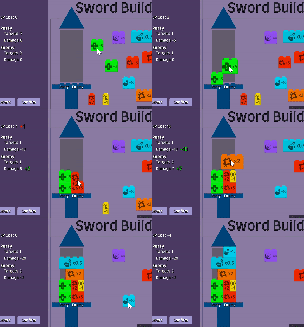
I began working on contextually showing the fields if their values weren’t equal to zero (if damage is 0, don’t show it at all). I didn’t finish it in time for Devtober, but I do like where it’s heading.
Move Calculations
A bit later in the month, I worked on calculating the skill based on block placement. They actually were much easier to do than the GUI (thankfully). Each block overrides an abstract class called ABrick (I've been calling the blocks bricks in programming). This class has an sp cost and an abstract method with a signature
public SkillMove ApplyModification(SkillMove skillMove)
The move being calculated is passed in, gets modified in whichever the class pleases, and is returned. Every block inherits this class allowing for a chain of modifications. Since the brick grid is set up as a 2D List, it's just a matter of iterating through it. The party and enemy skillMoves are split down the middle, so it goes through the first half, then the second half.
The code's super clean and adding a new block type is as simple as inheriting the ABrick class and overriding the ApplyModification method.
While moves that have multiple actions are interesting, they did cause a lot of refactoring work. The "move" was initially programmed as having a single action. But having multiple actions affected move saving/loading, target selection/deselection for both the AI and Player. The interesting (well, interesting to me) part of this was how some of the older code was easily adapted.
Moves are played out in combat by first selecting 1 or more targets from a pool of characters (enemies, party, all), then performing the move's animation for their target. The current implementation is a tween using a custom animation curve and an animation key (or timestamp) used as a callback of when to trigger the collision on the targeted characters. Then using an OnComplete call to trigger the next turn in combat.
What makes this easy, is that it can iterate through a list of moves, feeding each move's targeting group for selection, then chaining each callback to the next move. Then the final move calls the next turn method. So for that piece, to make a move with multiple "moves", all I had to do was add a couple for loops.

Google Sheets
I nabbed a Unity Asset from Humble Bundle called Databox. Databox provides a framework for saving and loading game data. My favorite feature is its integration with Google Sheets to pull data directly from it. Being an RPG with stats and leveling, I wanted to visualize this data as much as I can, so offloading my table data to sheets was a goal of mine.
My pipedream is to be able to predict a player's level range based on the number required and optional enemy encounters so I can tune early game stats/XP/level curves without being unaware of late-game snowball effects. Of course, it won't be a total replacement for good ol' manual testing, but it's certainly a start.
As for Devtober, I created a sheet of moves with damage, target count, and sp cost fields.

I also made two sheets assigning the moves to different characters. One for the party members, and one for the enemies. The enemies also got a percentage chance of using each move. Down the line, I'd like to work on stronger enemy decision-making, but this is a great start. Then I created an editor script to pull the data and set the character prefab's moves from a <string, ScriptableObject> dictionary of moves.

Ultimately, I think I spent too much time trying to create a catch-all table of data. Maybe it will be a huge help down the line, but there are certainly tradeoffs from it. It forced me to solidify fields so prototyping different combat mechanics may be difficult down the line if they don’t fit this table skeleton. However, doing this later in the process could have slowed down development to a grinding halt. Only time will tell on this one.
What Went Wrong
Ok, I got a free New World key and played the heck out of it at launch. Other than that, everything I worked on went pretty smoothly. My Devtober goals were to complete the full skill creation loop, load game data from Google Sheets, add battle status effects, and finish 3 boss fights. I got the first two done, and began the work of designing status effects, but fell into an interesting rabbit hole of how to make turn-based combat engaging. Check out this article on randomness in turn-based combat. Oh and this great video on team role archetypes in combat. Super interesting and inspiring!
What I Learned
Say no to MMO’s. Also, UI for a unique system requires lots of iteration since there isn’t a commonly used framework. I’m certainly not done with it yet. But it also means there are some cool possibilities to explore. I’m sure I’ll learn more about how my decisions this month will affect the project down line later.
If you’d like to support us, the best way to help us out is by Wishlisting Racecar Bed on Steam
Dang! Around level 28 the difficulty really kicks into high gear. I really love how the combination of paths and numbers gets the player to think outside the box. Great visuals and music as well. I enjoyed what I've played so far and will deff be coming back for more!
Congrats on the successful steam and mobile releases! Keep up the amazing work!
-Sasha
Thanks for playing and the feedback! We skipped putting in credits for time purposes, but it for sure feels weird without them.
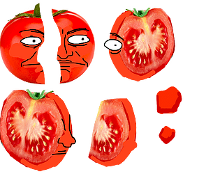
Super Sexy Bob shows up in his full tomato form in this game
https://scoot-o-speed-studios.itch.io/vegeteble-storeiz
Thanks again!
- Josh
Really tough, but lots of fun! I replayed it after seeing the comment about adding lives and there is so much more to this game than I thought! I finally found how the theme ties in. All the music was great. Story was hilarious!
Gameplay was fun! The parallax backgrounds with floors and ceilings were awesome. The difficulty was really high. I think some selection of powerups, smaller hitboxes, slower enemy projectiles, faster player movement would help ease up on it.
I recommend putting the "Shift+] to get extra lives" on the game's description so more people can see the full game.
- Josh
Hiiii!!!
First off, congrats on getting such an intricate, well thought out story/game finished so shortly after working crazy hard on SuNoFes! You're a writing MASTER!
Josh and I played and discussed this game on stream... but unfortunately it seems the VOD didn't save :( :( But rest assured, we found it quite enjoyable! We enjoyed bringing the different characters to life. At one point, Josh gave Rusty a very old man voice. When we realized he was young like Ruby, I said "Well I guess puberty hit him like a tractor." xD xD xD
Anyway, on the note of characters... you did an amazing job making each character feel genuine and unique. Despite the characters only recieving a description and what they're selling, they each had such a unique voice! You also really nailed the small town, rustic atmosphere in the game, creating a sense of nostalgia even for those who never expierenced anything like it!
We also thought it was really neat how there's timers you can control, like exhaustion / sunburn, but also timers that can't be controlled like time till the market closes.
However, it would be nice if there was some kind of physical consequence for reaching the peak sunburn. Like having to stop the game early to find shade? The buildup from normal to pink to red to crimson was great! But once we hit crimson and nothing else came of it, it felt kinda confusing as to why we were worried about it.
Also, while I TOTALLY understand you were short on time for the jam, if you were to do more with this game, I think the game would benefit a lot from some visuals. Even if they're really small, clip-art esque things on the sides or top of the screen, just something to help the readers keep track of what they learned and keep them engaged. Just because, as beautiful and consicse as your writing is, it's still a bit easy to get lost in that amount of detail oriented text :) Maybe just little things, like a map of veggie stands, or a clock with the time till the market closes, or like a sunburn meter or something. I bet it would take the game to a whole new level.
Finally, we weren't 100 percent sure if the courthouse serves a purpose in the game. We thought it did? Like to accuse the culprit, but going over there didn't seem to have an option to accomplish that. That being said, we didn't solve the mystery, so that's probably why. If it IS possible to use the courthouse later, a clue might be nice like "I can't make a case till I have evidence." ... If it isn't possible, mayhaps it could be! We were hoping it'd be open so we could accuse Gordon Ramsay
Once again, great job on creating a game with such a homey feel just through the power of words. Regardless of whether or not you decide to do more with this game, can't wait to see what's in the future! (and the past! I'll be getting around to your SuNoFes game soon! :D )
-Sasha
Nice work with this game! I enjoyed the noir aesthetic, and the inventory was well designed. I wasn't quite sure I was on board with what the truth about the wine revealed.... but MAN did that twist ending change my mind xD xD Consider me intrigued.
I will say, I do agree with Kaa Snake that some clicking points are unclear, especially with moving from one location to the other, or with which places can and can't be used with the inventory. In the future it might be nice to have a bit more of a fine tuned click area or some sort of clearer indicator for that. Aside from that, I really enjoyed the mechanics, especially the ability to use stuff from the inventory both on the scenes and with other inventory objects!
Storywise, a lot of good stuff too! Really good detective dialog and building the mystery suspense! However, something that bumped me a bit was the thing about the very red wine.
Spoilers ahead for anyone who hasn't played.
So right now, there's three types of "red". Tomato, Wine, and blood. While I get what you guys are going for with that (plus the Jam theme :P ) right now, it doesn't seem like these three red "clues" are fitting together properly. Having these three variables jammed in kinda took my brain on a journey like "ok it's a tomato incident! Oh wait it's wine. Tomato wine? No tomato password. WAIT BLOOD? but a tomato incident?!" you know... the kind of train of thought that leaves the player wondering whether or not they understood everything right, as opposed to following the story clearly.
If you were to do more with this game, I'd suggest narrowing these three red factors down to two. Perhaps keep it at wine and blood. Like just that the wine is the "extra red chardonay" but in truth it BLOOD. Or... maybe it could be tomato and blood. What if at the resteraunt's basement... they serve spaghetti with EXTRA RED TOMATO SAUCE! I feel like one of these two will make that part of the story a lot easier to follow, and punch a lil harder.
Hope that helps you! Keep up the good work!
-Sasha
My pleasure!! I'm glad these notes help (and it's really great that you were already aware and working on some of them, like the dice rolling sound!) Also clever possibility with having the player choose between controlling all three girls or just one!
I'm sure this game's next update will take it to a whole other level! Can't wait to check it out and see how it all turns out!
If you have time, would you like to check out our SuNoFes game as well? I'd love to hear your thoughts on it! :)
-Sasha
Hey guys! Really liking what I'm seeing so far, but it seems I've hit a wall with progression. Is there a way to progress once Detective Quin gets down into the basement? I've assembled the phonograph but can't put seem to find a place for it. I figured it might be the waiters cart since there's a lot of space there... but that wasn't it.
Is there something I'm missing? Let me know! I'd like to finish it all the way through before giving a jam rating :D Besides, I must figure out why the wine is so red!! :P Might it have something to do with LE TOMATO INCIDENT??
-Sasha
Thank you so, SO much for playing and for the kind words! You're absolutely right in your guess that we enjoyed ourselves making this. It was a ton of fun! The meta parts were by FAR my favorite part to write. I was like... ok, 4th wall.exe no longer found! xD And I'm glad you enjoyed our veggie shennanigans and their respective dialogs!
If you don't mind sharing, what was one of the parts that made you laugh out loud? :D :D :D
- Sasha
Absolute HANDS DOWN 5 star rating in the enjoyment category from me. I just had to play through several times to click all the choices and get all the endings.
I absolutely adore this game's dry, meta humor, and how the game really taps into it's weirdness and just OWNS it. Yes, of course there's more I wish I could have seen, and learned about this bizarre world of tomatoness... but that's ok becasue not only was the lack of certian features (like smashing the doors) brilliantly called out with the 4th wall breaks, but also the amount of clever little things that you COULD do were just glorious.
Without spoiling this for the other players, (anyone reading, think of this as a list of things you MUST TRY), some of the things that actually made me SNORT with unexpected laughter were:
Using the Mallet on the TV
Using the Mallet on Tomato-Chan
NOT using the Mallet on Tomato-Chan
Not eating the tomato.
Seriously, the programmed reaction to these things is just brilliant.
All around great job. And really polished too, considering the jam length and the game's incomplete nature. The only two small improvements I'd suggest are just on the technical side.
1) Given the "gotta try everything to find secrets" appeal of the game, it might be nice if a tool could be used several times in a row without reselecting it. So like Use -> Mallet , Use Mallet on -> (list of things, including "use different tool" or "back" ). Or maybe even like "attempt to destroy something else, you agressive psycho?" to really tap into the meta nature xD
2) The way the music loop started over every time a choice was made got a little distracting over time. It might be nice if the music played continuosly over a scene instead of being linked to choices.
But those are just two tiny tecnicalities in the face of absolute tomato genius. Regardless of whether or not you do more with this game, I can't wait to see what other things you create.
Keep up the good work!
-Sasha
Heyya!
First off, congratulations on completing your first jam! A visual novel is no easy feat, especially in such a short time. Everything looks really polished and runs smoothly. And you worked solo on this right? The fact that you got a full visual novel done on your own for the very first time is amazing! You should be very proud of yourself :)
I thought the concept was really cute too! Three girls playing a DnD like for the first time is a fun idea for a slice of life game. I also liked the dice rolling thing and how the actual game play felt like they were in the world. So good job there!
The only thing I'm not too sure about is the idea of the player controlling the actions of all three girls. There were a lot of times where that got pretty repetitive and had me skimming through the text. Especially at parts where all three girls made a decision back to back, like choosing the style/wisdom/magic points or buying things at the store.
If you decide to develop this game further... I wonder if it would work better if the player got to take control of just one girl? Maybe they could even play AS her... getting to name her and stuff. That could also help the player get even more immersed in the story, since the characters would talk directly to the player instead of just each other!
Also, this game could really really use some sound design. It doesn't have to be anything too fancy either! Maybe just some background music (whether from a composer, or royalty free stuff online!), and a few sounds like dice rolling could take the game to a whole new level!
Hopefully these notes are helpful! Congrats again on your first jam! :)
Keep up the good work!
-Sasha
Of course! <3
and hey, anything is possible with visual novels. You're the writer, you get to write it your way! Especially through beautiful poetry! :)
I actually looovvveee poetry too, especially for the rhymes and rhyme scheme. I even snuck some of that into our game xD If you have time to give it a try... I'd love your feedback as well! :D
-Sasha
Absolutely beautiful. I'd call this something even beyond a visual novel... it's a visual poem. A soliloquy brought to life.
What's really interesting about this to me is just how seeing the character and the stars in the background really brought the cryptic words of love to life and really added an emotion to them. I admit, if I were to read the text of this soliloquy on its own without the visuals, I might have gotten a bit lost in the more cryptic parts. But having it broken down line by line while so perfectly setting the mood through the music and art... makes the reader feel one with the character.
Just absolutely brilliant. Yes, it's short, but that's the way it needs to be. Because that's the way poetry is. Short-lived, like a moonlit flower dancing only while the darkness comfortably cloaks it from the busyness of day. (that came out of nowhere, haha. Still in a poetic mood after that expiereince! xD)
In a day and age of fast paced tech and stuff where poetry is kinda being seen as like a dated thing... stuff like this could totally bring it back in a whole new way, with just as much beauty and a whole new level of understanding. Please keep doing what you're doing! I can't wait to see what other poetic emotions you bring to life next.
Really, really good stuff. Amazing work.
-Sasha
This was a lovely character piece! Though it felt a little slow at times, overall you definitely kept my interst with details in the dialog. The story had a very grounded, real feeling to it too... I especially liked when Max tried to get Lyra into animal crossing.
Also, I found it really interesting how Max and Lyra are both lonely and struggling with their passions/professions, but express it in such different ways. They truly are perfect for each other and have wonderful chemistry <3
The only small thing I'd suggest is to be on the lookout for Max describing someting about Lyra using the specific phrases "cute or "heart a flutter" . I noticed this was repeated quite a few times throughout, to the point where it started to feel repetitive and flat. Max is extremely observant from what I encountered, so I'm sure she'd pick up on more details about Lyra than just her overall "cuteness" :) I'm sure swapping out the cute descriptive with some specific details that Max notices in each of these encounters will bring the story and relationship to a whole new level.
Really well done with this project! Keep up the good work!
-Sasha
Okay... can I just say that I'm absolutely IN LOVE with your art style. It has such a unique, storybook charm to it. The character design is also fantastic. I love how unique everyone looks. The music's lovely as well... and the finished backgrounds are stunning!
Now onto the story! Sooo yeah! I deffs enjoyed it. I dig the whole "kids as we know them but in a midieval setting" vibe. I really really like Derin's character. Not just her determination and her being so ready to defy this world's stereotypes, but she's got a GREAT voice. My favorite line was when she was telling her mom about the fight with Narcisa and said the same line twice but one was bolded xD I can't remember the specific wording anymore but I loved that. Also the sympathy for the green beans thing was great.
Also bringing in the mysterious girl was a great way to stir up the tension. You deffs ended the whole thing on a great cliff hanger! I'm for sure eager to learn more and will definitely continue reading as more updates come out!
That being said, there were a few things that bumped me a little here and there.
First off, at the beginning with the chicken chase... it's a great scene to start with! But I'm not so sure about giving the chicken a human girl's name like Henrietta. Given it's such a chaotic scene where we're being introduced to three female characters at once and they're all like calling each other's names, it's really difficult to track everyone there... which is very risky at the beginning of a visual novel, because that can turn people off.
Three simple ways you could make this opener easier on the reader:
1) Have dialog boxes labeled with names so we know who's talking right away.
2) Change the chicken's name to something less human like Sir Cluckster. Or maybe it's a male chicken like Fredrick!
or
3) Have a character make it clear VERY early in the scene that Henrietta is a chicken, by having a character call attention to the potential confusion, like having someone say "Who names a chicken HENRIETTA" and then Lettie says "She's like my daughter!" or something of the like.
Second thing that bumped me a bit: I wasn't really able to figure out how old Lettie is. Sometimes she gave like an 8-9 year old vibe, like talking about the scene with fighting Mary and the "kids at school" and other times she seemed much older, like 14-15, talking about marriage, or saying "my dear Henrietta." I recommend doing a read through on her dialog and watching for lines like these to make her voice a little more consistent :)
Third, during the encounter with Narcisa and her brother, as beautiful as the art and animations were, I thought it was a bit over-animated. Having it swipe fade between the two arguing parties was a little too time consuming. Might be better to have all the characters on one screen there? And also the animation of Narcisa and her brother rotating to switch places felt unnecessary most of the time. With the exception of the "OHOHOHOHO" part (love that btw), because there the rotation means they're laughing in her face :P . Everywhere else, I think you can do without it.
Finally, there were a few times where exposition elements felt like they were repeated too many times. Examples are the mention of the hunt, the code of honor, becoming a Banner Knight, and the academy. I do understand that the reason for the repetition is becasue Darin has to explain certian things to different people, and that saying she'll be a Banner Knight a lot is part of her character, but even then it still felt like a bit much. If possible, see if you can go through these exposition elements and see if any repeated stuff can be condensed just a tad. I think it'll perfect the pacing and add a whole new level of immersion to your story! :)
Of course though, all of these are tiny little things to make this already great story even better!!
Congratulations on such a well done first chapter. Keep up the good work. I can't wait to see what's in store.
Good luck in future development!
-Sasha
This was a fun concept! I liked the strategy with the brother and sister's moves changing each other's patterns and the accidental risk factor of one killing the other.
Though I will say, unfortunately, I was't quite able to figure out what the specific strategy was behind determining whether or not one siblings attack would be horizontal or vertical, or if there was a way to pre-determine that. Still, I had a lot of fun with trial and error!
Also great job with the music Major Bruno! Very upbeat and suits the youthful intensity very well!
- Sasha
Many, many cars were harmed in the playing of this game xD
For real though, I'm so happy this came up in our feed because this game was just delightful. Creative concept, great difficulty curve, and smooth gameplay!
It did get a little frustrating a few times when I made it to the end but just slightly missed the goal diamond and had to drive off the cliff instead. Perhaps it would be a bit smoother if the final diamond was a finish line instead, covering the entire ending? However, It totally would make sense that the single diamond is just there to add to the challenge. In that case, maybe an easy mode that turns the diamond into a finish line! (perhaps it could be called winner mode! or cheater mode :P )
Also I agree with other commenters that a "next level" button would be nice!
Congrats on a fun, well executed game! Keep up the good work!
-Sasha
Glitch!
Sorry to be getting to this so late after the jam, but I'm glad I finally got around to it.
Such a lovely demo. Short but very (bitter)sweet. As usual, you really nailed the visual and audio aesthetic. The art style is beautiful, sound design is fantastic, and I really liked how you used the fade effect to add a bit more animation to the scene, especially when the protagonist decides to give Meadow food.
just, all around great job, especially in such a short jam time!
Now, storywise, I was defintely left with more questions than answers, even after the true ending. I COMPLETELY understand this is a demo though and you probably intend on expanding the story, or at least planned on it :)
If you do go back to expanding the story, I think what I'd like to see the most is to learn more about the protagonist... how did he find Meadow? What brought him to understand her on such a deep level? Was it personal expiernence? And what led him to write that poem?
Also it would be kind of neat if some of the vague choices like "Allow Meadow to trust you" could be elaborated on or even expanded into several more choices. Like how does the protagonist get Meadow to trust him?
But of course all of these are just things I wish I could have known about in an already very touching and bittersweet concept.
Eager to see where this goes if you develop it more! And if not, that's ok too! Even as a demo, it's a beautiful accomplishment!
-Sasha
Umbrella mechanic and centering it around staying dry is a neat idea! It’s rare when rain is used for something other than a visual aesthetic. Pointing the umbrella was a bit finicky for me, but it didn’t ruin my enjoyment or the novelty of it. Lol the Springwater Waterbeds made me chuckle.
Great music and sound design! I liked the story, it has a nice Night in the Woods feel/structure to it.
- Josh
Nice backgrounds and story as usual! The gameplay reminds me a lot of NES/SNES platformers from back in the day. Lots of fun! I would have liked having more control over the jump height, but with the levels it still worked out alright.
The lizard didn’t seem to have a damage indicator so I had trouble knowing if I was actually hurting it
- Josh
Nice game! Very interesting and engaging gameplay! I like how it’s semi-puzzle, semi-rouge-like. Great dialog sounds. I like how it kinda goes along with the music! But did get a little repetitive after each room.
There was one point where I got stuck after opening a chest. Couldn’t select any tiles or items.
Other than that, great work!
- Josh


