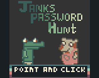
Love the style! And the overall look and feel it's amazing, even the music choice was on point! as other suggested, the font was not so simple to read, but overall really great job!!
Play Janks Password Hunt
Janks Password Hunt's itch.io pageJudge feedback
Judge feedback is anonymous.
- I love the art actually! I found the opening text a little difficult to read, but the rest of the game was very visually cohesive with the given color palette. The controls were a bit frustrating because you had to pick the action before clicking, and I think it could have been improved on by simply being assigned to different keys -- though, I do think this mechanic can be useful in the right game. I do see the theme of Building Connections, though I wouldn't say it's a strong motif. The game ran pretty well for me, and I thought it was fun. Great work!
Comments
Enjoyed the art a lot, the dialogue and the characters! The text was pretty difficult for me to read and I couldn't finish the game. However, this is coming from someone who isn't good at puzzles in general. Good job!
Wow, The art for this game was phenomenal. Very funny interactions! My only issue is how much my hand hurts from all the clicking XD. It would be a fun score system where you can see how many times you've clicked on the game and the lower the score the better. But the real fun would be in watching the high numbers of how many times a person clicked!
Really nice graphics, sounds and funny dialogues!
The only issue for me were some words I couldn't read properly because of the font.
That being said, well done! Super impressive!
yeh, that's an issue with low pixel games. because my main sprites are so small, in order for the text to not be half of the screen it also needs to be small. The font is only 5px X 5px which is craaazy. There might be a way to use a different canvas layer for a bigger font but ui elements and canvas layers aren't my strongest suit.
Thank you for your nice comment though. It will always be great to hear that my efforts were appreciated, especially when I worked as hard as I did on this project.
thanks, my love of pixel art point and click comes from the old DOS monkey island games of my childhood. And the animal characters was because I saw the colour pallette a week before the jam started and it screamed, crocodile protagonist at me. I haven't played either of those games before but night in the woods looks pretty good so I might check it out when a steam sale rolls round.
Love it! Super impressive use of the color palette and a fun little point and click adventure!
The writing is really witty ("I thought it was a jar" made me laugh a lot lol) and all in all it was a fun experience!
My only nitpick would be to make which beer bottle is a pick-up in your room to be a little bit more different from the others, since all the beer bottles look so similar! (Maybe since it's a little rancid, make it a little dirtier?)
Other than that, I had a lovely experience! (freaking Carl man, you can't just change my password and then let a seagull just-)
-N
Thats good feedback. Truth be told, the not knowing which bottle was a way of artificially lengthening gameplay in a short story game. It's not big, it's not clever and I'm sorry I did it. i essentially held you hostage for an extra 30 seconds. :-p
Really though, I probably will change it if I go back in to give the game a little polish and update after the judging is over.
Really enjoying how everything's working together so far! The narrative and visuals are fun and humorous
Thanks.I put a lot of effort into play-testing as i went to make sure the game worked the whole way through and it ended up being an actual complete-able game. Its tough as a solo beginner to make something complete and workable in under a week. But I would like to think i did it. Be sure to let me know if you have any input on the game or things you'd change. I'm sure to go back and at least polish this up a bit once the judging period is over.




Leave a comment
Log in with itch.io to leave a comment.