Play game
Wormhole Escape's itch.io pageResults
| Criteria | Rank | Score* | Raw Score |
| People's Choice | #6 | 3.556 | 3.556 |
| Judge's Choice | #7 | n/a | n/a |
Ranked from 9 ratings. Score is adjusted from raw score by the median number of ratings per game in the jam.
Judge feedback
Judge feedback is anonymous and shown in a random order.
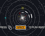
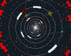
- This adhered to the one button once you get past the menu, but you can regularly lose if you step away due to the red stars that kill you. I like the nice retro look, and the soundtrack works well with it. The gameplay, however, does require precise timing in many situations to avoid the red stars, and especially since it's not entirely clear when the player will go clockwise or counter-clockwise when they descend to a new ring. Also, I saw ships suddenly fly onto the outskirts of the screen at one point which cause me to die because I didn't react fast enough.
- Great game! Really embraces the spirit of the jam! Wished it started at an easier level though for noobs like me :)
- I love the concept and how you have responded to suggestions for improvement. Its turned into a really neat game.
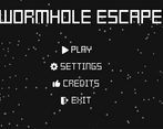
- There's some really good thought, and coding that has gone into this game. For me, it seems to need a little more tweaking of small elements to make it feel "right". That's not easy to quantify, I realise. There's something a little dizzying, eye-straining, and jarring about some of the visuals and audio. The similarity between red black holes, and yellow stars with the constant pulsing (including the pulsating at the centre), and your ship not really standing out, make tracking what's going on hard going for me. That's with the starfield off. Some of the sound effects are harsh, and the music (that's on by deafult from the off), I don't like. I feel I'd prefer a more relaxed, ambient backing sound track, and gentler SFX, and for it being easier to track what's going on. Maybe a little jukebox option, and softer SFX would improve things there. It seems like small things to tweak, to make this a far more enjoyable experience. A few other issues - you can't use SPACE bar to get past the front end menu. The slowest speed on the slider says "FASTEST". Master sound volume seems redundant (when you have music/sfx). I really like the use of icons/symbols alongside most text. Not enough games do that. It's great that there are options to reduce the intensity of the audio visuals (although for me, not enough).
Leave a comment
Log in with itch.io to leave a comment.


Comments
This game has a cool game play experience. I would suggest having a speed option in the menu, so you can choose how quick you have to be to react, as the game moves quite quickly.
Thanks for the feedback! Glad you enjoyed it.
But there is one, right in the settings. It should be the last slider.
Game on!
vid review
Thanks for the review!
Indeed, i should either introduce a small tutorial or a short explanation the first time a players starts the game.
Game on!
Nice job on this game! Really like the game music.
nice concept! :)
I like this! Had trouble with the pickups before; it's very busy and takes some getting used to. Very good though, pings my Tempest 2000 zen thing man.
Glad you liked it!
Very nice! If you have a chance, some improvements for accessibility for you to consider, for when you have time:
1. Reducing distractions: Option to turn off the starfield (or dim it right down). Makes me a bit dizzy, but some will really like it. Some people may find it a distraction too.
2. Option to make your star-ship far more prominent. Maybe a bolder outline, or make it pulsate colours a few times at the start, or some sort of highlighter. For people with tracking issues, as it is, may be a problem. It took me a while to work out what I was supposed to be tracking. Some will constantly find it hard as it is.
3. Speed option. It's still too fast for some players. Perfect for some too.
4. Sound FX. Can really help someone. I like that it's sparse now, but some sounds would be really help people with tracking issues, comprehension issues, sight issues and so on.
5. Menu option. I love the purity of your start, play, restart. But menu options can still be extremely important... even if those menu options are only available via a cog that can be click on by a mouse... (or one-time set-up at the start). It's worth knowing that some switch users can use mouse emulation... and some would be purely reliant upon a helper anyway to sort that out.
Anyway, good luck, and well done.
Thank you for you feedback!
I completly agree with each suggestion. This would really improve the game. For this reason i focused on releasing an update as fast as i could (5 min ago to be more precise) with all the changes suggested.
Thank you for your interest and kind words!
Great improvements there, KennyTheBard, some last thoughts from me....
Sliders: I like that you can click anywhere on the sliders, and it jumps to that %. For a switch user with a mouse emulator, this is good I would suggest making the bars a bit wider and the sliders bolder and brighter, to make the target area clearer and easier to drag.
Text: Not everyone can read text, and some will struggle with the font (although I personally like it). I'd suggest (if you have time) reducing the text and using a symbol with it for anyone unable to read English. Will make the game more international, and more accessible in general.
"STAR BRIGHTNESS" with a symbol for the sun (a common TV brightness symbol).
"GAME SPEED" with a symbol for a tortoise at the left side of the slider, and a hare the right side. Or a running figure. Or something better. I would recommend that your slowest speed, is a quite a bit slower than it currently is. For some switch users, there's no such thing as too easy.
"MUSIC VOLUME" with a symbol for a musical note. Maybe just ON/OFF if easier. Strongly recommend being able to turn off music.
"SFX VOLUME" with a symbol for loud-speaker, or something better.
Sound: Being able to soften (or completely turn off) music, whilst having SFX that are not overwhelming, but clearly tied to you pressing your switch, and the events on screen can have big benefits. Some Autistic people can find constant music overwhelming. Some switch users, and visually impaired users can find it confusing to not be able to work out what is happening, or even if they've pressed their switch and it's been detected.
Anyway, great work, and brilliant that updates can be made so seemingly painlessly.
Thank you again for your feedback. It's great to have a clear direction to work towards and all of your suggestions have been really insightfull!
Without any intention to spam you, I just uploaded a new version of the game, adding the proposed improvements and more (credits, to be more precise). While i feel the game is in a really good place from the playability point of view, it feels far from finished for me. I have a few new things i intend to add in the near future, but before that i would like to ask you how the obstacles and collectables feel like. Are the golden coins suggestive enough as bonus points sources? Are the red bombs suggestive enough as bad things that should be avoided? For the white walls i already have a few ideas to make them even more suggestive (maybe some spikes), but suggestions are always welcomed.
Thank you!
Some nice work there. A few more thoughts.
1. SPACE BAR and LEFT-CLICK: It would be better for anyone using a mouse (or mouse emulator) if you could use LEFT-CLICK to play. It would be more intuitive for such users. I do like that once the game has started, it's easy to RESTART and play again. That should be the same for Space BAR, and Left-click use. You shouldn't have to move the pointer to do that.
2. Front end MENU is all text: Same problem as before for people who cannot read English. Possible solutions: PLAY symbol could be a triangle on its side pointing to the right. SETTINGS a COG or spanner. EXIT a European door exit sign symbol. CREDITS perhaps a question mark, or something better.
3. ESCAPE KEY. Requiring this key forces a switch user to either have access to an On Screen Keyboard (normally using a mouse-emulator to click on it), or a helper. Might be an idea to also have a back-arrow symbol to get back to the front menu screen. Additionally, ESCAPE does not seem to work at the GAME OVER screen, which is confusing.
4. FULL-SCREEN. Once you enter this, how can you exit it, if you don't have access to the ESCAPE key?
5. MASTER VOLUME. This is redundant as you have sliders for SFX and MUSIC. I'd recommend defaulting to 50% as it's too loud in competition with the SFX in my opinion.
6. SFX. In game, when you press SPACE BAR (and hopefully soon left-click), I'd recommend it plays a sound effect. This will help users realise that what they've done has taken effect, alongside the visuals.
7. Making sense of the game. I think that the stars are good, and black holes are bad, becomes clear quickly in the game. I would say that the dark holes are not that easy to see, if your eye sight is not brilliant. Maybe a HIGH-CONTRAST option might be an idea?
8. Improving the gameplay further. Maybe a audio-visual reward for certain targets. 10, 20, 30, 40 big one for 50 and so on?
9. SPEED. If possible, I'd suggest 5 divisions, with SLOWEST being even slower than the one you have.
Best wishes,
Barrie
OneSwitch.org.uk
Hello again, Barrie!
If you are willing to give it another try, i think you would be pleasantly surprised! I added lots of improvements and fixes for a better experience. Also i added a swarm of attackers that will force the player to be on the move. I plan to make this feature optional in the future, but for now i would love to hear your impression on it.
Thank you for all the feedback you have provided this the last week!
Your help is greatly appreciated,
Kenny
Excellent improvements.
I like the swarm of attackers. Good idea. Making that optional a very good idea for players unable to deal with the pressure. On that front...
...to really bump up the accessibility of the game for users with very slow reactions, you might want to also add a difficulty slider for the black-hole frequency, from none to what you have now.
High-contrast mode a nice option (maybe use the TV contrast symbol for that. I would suggest that your space ship should be more prominent in high-contrast. If I blur my eyes, I find it hard to work out where my craft is.
Still think it would be good to have a sound effect for when you press SPACE BAR/Left-click. Even if just a gentle blip. Helps understanding.
I still think the master volume is unnecessary clutter.
Nice!