Play Smash Demake
Smash Bros.'s itch.io pageResults
| Criteria | Rank | Score* | Raw Score |
| Technical | #14 | 4.073 | 4.073 |
| Overall | #19 | 4.122 | 4.122 |
| Concept | #22 | 4.146 | 4.146 |
| Visual | #29 | 4.146 | 4.146 |
Ranked from 41 ratings. Score is adjusted from raw score by the median number of ratings per game in the jam.
Limitation
Yes
Leave a comment
Log in with itch.io to leave a comment.


Comments
My two Melee favourites. <3
Looks really neat (sadly, I'm not familiar with the orig game)
But well done for doing it within the restrictions also.
Nice one! 😀👍
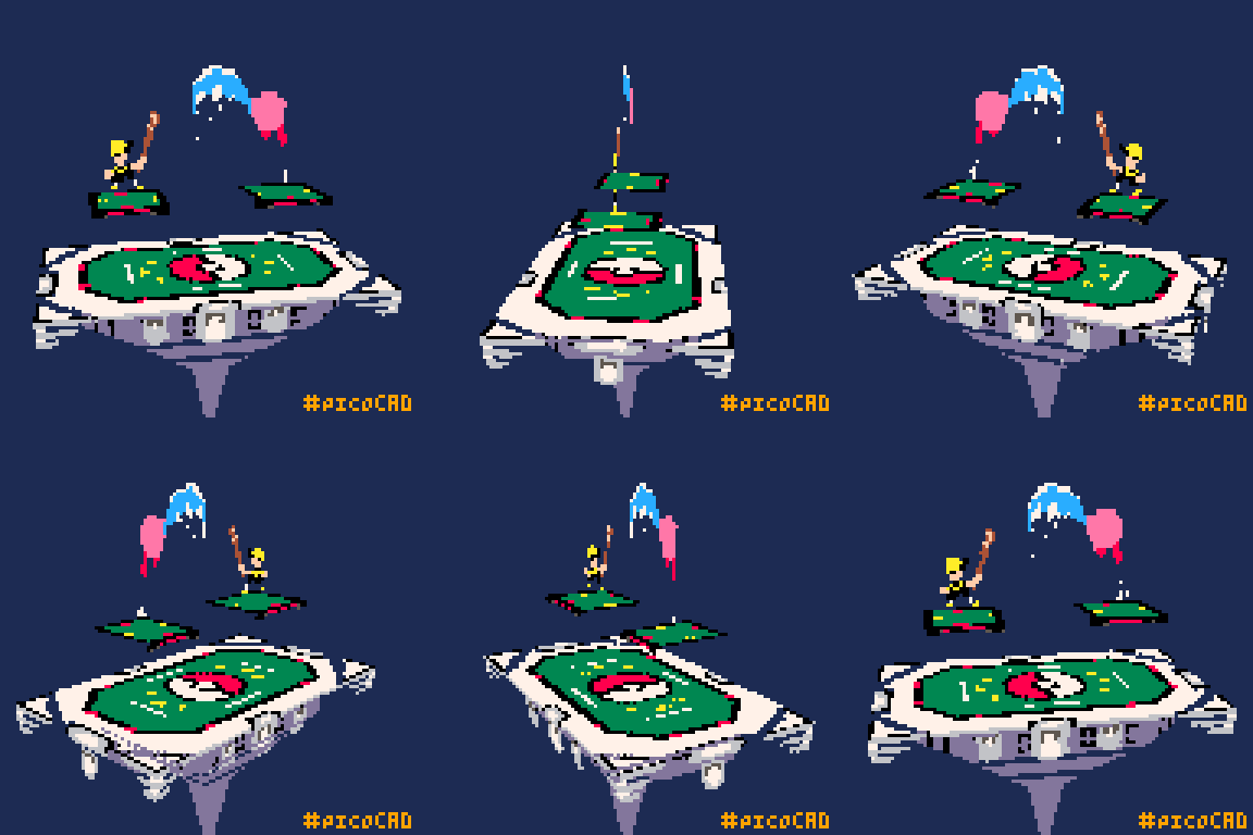
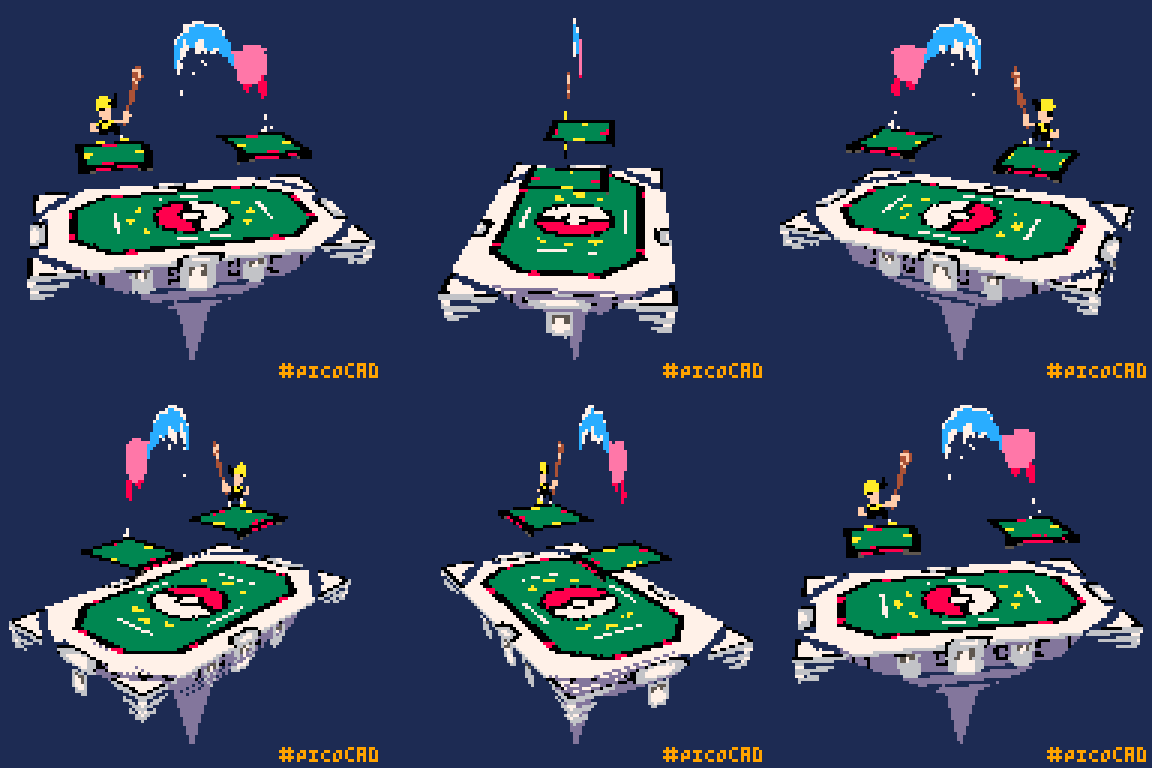
Sometimes I miss Melee :,) This is so well-polished. I love it. Very interesting that the top surface uses two separate textures. Does that reduce wobble?
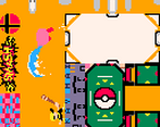
[edit] I love that you made room for the Smash logo and loss.jpg in your texture, too XD
Genuinely happy you saw that easter egg.
You know... tbh I'm not 100% sure it does reduce wobble. I think to an extent for the limitation it did.
By making the octo mesh first it allowed me to tackled wobble first and then not worry about it while designing the rest of it.
I had to make the octo mesh particularly large so I could reduce wobble of course, but the more I look at what I did the more I think I could have just combined the two.
BUT it allowed me to adjust the alphas on the square edges rather freely and I think that saved me a lot of headache as well.
I think I'm going to revisit this project but without the limitations.
There's so many... so many things I could do to reduce the texture size and more things that I want to add.
I was also mildly surprised one of the fighters wasn't Mr Game & Watch, but I guess if everybody's gonna be flat, might as well not limit yourself to him.
[edit] I also have a wasted primitive in mine, so I get it. I go back and forth on whether to go back and change it; sometimes a project just has to be done... I look forward to seeing whatever you choose to do with this, though.
Awesome mixture of different concepts. Well done!
Brilliant! The shapes and everything are soo goood, and great use of alphas, this is such a cool, cute, and impressive piece!
No U!
Really that means a lot.
I really like this whole concept and those are some great textures too.
Thank you!
I think I put the most time into the texture work, glad it paid off!
I love this one! great work!
I love the angles and hanging bit on the edge, it looks really cool
Those were my favorite part to make!
lel great work!
That's cute, great idea