Play game
ADAPT's itch.io pageResults
| Criteria | Rank | Score* | Raw Score |
| Theme | #233 | 4.000 | 4.000 |
| Playability | #258 | 4.000 | 4.000 |
| Cleverness | #282 | 4.000 | 4.000 |
| Artistic Style | #970 | 3.000 | 3.000 |
Ranked from 1 rating. Score is adjusted from raw score by the median number of ratings per game in the jam.
Judge feedback
Judge feedback is anonymous.
- I can see where the lighting hindered y'all, but I get the gist of what you were aiming for. I like the "Mario" style power-ups turned into shapeshifting. Not a new concept but executed in a different context. Hopefully refine that lighting, maybe tighten up controls, and see where y'all get!
Did you include your Game Design Document as a Google Drive link?
Yes
Seriously... did you include your Game Design Document?
Yes
Is your game set to Public so we can see it?
Yes
Tell us about your game!
It's a 2D platformer where the protagonist is one of the victims of an evil alchemist who experiments with living creatures, the will to survive of the protagonist snaps him back into reality, in the dungeon he got trapped in, along with all the other shadow experiments, will he be able to escape or is he going deeper into the lair of the beast?
Thanks to the alchemy experiments the protagonist is able to take in the shadow of other animals and shapeshift into them, giving the player the ability to double jump, dash and wall jump, depending on the animal they absorb.
Extra Notes
You move with the arrow keys, space to jump and A to dash.
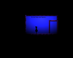
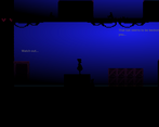
Also, it seems the lightning settings we used inside godot arent that compatible with itch.io cause the game looks darker, my apologies :/
Leave a comment
Log in with itch.io to leave a comment.


Comments
I can see where the lighting issues may have messed up some visuals, but even despite that I think it looks really good. I wasn't able to access the options menu if that was implemented, and I also didn't see any fullscreen option on the page, which made things harder to see (even when zoomed in on the browser). The sounds were good, but the death sound is way too loud, it jumpscared me when I first heard it lol.
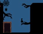
Aside from that the game plays well and looks great, I love the shadow puppet style of it all. I can definitely see this being a full game with different forms and movements concept taken even further.
I love the artstyle! It's got a lot of soul and personality. Reminds me a lot of those old timey shadow puppet theaters. Very well done!
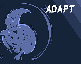
I love your title art sooo good. I think the characters step are bit to wide so doing precise things was very hard. But could be me im not so good at platforming ^^
It's a real bummer you were running into issues with the lighting for the web build of the game. Once the judging period is over you should upload executable builds; I'd love to check it out in the way your team intended for it to be!
That aside I really like the concept with the form changing, I also really like the character art--especially on the title screen. I'm getting a bit of a limbo vibe from the silhouetted art, well done!