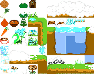
Play Winter Asset Pack
Lhyne & Moorgane - Winter PixelJam 2024's itch.io pageResults
| Criteria | Rank | Score* | Raw Score |
| Theme/Restriction | #13 | 3.714 | 3.714 |
| Consistency | #14 | 3.286 | 3.286 |
| Clarity/Readability | #14 | 3.143 | 3.143 |
| Overall | #14 | 3.143 | 3.143 |
| X Factor (overall enjoyment) | #15 | 2.429 | 2.429 |
Ranked from 7 ratings. Score is adjusted from raw score by the median number of ratings per game in the jam.
Difficulties/Obstacles
Health, mostly. Drawing white snow and grey shadows on a white and grey background. And making the things drawn at the beginning of the jam match with those drawn at the end of the jam.
Leave a comment
Log in with itch.io to leave a comment.


Comments
I like the wide variety of sprites. The snow covered sign and plant were particularly good, really sold the theme well.
Most of all I liked the vegetables thought the carrot needs more contrast and somewhere I see very low-contrast shadows/shines. The house looks like a perfect but I would add a darker blue to the top part of the glass.
It is a team submission and it looks like all I described above was created by one person and everything else from tile set by another person. Am I right?
What I can say about everything else? Ground looks like a sketch. More shadows, more details and it will look great. If I my above guess is correct, so your teammate can show/explain you where/how... If you want I also can say something
They did most of the food, the house, bush and trees, and I did the tileset, yes !
We had so much more planned but are really happy to have been able to do that already.
I plan to add even more and rework everything as time goes, especially since I have time and work before getting to the snow levels, so I'll work on shadows and tinker with everything. Sharing it and reading your comments help me a lot in that it makes me look at it again from another perspective and I see more things I could do in the future, thanks a lot.
Hello, I am the teammate who did the vegetables, soup, tree and bush, and house,
thank you for the feedback, especially on the carrot, i really didn't know what more to do but it didn't look quite right.
I like to do simple 32x32 pixels like this but i wouldn't want to try the tilesets just yet, it looks harder for me.
We will make much more for the game we are making though, but the jam was already a great motivation for doing a few of the assets.
Read about adding team members metadata https://itch.io/jam/game-off-2019/topic/622439/how-to-add-team-members-to-submit...
Can you explain further?
I have been working on other tilesets at the same time, and game code, and also other things. So adding health as a factor, I sometimes worked by packs of hours and then not doing any for a day at least, or doing unrelated things. Which means my ideas were really chaotic and for instance, two of the tiles at the bottom were created with the idea of doing underground rivers later, but I changed my mind and they don't fit with much else anymore. Same for the snow, I started while being exhausted and did a big amount of snowy tiles only to realize later it didn't have the flexibility I needed, so I had to add other smaller tiles if I wanted to make only small packs of snow. And then reworking everything so it doesn't feel weird when put side to side. I'm really chaotic these past weeks so it's hard to do consistent things.
Okk... But do you mean that person must submit something at the beginning of the jam and then make updates which will be consistent with previous version?
I thought those lighter water tiles represent ice and the darker tiles represent deep water that stays liquid
I'm not exactly sure to understand.
We didn't submit anything else than what is here.
We worked on it during the jam but the quality of the work and ideas that inspired it varied with every day, which is why it may be inconsistent. I'm not sure how much I will update this project in the future, because for now I still have a lot of work on my game and not much time available in my days to work on it. Maybe if I end up doing more work on this spritesheet I will update the project page with an updated version when I'm done working on it.
When it comes to the water, the lighter tiles at the top represent ice (with light reflection on them) and under is clear water where the sun shines more easily and the cold affects it more. The darker tiles represent deeper water where light doesn't goes through well and that is less affected by surface cold, yes.