Play game
Astral Horizon (Demo)'s itch.io pageResults
| Criteria | Rank | Score* | Raw Score |
| Overall | #5 | 4.107 | 4.107 |
| Audio | #6 | 4.143 | 4.143 |
| Gameplay/Design | #10 | 4.143 | 4.143 |
| Fun | #10 | 4.143 | 4.143 |
| Graphics | #20 | 4.000 | 4.000 |
Ranked from 7 ratings. Score is adjusted from raw score by the median number of ratings per game in the jam.
What would you like feedback on?
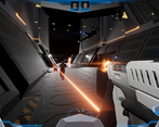
Gameplay, especially how movement and combat feel.
What did you update?
This is my long-term project that I recently released the demo for (not created for a game jam).
Leave a comment
Log in with itch.io to leave a comment.




Comments
This games not fair. haha. Way beyond just a "jam game". I will be following this. Wishlist on steam. I am enjoying the demo. The 6DOF sets it apart from most games. It can be quirky and needs some balancing but it is worth riding that at much as possible. Looks great too. Any dev logs on this? Curious about it's development so far. (Never mind just found the TWITCH streams)
WOW! I was not expecting to find something so fleshed-out!! Excellent job!!
I loved the 6DOF and my only wish is that I could use it the whole time!
Really good game! The combat and movement feel really good, although sometimes while moving the camera got blocked by something (maybe the player?)
The game is polished and really fun to play! Enjoyed messing around with 6DOF movement but found it quite tricky to use it effectively in combat. That's probably because I would need to put more time to get use to controls and I am also not a FPS guy. But other than that, I really enjoyed this demo. Well done!
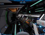
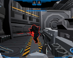
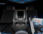
The 6DOF movement works great! I do feel like it's a bit disadvantageous for fights in "regular" spaces like rooms, because you end up in everyone's line of sight in cases where it would be more optimal to just play it like a cover shooter. I really liked using it in the exterior fights though, especially while changing from floors to walls and fighting vertically. Maybe it could be enabled only on certain fights / locations, so that you can more finely tune each encounter based on movement possibilities? idk.
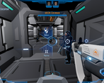
I also feel there's way too much info on screen without a clear hierarchy so it was tough for me to keep track of my ammo / health / etc, maybe changing position / size / color for the things the player needs to know at all times would help a bit.
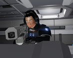
As a non-gameplay sidenote, the cutscenes look great as well!
- I really liked the concept of vacuum maneuvering for combat. The main problem is that that results in a lot of buttons for the player to become familiar with. A controller might offer greater flexibility and it's not as common nowadays for games to recommend that the game is played with a controller. With the keys, I found that I had to "search" for the button C/Ctrl a lot more so I would say for movement, try to stick to keys that are closer and more natural to the wasd. Maybe switching the mapping around (for example - change C/Ctrl to F) the buttons will make it a more fluid experience. Since that sort of maneuvering is one of the central aspects of the combat, focus on that first and then on all the misc functions that would be used less during combat.
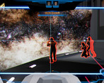
- The combat seemed a bit easy so far with the help of the teammates. I may have missed that, but are you planning on making the teammates expendable or central characters in the story? Depending on the answer to this question, the loss condition might have to be different.