Play game
Box Reverser's itch.io pageResults
| Criteria | Rank | Score* | Raw Score |
| Fun | #48 | 3.310 | 3.310 |
| Gameplay/Design | #49 | 3.345 | 3.345 |
| Audio | #64 | 3.034 | 3.034 |
| Overall | #73 | 2.983 | 2.983 |
| Graphics | #103 | 2.241 | 2.241 |
Ranked from 29 ratings. Score is adjusted from raw score by the median number of ratings per game in the jam.
What would you like feedback on?
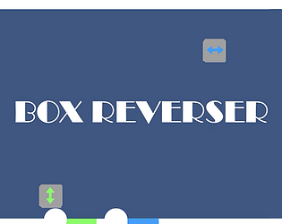
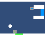
Anything, also are the sprites for the boxes with the arrows good?
What did you update?
Added a level, changed some levels and added a few new features, as well as adding sound effects and new sprites
Name of updated upload (if downloadable)
Box Reverser.zip
Leave a comment
Log in with itch.io to leave a comment.




Comments
Really cool game, very chill. I like the minimalist controls and the scoreboard at the end is an excellent addition.
If I had to give one negative, I would say that it didn't feel entirely like a puzzle game as there was a decent amount of skill involved with the timings and it didn't feel entirely like a skill-based game because of the puzzle elements. I would recommend trying to lean into just one of these aspects a bit more (if you plan to continue working on this game).
A very good game!
This is very nice. However, it could use a lot more juice to be more entertaining. The music is very chill and relaxing which I think fits the game well. The sprites are serviceable but rather basic. The puzzles are not particularly challenging, but the addition of the leaderboard makes it very tempting to keep replaying. Overall, this is a solid game that could be excellent with a little more spice to the graphics and more challenging puzzles.
So far my favorite game from this jam! You made a single input mechanic very intuitive and engaging. It's a great response to "roles reversed". Each puzzle took a little thinking, a little feel, very fun. Trying again didn't feel bad, because often I came so close the first few times.
The gameplay is already great, but this game could really benefit from visuals that gameplay a little more context. I also think the game would really benefit from a series of intro levels with just 1 object.
It would also be very fun to experiment with levels that involved 3 or more objects, objects that fall at different speeds, elements that bounce objects, portals, etc.
Awesome work!
I see this as a great mobile game.
Very simple concept, but very fun! With more levels, I could see it becoming a fun casual game!
The sprites for the boxes with arrows are fine if you're going with a simple look but you could probably have more fun with it like making it an object like a magnet or a creature of some sort.
Overall it was a fun experience, one of the best in this jam for sure! Great job!
I really liked the concept!
A lot of the puzzles were much harder than you intended due to the momentum, I think that might be helped by added graphical fidelity - for instance, if there was a grid in the background, it might make it easier to line up shots.
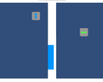
I like the simple yet unique concept here, though the difficulty curve felt a bit uneven. I remember there being one level where the blue and green holes were right on top of each other and it took me many tries, but several levels after that were super easy. You may want to rearrange the stage order. Graphics get the job done but are a bit basic. Otherwise, good job.
Fun game. Something very satisfying and relaxing about being able to play a puzzle game by just 'lazily' clicking both mouse buttons. Some levels end up being very satisfying, others are more trial & error and a bit of messing about to get it right. I think that's just one downside of the concept: you can see the solution, plan for it, and still mess it up and have to retry and fiddle around until you get it exactly right, because you just barely over- or underclicked it. For the most part though, the levels felt smooth and intuitive enough. The graphics aren't particularly exciting, but they're clear enough and I understood how to play it pretty quickly. The music's also a great choice. Great game to expand upon with new obstacles (and as another commenter suggested, a new block, or perhaps something that extra reverses the gravity of the existing blocks?) but beware that the difficulty of a level is largely in the puzzle, and not purely in the fiddling about with having to click exactly perfectly.
Good concept, good execution, and ripe for more stages with more than 2 blocks.
But heads up, when I beat the last level I got to the leaderboard screen where the game immediately crashed, which froze the game window. My guess is it has something to do with the leaderboard, but the error message was a long complex string of unity assets and numbers, so I've no clue what the actual problem is. I'm using Firefox if that helps.
Fun game! the sprites for the boxes with the arrows are definitely good
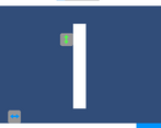
A lot of the levels boiled down to the same concept, I wouldve liked to see more different ideas thrown in (like the button but that was only there for one level)
Also I got a runtime error on the last screen, i think when loading the leaderboard?
really liked the gameplay! i think you could add some more interesting visuals but it's good enough as it is right now!
An overall fun game! I hadn’t played a momentum base puzzle game before. The movement wasn’t too much to distract from the puzzle aspect so I think they worked great together. The sounds and visuals worked well with what was going on. Only thing I could think of adding would be some particles for visuals on the movement to give it some more oomph.
You asked for some feedback on the sprites for the boxes, I think that because the goals, obstacles, and backgrounds are all solid colors it the sprite that you used works fine and matches well with them. If you wanted to make them more detailed/complex then you should probably also do the same with the other aspects of the game. Also, I'm shocked you were able to create so many levels with such a simple mechanic, so good job on that
Very good job!
Nice entry! At first I was a bit frustrated with the game (almost quit at the third level, lol) but enjoyed it at the end. I think I would have enjoyed the game a lot more if the velocity of the blocks was slower. If the intention is to make a puzzle game then maybe the game shouldn't be testing the reaction times of the player so much (personally) and the relaxing ambiance of the music would fit the gameplay more. I think only one arrow on the blocks indicating where the point of gravity is would be more intuitive or maybe it would've made me understood the mechanics a bit faster. That's all I have to say :)
One main thing for me was not being able to start the level with just a left click. it slows you down and having to reach for the keyboard is annoying. Of course, the graphics are a weak point right now but besides that, I think the game could benefit from some additional features although you've made a lot of variety in the levels with the simple features, and it doesn't really get repetitive.
It was a nice game.
Nothing awe-inspiring, but it definitely was a pretty good first jam entry.
The music fits. It was a good choice, and it helps with concentration.
The concept is simple enough and easily understandable. Though it is almost impossible to plan the route before starting the level, since you can't easily discern in which direction the boxes will move.
The visuals are definitely its weakest aspect at the moment. But they convey most of the necessary information. Meaning: they work, but could sure use some improvements.
Clever idea and well executed! The only thing I think would be nice to have is instead of the arrows on the boxes being bidirectional <-> , to instead have them just point in the way they're falling (so just -> when falling right). But really enjoyed it otherwise, I retried 30 times!
Very neat idea, would be a good base if you keep at it. It starts feeling repetitive after a few levels, without much being really changed up. The menus are also a bit buggy - I'm not sure what caused it, but every time I started a level I was paused and had to hit esc twice to open then close the pause menu and let the level start playing. This got to a point where the text "paused" was permanently showing on the screen.
Were you playing on the downloadable version? I think that one's a bit outdated
I'm not sure now, let me try it again in a bit to double check
I was playing the download one. The web version is much smoother :)