Play game
Seabound's itch.io pageResults
| Criteria | Rank | Score* | Raw Score |
| Story | #9 | 3.615 | 4.667 |
| Theme | #11 | 3.227 | 4.167 |
| Overall | #13 | 2.991 | 3.861 |
| Presentation | #14 | 3.098 | 4.000 |
| Gameplay | #15 | 2.453 | 3.167 |
| Horror | #16 | 2.453 | 3.167 |
| Creativity | #16 | 3.098 | 4.000 |
Ranked from 6 ratings. Score is adjusted from raw score by the median number of ratings per game in the jam.
How did you choose to implement the Theme: Song of the Sea in your game?
[SPOILERS]
Sal wrote a song that helped him.
Did you implement any of the optional Bonus Challenges, and if so, which ones?
The High Seas: The game takes place in a ship that sunk to the bottom of the sea.
Did you create your game in RPG Maker?
Yes
Leave a comment
Log in with itch.io to leave a comment.


Comments
SPOILERS
I really enjoyed how bittersweet and sad this one was (along with the had-drawn art) but the ending was a bit ambiguous.
With games like this, where it seems like everyone is dead, are they? I'm not a huge fan of stuff like this this, but it was still really good.
heyy thanks for commenting! :D
i'm glad you enjoyed the story and the art! if it wasn't clear already, those were the things i focused most on haha. put a ton of effort into both of them and i'm happy it paid off for you!
i definitely get what you mean with the ending, and i did have a few things planned to explain everything a bit more. but i didn't have time to put them in and idk it felt tacky to add them after i already released the game as completed.
thank you for playing!! <3
Hello. This was a interesting game for sure.
Spoilers.
Going to be real here I didnt think anything of this game the first time I looked at it and lets just say that I was a lillte correct there. I get that the style is because of the crayons from the story but even then it doesnt make it look good. Anywho I always say that a good story can make up for a bad art style. The story was one of the better things here. though even that could use some work. Dont get me wrong the story was decent but the way you tried telling it was a bit jaring. Having drawings underwater was just a bit odd. The character dialogue was a bit strange. Every time a character meets a new character it alkways started with hi and hi. Thats fine in real life but for a story that can be a bit wierd. Do have to say that i can see that you have put in some everts. But even so the decent story cant really save it.
Final thoughts is that this could be so much more. Just work on your dialogue and drawing skills and then I think you can make a good game because I can see that you do know how to make a story. So keep it up and hope to see you around.
thank you for the feedback!! :>
i fully admit the style probably isn't for everyone haha. since i have very little artistic skills when it comes to like, detailed drawings or even pixel art, i decided to go for a look that was purposefully "rough" to fit the story (while still trying to make it look readable). i'm sorry to hear it didn't work for you. i'll definitely try to do different visual styles in my following projects, to find out what sticks!
i'm glad you liked the story! and i completely understand the dialogue feeling weird, it's REALLY hard for me to write dialogue and i don't always get the best results haha. i have to revise almost every sentence and think "does this sound good? did i use this word before??". and sometimes everything just ends up sounding really unnatural lol. but i'll keep on trying! i really want to get dialogue right in my games. (i do want to say that the characters starting conversations with "hi" was on purpose. not trying to invalidate your criticism, just that it was a deliberate choice. i understand if it didn't sound good though)
thank you for playing!! <3
Oh my GOODNESS gracious. I didn't know you were doing this jam! first off!! that's so cool!! I just adore the style of the art of this one. It looks so TRUE to how crayon drawings look I felt like I could smell the crayon as I played. The simplicity and effectiveness of everything is really amazing. I know I said this about your last game too but, in my opinion it's harder to emote with a simple shape and style than a really complicated one. And you had me crying over these stick figures haha. Completely insane.
Spoilers for anyone who cares!
The slow unveiling of what happened and how I felt I didn't fully understand the picture until the very end was really well done. I think you found a good balance of subverting expectations without being too whacky about it. And I think it's a really brave and authentic choice to leave a lot unexplained. The magic details of how all this works isn't what important - the emotions are. and you NAILED that.
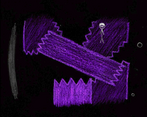
Maybe I'm just bad at puzzles haha but I felt like I just stumbled through the engine puzzle. Oh! but I loved that the engine looked like a crayon! idk if that was intentional but it made me chortle. And I'm noticing there's a lot of polaroid cameras in your games! Right? I love that.
The "storybook" sequence was beyond beautiful. I loved the fuzz? almost? on the screen and the way all the images moved and moved. I started crying when the second stone was dropped with the lonely one and pretty much didn't stop crying until the credits.
And speaking of credits I was crying and missed the music credit! I saw it just go by but couldn't read it. I wanted to ask - if you message me on discord maybe, would you mind maybe sharing the sheet music or notes with me? I'd love to make a fan song or remix or something with it, it really moved my heart. Hope that's not too weird or overstepping!
Also - SEABOUND I get it!!! Oh that's good. That's awesome. It just clicked for me with what he said at the end. Ohhh my heart.
aaahh i'm so glad you liked it!! i love getting comments from you, they're so detailed and always put a smile on my face <3 (and i WILL be playing your game on this jam ofc >:D just give me a little time to rest cause making this almost killed me-)
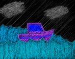
i'm really happy to hear you enjoyed the crayon look! i drew everything by hand with actual crayons, and i'm really proud with how everything ended up. considering i have zero artistic skills this style was a nice way to use what i do know to make everything look good. it's one of those things where i was like "hey, i have the tools to make it... it could look really cool... YEAH F IT IM DOING IT". and i'm super glad that it paid off!! :D (i am single handedly maintaining the crayon and paper industries alive lol. especially with the 'moving' effect; i had to draw everything four times for that... pain)
i'm also extremely happy the story worked for you. it was obviously the central point of everything, all of the "puzzle" parts were pretty much an excuse to get to the next portion of the ship (that's why i tagged the game as a visual novel). i'm really glad i had the time to convey everything i wanted to convey. and it's awesome the emotions worked for you enough to not care about the unexplained details, i was kinda banking on that happening or the entire game wouldn't work haha. (i had a couple things planned to explain things a bit more, but i had to cut them for time. i do mean a couple tho, i was very much leaning into the unexplained magic feel).
ngl, i was fully aware as i was making the pistons puzzle that it wasn't ideal, but i was running out of time and it was the only thing i could think of HAHAHA. so i did make sure you can stumble through it if you don't understand it lmao. and the looking like crayons thing wasn't intentional actually! man that's such a cool idea! why didn't i think of that! XD
i actually have no clue why i use cameras so much, i don't think i've ever even owned one. guess they're just a good storytelling device lmao.
oh man, don't get me STARTED on the beach cutscene. it was by far the hardest thing of the entire development process. i had to storyboard for the first time in my life haha. every single scene was extremely time consuming, but i REALLY wanted to make it. and hey, i actually did, and i'm beyond happy it worked for you! :D and fun fact, the fuzzy look was an accident; i made the first drawings kinda small and had to scale them up. but i ended up really liking how it got a bit pixelated so it stayed that way!
:O i'm honored you're asking for that!!! i know it's a small thing that appears at the start and at the end, but the song was legit the first part of the game i came up with. and i'm so so happy you liked it!! the credits say i composed it, but someone else (who didn't mind not being credited) played it cause i have no instruments knowledge. i asked them to send me a pic of it, and i'll share it with you when they do!
i know i've rambled a lot but man, it's so SO awesome to hear people have played and liked my games. it really makes all the effort worth it. you can probably tell from my complaining and the fact i submitted this 20 minutes before the deadline but i was really crunching for time, especially by the end. it's the biggest amount of work i've ever done for a game, and y'know what? i'm glad it was! it's nice to challenge myself sometimes :> (but i definitely could've managed my time better lmao).
to quote the credits, thank you for playing!! <3
p.s.: i'd say i'm taking a break after this, but i said that the last time and look at what happened HAHA. let's just leave it at i'll make another game if i want to and i won't if i don't want to. yeah, that's good.