Play game
An Artist's Companion's itch.io pageResults
Criteria | Rank | Score* | Raw Score |
Fan Favorite | #18 | 4.125 | 4.125 |
Ranked from 8 ratings. Score is adjusted from raw score by the median number of ratings per game in the jam.
Leave a comment
Log in with itch.io to leave a comment.
Comments
Good art and good use of the voice sound files. However, the last boss of the game was incredibly difficult and took me around 4 or five tries (and a lot of luck) to beat. The use of yellow text for low stats on a light background made it difficult/impossible to read.
Suggestion: Great concept, with really good art, but that last boss was WAY too hard. Tune it back a bit, and give it less ability to heal itself (nor none). Also, find more complementary colors for backgrounds and fonts.
Thanks for the Feed back Hawk! I really appreciate it! I think I corrected some of that in the update but I might also have added a few other problems lol (Not sure).
The title screen is customized in several ways and this game starts off right. The opening sequence moves along at a very nice pace with lots of graphical representations of the main character, I really like the face sets.
I usually turn the SFX down in RM games, but in this one I had to turn the BGM down and max the SFX to hear the voice acting, but unfortunately that makes all the other SFX a bit too loud. As a dev who wants to put in voice acting it can be a very difficult task to get the audio levels right. You can use a combination of applying a normalizer and limiter effect with Audacity and also manually turning down ALL OTHER SFX in the project except the voice acting. That can be a huge task depending on how many SFX are actually being used. (Animations tab modifications to the SFX, and any "Play SFX" events need to be cut in half or even a third in volume.) I've seen some really bad volume control in other games, and although this one also suffers in that same vein, it's not the worst offender that I've encountered.
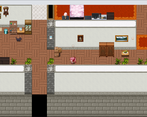
I like the art style you picked for your menus. The canvas background really fits the theme of the game and everything works well together as far as the aesthetic is concerned. I would add a border to the canvas menu in battle though.
The game kind of holds your hand and assumes you're an idiot, which isn't always a bad thing, but to some of the more hardcore RPG fans it may feel a little condescending. There really is no way to please every demographic, it's just what it is.
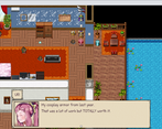
I feel like with your ability to draw you could have added an image of URI getting out of the shower. (In a totally tasteful way) ;) Oftentimes to get a project to sell you need to straddle a line between sexy and tasteful. There's nothing wrong with this, but just be careful not to go over the line.
I like the idea of changing the main character's title as she does more things. It's a simple and subtle kind of progression that adds a thin layer of polish to the game.
More on the point of opportunities to add art to your game, since it really is just a showcase of your art in a basic storyline, you could show a picture of URI dressed up as something cute when you reveal the "picture" of her at a cosplay convention. It's kind of lame that you use a show text here instead of actually showing a picture of her in cosplay. (I understand it's a game jam and there is only so much time, but I'm looking for all of the spots that could be improved for the future.)
The bulletin board is a very clever way to keep the player on track, I really like this. It shows all the steps that were taken in the playthrough as well as the next step. So if at any point the player gets lost they will at least get a hint of what to do next by visiting the bulletin board. This goes hand in hand with the blue arrows literally pointing to where you need to interact, very good job!
You're missing gameplay in some areas that warrant gameplay. For example, when you have URI 'practice her shapes' and other things like this. There needs to be some kind of battle system or something. It doesn't HAVE to be a battle, but if not, then make something unique. Maybe a clever way of naming skills and enemies combined with a play on types and resistances to make only the right actions work. There's really a lot of ways to improve this section and steps should be taken to add gameplay where you can. Luckily when URI sleeps she does have a unique battle which I found refreshing and much needed.
I'm really happy you added the battle system and easy random encounters in the floating garden as it does a great job in breaking up all the dialog and provides the player a chance to input some actions instead of just hitting next and reading along, however I think you could have added some custom animations and skills for the enemies. The player's battle action moves are also not animated all that great. It seems like you just used the basic defaults and that really takes away what could have been a nail in the coffin to some of your competitors in this tournament style game jam.
I think it was a cool and slightly unexpected move to make the Moon(your cat) the shopkeeper but you should not have him charge money to rest. The player may just be really bad at the game and need a free heal. (Most likely it's not an issue, but for those special cases it's better to grant the player a free infinite heal at certain points.) You can always force them to backtrack a little to use it which would give incentive to not use it for the challenge.
The paralyzing, triple attacking, healing last piece of art battle is completely imbalanced. The enemy shouldn't heal so often and paralyze shouldn't last as many rounds as it does. The fight is completely ridiculous. Also URI should have an ultimate attack that costs 100TP and deals much more damage. All you get to do is spam the same move with default animation over and over and over while consuming all your items. It's a terrible fight. What's the point of a tactical drink? TP is useless! 20 TP gives your very little MP in a single action while you take so much damage each round. The last canvas heals for soo much and soo often, it's completely unfair and rage-inducing.
A couple of events need to be player touch instead of action button. Strength is misspelled at the dragon boss and the maps are not that great, but all of these things are relatively minor. The point is, with the exception of the last canvas boss which it utter garbage, I feel that this is a fantastic entry to the game jam . I think you really need to add some sequencing and animations to the battle system. Give the enemies their own skills with custom animations. Show more sketches and remake most of the maps. Finally, fix the SFX volume issue and add some more general polish to the details. Do all of that and you may have the skeleton of a commercial game. Great job, I enjoyed playing this game, most of the time.
Hello! Thanks for all the tips! After submitting this game to the jam, I still had a few days to work on it and most of the things that you said (not all of it unfortunately) was added to the upgrade. I do not have access to MZ anymore so I am considering starting over in MV for a longer and better version of the game.
I don't know if I can share what has been added in the upgrade because it might influence the judging but there is quite a few changes.
About Moon in the jam version, if you decide to rest, he actually says "it was just a joke" and he doesn't actually charge for it. There is another way to heal yourself by going back to Sun.
I didn't know what to do about the SFX at that time, but at least in the upgrade, not all the sounds will start at 100% in the option menu. (I think it's ok to share that)
I couldn't add more URI illustrations because it would take me 3 or 4 days to make one (If I am only working on that), but I will add more in the future. I actually took the first week (and maybe 2 or 3 more days) of the jam to work on the face set, the walking sprite, etc... With no time constraint, I can go all out (Well life happens too but I can give it my all).
For the last boss, I felt like it was a necessary challenge... I agree, maybe too challenging. The player is somehow cruising through the game all the way to the end without ever seeing a game over. Since it was the final boss (almost at the one-hour mark), I felt the game kinda needed that so the player appreciates the ending more (because it is a short story, a short game). The narrator kinda hints to how challenging it is and how to beat it by adopting a more defensive approach. For that one, in the upgrade, I didn't nerf him but I gave the player a way to ease through that fight.
I am really happy that you enjoyed it because it is actually my first attempt at really creating a game. I had MV for a while but I was just playing with it for a month or two, and then just left it there.
Thanks again for all the feed back, I am actually competing alone against teams of devs in this Game jam so I don't want to get my hopes up but having a judge say that the game could be a skeleton for a commercial one it 's just amazing and already rewarding enough for that one month worth of work.
You shouldn't gear the game so the player can see the gameover screen. If they make mistakes they will see it, and maybe not everyone will. That's okay if they don't. Also don't restart with MV, it's 32 bit and not supported. Just save up and get MZ.
Game ends after the big fight with a fade out that never ends. You can walk around and interact, but you can't really progress, but the bulletin board seems to be a bit off if you manage to talk to it since it tells you to go to the computer and if you go to the computer, it doesn't do anything.
The cat gets stuck if you talk to it.
The message that you should check the statues is repeatable, particularly on the two sides.
The pig entrance looks weird.
You sure take a lot of showers...
The blinds just automatically move? Looks a bit odd.
Interesting first battle. Would've liked to see more of that kind of battle.
Had to go to your deviantart to find the birthday, but it wasn't exactly easy to find because you have a different name there than the first/last name and the credits scroll pretty fast. I had to read off my stream.
Felt like that one skill could have used an hint that it was an aoe because it seemed useless at first.
Very cute menu customizations.
The light skill triggers the gift event.
The enemies went invisible at some point. This looked odd. Might be due to me triggering the statue event again after seeing them (didn't engage).
Exposure seems to be a different icon than the other MP skills, so it seems odd?
Thanks for the feed back.
The only "bug" (really it was just a stupid mistake that I only found after submitting) that could break the end was the statues trigger. I guess that is why you experienced all that in the ending part. I really hoped nobody would notice the cat but yeah it was also something I only noticed later. Those two, I think I already addressed in the second version of the game so the ending will work as intended. (I wish I could share it right away but no one would play the original version if I do that)
The shower is only there to let you know that you do something in there. You are right I should have put a text saying " I already took a shower today" or something.
For the blinds, It's something I wanted to do, to show visually that it's the night instead of just adding a dark filter on the screen. I think I could have put a text on that, saying she claps and then it closes maybe but I didn't think much about that one.
Really ? the credit rolled pretty fast? hmmm that is strange...I looked at Hawkzombie's stream and it looked alright? maybe another bug from the bad trigger?
When you say the light skill, you mean exposure? I didn't mean for people to get that skill but I forgot to take it out of the game.
About the ending, I am sorry you couldn't experience it the right way. if you are still willing to play it again, please don't trigger the statues more than once. There is actually another boss at the end.
I am giving you the link to Hawkzombie's stream and his video on youtube if you just want to watch it instead. He starts streaming it in the video around 2:22:00 or something.
For the Deviantart thing I addressed that in the game too by adding another secret shared by a npc with another reward (in the v2) but people can still open the safe if they find it on the site.
Thanks again for the feedback! I can't actually work on it anymore because MZ is not free anymore but I think the next version is doing it almost right, (I still forgot about the exposure skill.) but Thanks a lot for playing it and sharing your thoughts.
https://www.twitch.tv/videos/1095353479?filter=all&sort=time
Exposure for an artist though. You know that people die of exposure, right?
The main thing is that when I'm looking for specific text and trying to copy it and the game takes up most of my screen, it does make it a bit harder. Especially since my mind doesn't store names.
I thought the birthday thing was okay, I mean, I think one dev makes you send her a picture or something to unlock an achievement and same dev has another game where a secret image can only be unlocked with a password found in one of her blogs (and the game berates you a bit for it iirc).
I just saw the video on twitch, thanks for streaming it!
haven’t gotten a chance for a full playthrough BUT i want to! incredible art are you a professional artist??
Thanks, I am not a professional artist but I like working on my drawing skills as a hobby.
This game jam appeared out of nowhere when I just finished designing the main character hahaha. my first idea for her was some kind of animation, but making a game instead was really thrilling.
Just gave this an initial playthrough to check it. Love the artwork! Feels like a nice inspirational story too. The gameplay wasn't exactly thrilling, but I think it serves a fine medium to tell the story. I did love the change of the paper battle image as you draw it, which was a nice add to the standard battle system. Nice work!
Edit: also put this in a first impression video if you're bored and want to see how I played your game haha: https://youtu.be/s50C5GXeQl4?t=2396
Thanks! I am happy you like it!
Thanks a lot, I checked the video. I am still improving the game, with things I had in mind, but I'll be adding that skip tutorial choice you suggested. I still have a few days on MZ before the contest version expires and feed back like that really helps.
I'll check your game and the other games in the jam next week maybe.