Play game
Overworked!'s itch.io pageResults
| Criteria | Rank | Score* | Raw Score |
| Gameplay | #1 | 4.250 | 4.250 |
| Sights and Sounds | #2 | 4.000 | 4.000 |
| Overall | #2 | 3.833 | 3.833 |
| Theme | #3 | 3.250 | 3.250 |
Ranked from 4 ratings. Score is adjusted from raw score by the median number of ratings per game in the jam.
Leave a comment
Log in with itch.io to leave a comment.


Comments
Since I like overcooked, I liked this game too.
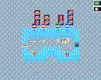
WOW! I enjoyed this game so much! Instructions are clear and the food icons are cute. The player graphics is also great showing his back side whenever it's serving. Overall, a very good job!
Overcooked! This game feels more of a complete game when it comes to mechanics.
It would be great if you've made full use of the area. Also the time mechanics is faster that it should be?
Pretty good set design and gameplay. Sprites for food and drink items were also great. As someone who loved playing Overcooked, the implementation of fulfilling orders is spot on. One of my favorite submissions.
You nailed the Overcooked mechanic perfectly! Love the small details on your game that improve the experience:
* Highlighted icons signifying orders in "danger"
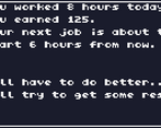
* The summary screen ala "Papers, Please"
Some suggestions:
* Make it clear that there's a second level (at least for this game jam)! I know people should play as much of the game as they can but it's quite possible that they stop without seeing the second level they would be a little hard pressed in evaluating the game's adherence to the theme without it.
* Increase the area for picking up/putting down orders. You could also try to snap the character in place when it's near the area but it's easier to address it by just increasing the collision area for that one.
* Actually, increase the size of the game elements! It would be easier to see all the great artwork you have made and you would reduce all the negative space around it.
You already passed the course before (lol) but congrats on a job well done!