Indie game storeFree gamesFun gamesHorror games
Game developmentAssetsComics
SalesBundles
Jobs
TagsGame Engines
A jam submission

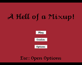
A Hell of a Mix-UpView game page

Entry for the Stareye Atlas Game Jam
Submitted by StLove48 — 13 hours, 4 minutes before the deadline
Add to collection

Play game

A Hell of a Mix-Up's itch.io page

Results

CriteriaRankScore*Raw Score
Concept#24.0594.059
How well the theme was followed.#83.7063.706
Message / Purpose#83.0593.059
Gameplay#123.0593.059

Ranked from 17 ratings. Score is adjusted from raw score by the median number of ratings per game in the jam.

Leave a comment

Log in with itch.io to leave a comment.

Comments

Submitted

This was great! Reminds me of Papers, Please, but with more of a focus on pattern recognition that changes each round. Very fun, I ended up with 15/17. All the sounds an aesthetics work well together too, with the app style.

Developer

Thank you so much for your feedback, I'm glad you enjoyed the game!

Submitted

Okay, I love this game. The writing was spot on, the music was such a jam and the game felt really solid to play. My only gripe is that there's quite a lot going on on the screen. Amazing work man! 

Developer(+1)

Thank you for your feedback! I'm glad you enjoyed it!

Submitted

Solid entry! Nicely done! The music was super catchy too

Developer

Thank you! The music was honestly perfect, and I can't appreciate my composer enough for the work he did. 

Submitted

Solid work! My only wish would be to have the ability to check the validity of the documents ourselves somehow rather than having to rely on Hint Angel to give away the gimmick.

Developer

Thank you for your feedback! I had wanted to include face images for the souls as well, but I unfortunately didn't set aside the time to draw them up early enough in the development. I will definitely revisit this game at a later date as I've learned and improved and doll it up a little bit.

I really liked it! Many of the comments made me chuckle. Only issue I had was that the left panel (with hints and such?) was partially cut off (running in chrome). 

Developer

Thanks for your feedback! I learned a little too late about double checking the resolution I was designing for and didn't make it very malleable. The workaround would be to try and zoom out in Chrome (set it to 90% maybe) but in future projects, I will be making that a priority.