Play game
Howling Good's itch.io pageResults
| Criteria | Rank | Score* | Raw Score |
| Novelty | #1 | 4.250 | 4.250 |
| Harmony | #1 | 4.500 | 4.500 |
| Overall | #2 | 3.963 | 3.963 |
| Kink | #3 | 4.167 | 4.167 |
| Horny | #5 | 4.250 | 4.250 |
| Sound | #5 | 4.000 | 4.000 |
| Narrative | #5 | 4.083 | 4.083 |
| Play | #5 | 4.000 | 4.000 |
| Aesthetic | #6 | 4.417 | 4.417 |
| Stealth | #28 | 2.000 | 2.000 |
Ranked from 12 ratings. Score is adjusted from raw score by the median number of ratings per game in the jam.
Early work
I had an idea of an horny cooking game when the Jam was announced.
Leave a comment
Log in with itch.io to leave a comment.


Comments
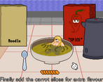
Bizarre and delightful! I wanted the food people to be lewder, but loved the way that they were drawn :P
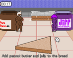
This was funny, and overall enjoyable! One thing I would change is the sliding scroll on the last level. It made the challenge a little more difficult than anticipated, especially with the butter part. Fix that up, and you have a really funny game with great gameplay!
Holy poop, this was straight-up amazing!!!!
I wasn't expecting just how in-depth and complete this was, not to mention the various mini-games and kinky stuff! The aesthetic is awesome, so's the music, sure both are simple but they work soo well together. The mechanics are challenging but still easy enough to be fun.
Overall I just love this idea, great work dude, 5 stars all around, :D!
I was going to save it for last, but I'm not always good with waiting for things when they're sitting in my download folder already, so yea I sorta ended up opening the exe on my first day anyways. Oops.
It's even better then expected!
Your pixel art keeps improving at an astonishing rate and I already valued it very highly to begin with. The animation transitions when the food people are moving around look really nice. The designs are very creative and have a lot of unique personality for each character (Roast is my favorite). Absolutely love the title screen.
Only points of potential improvement I can think of would be the gameplay and sound design. The music style fits the pixel art aesthetic nicely but I think it could use some additional tuning to match the action more. For the gameplay I'd like to see some additional variety to how the food ends up, maybe with some fail states, secret interactions and shortcuts.
I usually delete games after I play them, but at this point you've made so much stuff that I've kept that I might have to create a subfolder titled "Nekolag games".
Thank you for playing the game. I actually tried to restrict myself in some places so that I could make this game in time. For example the animations are simplistic, only having 2 or 3 frames usually. For sounds and music I decided to only use retro NES sounds to keep it simple. I'm glad that you liked the game, I still have your Archeology Agency on my pc.
You make really efficient use of your resources when you animate. With good timing, transitions and poses your 3 frame do the work that 12 frames do for a different artist.
Oh I love this! It's sexy and freaky and weird and funny... Really good stuff, unique atmosphere, nice art, nice music... The first levels are a little boring in terms of gameplay mechanics (but I didn't mind because what was going on was so fantastic) then the last level is super hard! Great gameplay though, I love the idea of dragging stuff past the imps. Only two suggestions: 1) Do something about the scrolling on the last level - it's hellish trying to click something in between the two screen! 2) Consider making each text line skippable without a delay - I'm a fast reader and it was a little frustrating, especially when I was trying to repeat the cake level.
Otherwise, I can't fault this. Super creative and fun! :)
Thank you for the feedback. You have valid points that I could improve in the future.
Play: The ordinary stages are alright. It's reminiscent of the kids' cooking games I used to play, so I enjoyed it, but the tasks weren't consistently engaging. The kettle was fun to pour, for example, but clicking the spoon was a bit odd, clicking and dragging would have worked better, yk? I also had to take points off for that final level- it came out of nowhere! 5 chill levels, and 1 incredibly stressful one with obstacles and difficult mechanics... It really threw me for a loop, and when I lost, I didn't want to go back and tackle it again, I just wanted to walk away.
Aesthetic: The pixel art is very well-done, the animations are stellar, and the little people are adorable, but the rest leaves something to be desired. The colors are a bit muted, I'd like to see a reimagining in a more vibrant setting to match the cute characters. The text looks out of place, it can't be sped up or skipped, and I don't know if the shaky grammar in the dialogue sections is intentional or not. (Honestly, I don't know which is worse...) Also, obligatory points off because I had to swap the position of my taskbar in order to read the text, since the window can't be resized. I'm glad the little fruit people from the title screen didn't appear in the game proper, they work well as mascots but they kind of creeped me out.
Sound: The music is very simple, and it works well with the pixel-art graphics and the (generally) low-key gameplay. I like that you have multiple tracks! Definitely one of the best parts of the game. I don't know how many- originally, I played without sound, and I just launched the game up again to check if there was any, and I was surprised by the amount of different music I was presented with just a quick click-through of the first level. Didn't pay any attention to SFX, though- if there are some, good, if there aren't any, add some because it'll be cute.
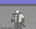
Narrative: There certainly is one, but it wasn't very interesting, and more importantly, it was presented in possibly the most unappealing way possible. The text was hard to read, oddly constructed, and impossible to speed up, so I found myself upset more than interested whenever the wolf appeared.
Horny: The little people are naked, a couple of them make out, and that's as horny as it gets. I'd assumed the kink focused on here was eating them, or something to do with the wolf (more on that later), but neither of those got shown, so it doesn't really present much to go off.
Kink: Food is not exactly breaking new ground. A couple of the sprites are disproportionately lewd- the peelable vegetable girls and the sandwich come to mind- but the vegetable girls once peeled just look like ordinary people sitting in compromising positions, so it doesn't come across as 'food people' so much as... 'people dressed up as food'. Is that a subkink? Is this just too specific for me to get? +1 star for making me unsure.
Stealth: It doesn't try to be stealthy, so it gets low points but not in an insulting way. It's just not that kind of game!
Harmony and Novelty: I liked the cooking game mechanics- as I said before, it reminded me of other games I've played, which made it more endearing, but they could be a little more immersive. The final level was very novel... but not in a good way. It's better to present these mechanics to the player gradually and in a safe environment before challenging them, instead of just 'lol here's a bunch of hard stuff and a strict time limit good luck'.
Final Thoughts: I'm most upset about the window size. Everything else is a style and taste sort of thing, but that's just an accessibility problem.
Thanks for the great and detailed review. It helps a lot when someone else tells their thoughts about my games. The screen resolution is something I would like to tackle in my future projects. Mostly I tried to make this game into a silly experience.
Unfortunately, scaling resolution isn't something I have experience with either- for my own project, I just fucked with the camera settings until it displayed right on my dinky lil laptop screen- so I can't give you any advice regarding how to do it :( I was probably a little too harsh, it's like three in the morning and I'm always in the mood to be detailed with critiques. If there was a silliness category, you would score pretty high lol
The game is sized weirdly, at least on my screen... I can't resize the window, but at its original resolution, the screen is cut off, which makes the text at the bottom difficult to read. :(
Edit to this: As Nekolag commented, this happens when it isn't in a folder as it tries to just delete everything in its folder, and when its not in one it just starts deleting everything. So just be careful with deleting it with the uninstall program it gives you
Original comment: This is malware. the uninstall started deleting EVERYTHING ON MY COMPUTER
I've looked into this. This kind of thing has happened before to others. It appears that games made with Gamemaker Studio have a uninstall button that will delete everything in the same folder. Therefore the game should be kept in its own folder. I recomend that you should remove the game by deleting the whole game folder. Yoyo-games might have more information about this problem. I'm sorry, this is very annoying to me as well.
An example: https://mobile.twitter.com/tobyfox/status/1057639821177278470
ah alright. sorry i was just really upset when it happened. Winrar just happened to extract it without putting it into a file I guess.
I understand. That was a really scary thing to happen.