Indie game storeFree gamesFun gamesHorror games
Game developmentAssetsComics
SalesBundles
Jobs
TagsGame Engines
A jam submission

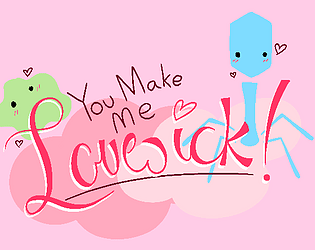
You Make Me Lovesick!View game page

(NSFW Arcade Game)
Submitted by actiniumhydroperoxyl — 1 day, 23 hours before the deadline
Add to collection

Play game

You Make Me Lovesick!'s itch.io page

Results

CriteriaRankScore*Raw Score
Stealth#14.4174.417
Kink#103.5003.500
Novelty#113.5003.500
Play#133.4173.417
Overall#173.2963.296
Aesthetic#203.4173.417
Sound#212.8332.833
Harmony#213.2503.250
Narrative#232.9172.917
Horny#372.4172.417

Ranked from 12 ratings. Score is adjusted from raw score by the median number of ratings per game in the jam.

Leave a comment

Log in with itch.io to leave a comment.

Comments

Host(+1)

i think i got her to sneeze but the dialogue made it seem like maybe there was a Level 2 Sneeze if i got more cells (20?), but i couldn't manage more than i think 18.  or maybe that was the payoff and i tried to route this for no reason??  i see from other comments that there's no ending so maybe that was it then?  nice, i won

at first i thought everything reset when i ran out of life, but then i reread the instructions and it clicked and i actually really like that it was only a temporary setback with no other punishment.  feels really forgiving but also leaves a lot of room open for doing some speedrun bs to get every single cell in one pass without taking more than two hits (i did not do this though)

i take it the girl is literally dating us, but we presumably divide asexually (and in fact are doing that constantly throughout the game), so is she dating all of us, or do we decide which of us is the original, or, look i really need some lore here and i don't know why

at first i thought this might be a little too on the nose during a pandemic, but the protagonist is clearly a bacterium and not a virus, so that's fine probably.  and they're really cute anyway

Developer

She has different dialogue for 0-10, 11-20, 21-30, and 31-40 points, but the sneeze button has the same dialogue no matter what, unfortunately, as long as you have more than 10 points. I'm definitely going to make more adaptive dialogue in the future... just couldn't be bothered now sldkjfsdlf It's difficult for me to get into the later stages, too, I'm going to be a little more careful with further level design.

Speaking of things I couldn't figure out how to do, yeah I toyed with different ideas for death until I just gave up and slowed you down for I forget how long. A couple of the cells were placed specifically so you can't get them while you're dead, just to make it have more weight, but if you try hard enough, you can keep increasing your points even during that window. It might change in the future? Like, resetting your position until you 'respawn'? I would have done smth like that for this build except I didn't want to fuck with the camera too much because that's held together by duct tape bay bee. I do not know if the speedrun bs you speak of is possible since I suck at platformers, it might take too long to get to all the floors before they respawn. In addition to health powerup, I might add a speed one?

I'll add lore eventually, I promise. It's supposed to be two different points of view, although I guess I didn't - the germ is one character, and the person she's dating is another. Some mention of that is made on the jam page, but the fact that I forget where and how it's worded isn't a good sign for the overall lore stability... 'Do we decide which of us is the original' made me think of a democratic germ society though which is ridiculously adorable. Little germ politicians in teeny tiny ties.

also... listen i cannot help it. covid terrifies me but headcolds are hot- *shot*

Host(+1)

it is a crime that this didn't win kink tbh

Developer

;w; tysm omg... That's definitely the category I was aiming for, seeing as how I was expecting the only competition to be furries and food, but of course the super cool bug game had to show up too lol. Don't get me wrong, though, I'm very happy with my results! I should have seen high scores in this category coming, especially since it was difficult to get to the 20-40 range without being quite dedicated/having the map memorized like I do at this point. Guess this means I have to at least take a crack at improving it... tbh, I was going to anyways. I was in a really good place mentally during the jam period because I had this to work on, and I've been in kind of a slump since. Maybe this is some kind of sign that I should take making games more seriously? :thinking: who knows not me

Submitted(+1)

this was really cute, but i'm not sure if i'm picking up everything you're putting down here. the game play was good, it was fun to jump around as a cute germ to impress a cute lady but i couldn't really grasp what the point was or how i was actually infecting her. i wasn't able to get her to sneeze, either.

one thing i noticed was that when i go to the how to section and then back to the main screen, the music starts again and then when i play the game im listening to the music twice.

another thing i noticed is that the how-to screen, while cute, was hard to read and understand, but i imagine you plan on tidying it up when you have a chance.

Developer

Ew, music bugs. Writing that down. 

I can imagine the how-to screen is a little confusing, yeah. It was definitely a last-minute addition. I think the framing will be more clear once I touch up the visuals to make them look more organic and make everything's function clearer? As for that button, it only works once you have eleven or more points. 

I'm going to add a proper tutorial and intro kinda thing when I pick this back up again, so I hope it'll make things more clear! Thank you for the comment :D

Submitted(+1)

I like games where you play as a microbe. Sick game, cute style.

Developer(+1)

hehe germ jokes

Submitted(+1)

Really cute style and everything works nicely together... Music, art and gameplay... Took me a little while to figure out what I was doing but then the gameplay loop really became fun... I got quite fast at looping through the checkpoints! Is there an end to the game? If so, I don't think I was good enough to get there. ;( Really enjoyed playing anyway!

Developer

Ty for commenting!! 

There's not an end, don't worry. Your points cap out at 40, and from there they just decay back to 0 if you let them. It's almost more like a toy than a game at this point, since there's no end or fail condition. Or a dressed up tech demo lolol

I'm glad people are liking the gameplay! It's really starting to grow on me too. I wish I could make a bacteria pun here but I can't. Darn. Speed strats seem to be the main appeal, so I'll try and focus on those when I make more content. :D

Submitted(+1)

That's a fun and unique gameplay loop concept that I don't think I've seen done before. It's sort of like a perpetual speedrun. I know you're planning to change it up, but I actually think you're on to something good here.

The look of the game area works for the demo well enough, I for one am glad that all the art timeslot allocations went into making the girl cute.

The music loop choice fits the aesthetic and gameplay very nicely and goes a long way in making it fun to run circles around the map.

I actually thought the bouncing icons were part of the game before I read the description. They're kind of fun. Maybe it's a harmless bug? 🦠

Developer(+1)

Aaa I'm glad you like the art! I was nervous going into it, because I'd tried and scrapped a few sprites already, so I'm glad I found a style that works well :D

Yeah, I started going 'speed strats' to myself as I tested it out, haha. It'll probably grow on me more once I make it a little more substantial and give you a few things to do. Maybe the final levels will have, like, a chill half where you can devote more of your attention to the other side of the screen at the cost of not getting as many points, and a more extreme half with higher risk and more reward? Anyways, the endless sort of vibe is why I call it 'arcade', so I'm glad it's not boring.

The bouncy movement was actually exactly what I'd expected, since all the UI parts use a camera code very similar to the code used to make the camera follow the player, and that's at a slight delay that makes it bouncy as well (to keep it from going crazy in certain spots). The health bar and the pink button did it, so I intended to keep it as the general visual style because it's cute... but then the rest of them just didn't do that. I'm almost scared to inspect the problem in case they suddenly stop. It kind of works, since the wobbly ones have to do with the platforming and the static ones have to do with the girl, and reading moving text might be difficult for some people, so... fingers crossed it stays this way, I guess!

Also omg I didn't know about that emoji. 🦠🦠🦠🦠🦠

Submitted

Looks like a cute start! I feel like you have something very potentially interesting with how "capturing" spawners works, even without any kind of "spawning" mechanic yet -- it seems like trying to figure out efficient "loops" to maximize how many you have captured at once before any revert back to "uncaptured" could be an interesting puzzle. Maybe hitting a certain score threshold permanently unlocks new paths, allowing for better and better loops over time?

Do you have any plans to make "sneezing" a game mechanic, or is that more of a "reward" for capturing enough spawners?

The one thing I really longed for was some kind of map or mini-map, to help me plan out routes. 

Adorable art style, too! The how-to-play screen is really cute.

Good luck with your plans!!

Developer

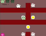
It's interesting that the spawners came across like that! :O They actually do spawn things- the yellow circles are separate things they're spawning above them, and they destroy themselves and add to your score when you touch them. I should probably have made them smaller? But I don't know if it would have come across right either way, since now that I'm looking at it, it does look like lights going on and off. If they were moving, or if they dropped a bit onto a surface instead of popping into existence, it could come across better, but... maybe I'll just fully swap it to a 'capture the flags' sort of mechanic instead of a 'pick things up' one. This level would play pretty much exactly the same, the final sprites could be way more interesting, it could be optimized (since the game would pretty much only have to deal with half as many objects), it could make for more interesting challenges (tricky platforming, 'stand here for a while', etc), and each spawner could run on its own timer like I originally imagined, instead of relying on the janky global timer I resorted to when I couldn't figure out how to make individual instances command themselves independently right T_T

Expanding paths as you get more points is a good idea. I'd thought of opening passageways lead to a 'higher risk higher reward' type area, with more difficult jumps and trickier enemies. Unlocking passageways in the same space would work too, though, and put more focus on speed and efficiency. Both would do well as a more permanent sort of progression, since I can't think of a way to kick you out of the area or close the gates when you don't have 'enough' points without it either being awkward or potentially trapping the player. (If you only had one level to focus on, keeping your points up would be easy, but once there's multiple levels, your points for every character other than the one you're focusing on will decay slowly, so I'll have to keep that in mind as well...)

As for that button, it was half 'you get a reward for keeping your points at least above 10' and half 'I have to include it at some point because a) i drew the sprites and want to use them and b) it's the whole point of the game, but I really don't want to jump through the hoops to make only some dialogue change her sprite when she's clicked' tbth ^^' Plus, the button just made sense once it was there- given both the context of the dialogue it causes and the way I coded it, I could easily make it spam-clickable without feeling out of place or breaking shit, and also it keeps that side of the screen from looking too blank. I doubt it could serve much of a gameplay purpose, at this point at least.

A map is a good idea! I'd originally gone for, like, those 'you are tiny and navigating a big world' vibes, but the zoom level I went for with the camera in the end (none) doesn't lend itself to that very much, since you can see just enough to be frustrated. It wouldn't be very difficult to add, either, since I could just take a screenshot of the map and then have it pop up- that's definitely on the updates shortlist :D 

Thank you so much for your feedback!! You gave me so many good ideas :')

Submitted(+1)

Spawners: Oh! Yes, I see that now, it's spawning the yellow circle. I was reading the "color change" as "capturing" the spawner, especially since my score was going down... that made me think my score was just the total number of spawners I had "captured." I should have realized I wasn't actually "holding" 20 separate spawners at once, though!

I guess I was thinking of a virus, taking over a cell to make more virus instead of more cells... so I was expecting that the "spawners" were the ones making the antibodies, and that capturing them might (in some later version of the game) allow you to have it make more of you instead. Thinking about it more, maybe "capturing spawners" could determine how quickly some kind of "viral load" bar progresses? So when one "flips back," it's not a total reset. Just an idea!

Expanding pathways: My idea there was that any new pathway opened would be permanently opened, even if your score decreased afterwards! Maybe it opens the second you hit the threshold, or maybe you have to arrive at the barrier with the correct score to break it down. The better you play, the more quickly you can hit the next threshold and move onto a more efficient loop. (But that's my bias for games where routing/refining is involved.)

Map: Since you mentioned the "you feel small in a large space" feeling, I think that's a good point and a good feeling to try to capture! And yeah, just having a nice map/mini-map of the area may detract from it. What about a  button that lets you zoom way far out? That could help showcase how small you are, maybe? A persistent mini-map might end up trivializing the exploration / learning aspect of the game... whereas being able to get a glimpse of the larger surrounding area might help a player who's willing to spend the time zooming out get a sense of how everything fits together?

I'm glad you found my comments useful!! I hope you find mechanics that you're really happy with!!