Play game
The NightmareKingsHome's itch.io pageResults
| Criteria | Rank | Score* | Raw Score |
| Presentation | #16 | 2.858 | 3.500 |
| Creativity | #17 | 2.858 | 3.500 |
| Horror | #18 | 1.837 | 2.250 |
| Gameplay | #18 | 1.837 | 2.250 |
| Story | #19 | 1.837 | 2.250 |
| Theme | #19 | 1.633 | 2.000 |
| Overall | #19 | 2.143 | 2.625 |
Ranked from 4 ratings. Score is adjusted from raw score by the median number of ratings per game in the jam.
How did you choose to implement the Theme: Dreadful Nightmare in your game?
Player is not the same person
Did you implement any of the optional Bonus Challenges, and if so, which ones?
Player wakes up as a alternate person
Leave a comment
Log in with itch.io to leave a comment.


Comments
Art/Design:
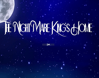
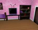
The menu screen looks nice, though the start button was very small. Some of the text was hard to read because of the background. The environment design wasn't bad, and the character you play is cute. One issue with the environment design was the room with the piano. It was huge with barely anything in it, which made it feel empty.
Gameplay:
The game is a short, simple, enjoyable experience. However, the camera angles and auto camera detracted from the experience. At some angles, it shows the sides/top of the character image. You could make it so that the character image always faces the camera, though I'm not sure this would work for higher camera angles. The camera also interfered with the controls, making them work unexpectedly. It looks like WASD was moving the character in relation to the character's orientation rather than the screen orientation.
Horror/Theme:
I honestly didn't feel like this was a horror game. It didn't have much of a horror atmosphere or theme, and nothing scary happened. I imagine the screen randomly fading to black was meant to add a spooky aspect to the game, but it didn't have that effect. Rather, it confused me, and it was irritating that I had to wait until I could see to keep moving. I also feel it only loosely fits the theme with the beginning image and drinking the soda. Outside of those two instances, the rest of the game felt it had nothing to do with the theme.
Other Things:
At the very end, when you have the game over screen and can still move around, if you hit E the character changes, which was also confusing. Another thing confusing is the description "your home is not your home anymore," and I don't understand how that relates to the game.
Despite the lack of horror and the camera issues, this game was still enjoyable as well as cute.
Fair points overall. I underestimated the days left to finish the game to it’s full scope. I will still be updating. Thanks for the detailed feedback!
I liked the hand draw character you got there and the fixed camera angles. Keep it going :)
Thanks! Appreciate the feedback!
is it normal that the game is completely dark?
I don't know, after pressing the first start button, then there was only a black screen
I uploaded the web version hopefully that allows you to play it