The idea is really good, but the game need a bit more work before it will be super fun to play. The voice over was really good and interesting.
Play game
Don't Push My Button(s)!'s itch.io pageResults
| Criteria | Rank | Score* | Raw Score |
| Gameplay Innovation | #21 | 3.200 | 3.200 |
| Audio | #32 | 3.200 | 3.200 |
| Overall | #62 | 2.933 | 2.933 |
| Unexpectedness | #73 | 2.533 | 2.533 |
| Visuals | #85 | 2.600 | 2.600 |
| Fun | #87 | 2.533 | 2.533 |
Ranked from 15 ratings. Score is adjusted from raw score by the median number of ratings per game in the jam.
Please list any pre-made art/music/code/other assets that you used.
Music: reNovation by Airtone & Cool Vibes by Kevin MacLeod
How many members in your team?
List each team member's role, along with their social media / website links!
Yoshirou Weeb, Developer & Everything else, https://www.youtube.com/channel/UCV2KAn6-R6pgT2ekqZ_DQow
Anything you want to say to players before they play?
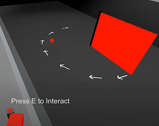
W, A, S, D to move, Mouse to look, E to interact
Comments
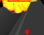
I really like the idea for this game, activating traps in the right moment, and every single one of them is unique, but I have felt some problems like waiting for the target is a little bit too slow, and some traps dont have a clear timer to show when they will activate after the button is pressed, all this things demotivated me to try again after I died on the 3/4 level, maybe the game could flow better if it had checkpoints, or the paths to the buttons were smaller or/and the player could teleport to them.
But overall I really liked the concept, if patched it could be a very little fun game!
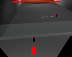
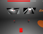
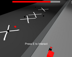
The game reminded me of Orcs Must Die (with the traps and the tower-defense-like aspect), while the color scheme reminded me of Inside.
Camera can be a pretty hard thing to get right, but I found that Cinemachine can be pretty useful for that. It's pretty difficult to grasp Cinemachine at first, but there's a bunch of tutorials/guides to ease the process.
I'm also always wary about putting your instructions or critical gameplay aspect only within the game audio (and not having some kind of textual counterpart). This can end up providing a very different gameplay experience for hard-of-hearing/deaf players or players with limited listening proficiency in English. I also couldn't replay the tutorial, because it was skipped on subsequent playthroughs. The sound design was cool, though!
I also found it difficult to press the 'Start' button in the main menu (not sure if this was a pun with the title of the game lol).
I found it really hard to time the buttons correctly. Not sure if some traps like the boulder has a different delay from the other ones? It also took me quite a bit of time to get from one button to another. I'm always a fan of "fun" movement regardless of the rest of the gameplay (games like Spiritfarer and Night in the Woods feature "fun" movement techniques that players can enjoy amidst the rest of the game).
Also not sure how I felt when the game told me to "Get a life nerd" lol
thanks for the detailed review! I didn't actually think of the whole instructions only being in the audio part, I think I would've added subtitles if I had more time since I started the jam halfway through, and I've been hearing of cinemachine here and there but I've never looked into it so I'll have a look. The timing was explained in the tutorial as far as I remember. It basically said it ranges form 3-5 seconds, and yeah that's where I should've added difficulty options, I probably played through the level 50 times so I had no right making it that difficult. Anyways thanks for taking your time to try my game :)
Getting the timing right is very difficult without a lot of practice. Difficulty is just set for the play tester of the game not a new one.
A game about buttons? Count me in!
The idea is awesome! Reminds me of those Counter-Strike maps I used to play as a kid. It’s cool that you managed to make the game look good without any models! I also liked the voice acting and music.
I feel like this game is a bit too slow. And for some buttons you don’t know in advance the time it will take for the trap to trigger, so you just have to guess. But otherwise a great game!



Leave a comment
Log in with itch.io to leave a comment.