Play prototype
Bot-Lite's itch.io pageResults
| Criteria | Rank | Score* | Raw Score |
| Creativity | #6 | 3.833 | 3.833 |
| Gameplay | #11 | 3.417 | 3.417 |
| Use of Theme | #14 | 3.917 | 3.917 |
| Overall Enjoyment | #15 | 3.167 | 3.167 |
| Overall | #15 | 3.264 | 3.264 |
| Audio | #20 | 2.583 | 2.583 |
| Visuals | #25 | 2.667 | 2.667 |
Ranked from 12 ratings. Score is adjusted from raw score by the median number of ratings per game in the jam.
Leave a comment
Log in with itch.io to leave a comment.


Comments
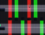
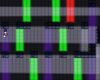
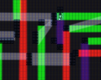
this is actually super cool, especially the colored light, very nice work!
Thank you!
Nice take on the theme, a bit more animations on the player and some feedback would add to it but hey its a jam who has the time, nice effort.
Thank you! We had the animations ready to go but didn't get to put them into the project in time.
Interesting concept, but not the greatest execution. The jump felt too floaty, the audio was extremely jarring, the controls were awfully placed (dash with left shift? Q? It was a chore to dash using wasd for movement, and when i changed to the arrow keys I had to put my hand in an awkward position, Enter and x for dash, with x for jumping in addition to space bar, would've been a lot better), and the gameplay didn't feel polished at all. When using the blue/purple light the momentum wasn't preserved, instead it was flipped, which made it feel jarring and snappy, instead of a flow of movements we come to expect of games that play with gravity.
If I was to give a suggestion, it would be to polish a lot more the gameplay mechanics, to make it feel smoother and nicer to play. That is the main metric in a game, how well it can be played and how enjoyable it is.
Ethanscharlie and I will be working on a better release. with better art and a different engine. we have been thinking of using one button to use stuff like the dash and whatnot. but I didn't know the gravity flip was a problem until you said something, and I'm sure we will try and make a better version of this. thanks for playing and for the feedback.
Loved the level design here and the idea is fantastic as well. Faced a few issues with the blue light when jumping so a more effective programming of the character controller to make it more intuitive may be a nice improvement. Overall cool game you've got here.
Reminded me of portal and it's light bridges for some reason :)
Neat game. Creative game mechanics.
Thanks!
These were some super fun and creative levels. I liked the song a lot too.
Thank you! I wish we could say the song was ours, but it was borrowed from an external source.