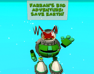
Play VR Platformer
Farrah's Big Adventure's itch.io pageResults
| Criteria | Rank | Score* | Raw Score |
| Fun | #50 | 2.315 | 2.500 |
| Use of Theme | #58 | 2.623 | 2.833 |
| Overall | #59 | 2.572 | 2.778 |
| Creativity/Originality | #60 | 2.777 | 3.000 |
Ranked from 6 ratings. Score is adjusted from raw score by the median number of ratings per game in the jam.
Leave a comment
Log in with itch.io to leave a comment.


Comments
Super cool! I like the art style which made me feel nostalgic and reminded me of my childhood games. the instructions were spot on and essential, I think it's missing a few fixes and polishing and can be ready for production. But I think you did a lot of awesome work there! I hope you don't abandon this project and continue to work on it and publish it on other stores too!
thank you for the encouragement! Your game was great!
I really liked the world you built for this and I can see where you were going with the camera changes. Reminded me of N64 games like Banjo Kazooie <3 Also, loved the mechanic to place objects to create new platforms! And as mention elsewhere, very clean menus!
If you find some time this weekend, please check out our game “Starship Minis” and leave a comment to let us know what you think! https://itch.io/jam/vr-jam-2021/rate/1145490
Thanks and congrats on completing the jam!!
I'll second that I can see the work that was put into this one. Having the menus and tutorials was helpful.
I'll also second the camera changes being rough, but that's good news since you have such a clear direction on what to improve for any future builds. Good job overall and it'd be fun to see more.
I think this was one of the few games in the jam that had a working menu and instructions/tutorial on how to play which was very helpful when jumping into a new VR experience. I have relatively strong VR legs since I've been playing since the DK1 but those camera changes....wooooooshhh... I had to stop. I wanted to play more, as I could see there was so much content there, but I couldn't deal with the weird angle on the camera changes to make me want to continue playing. If you iron that out on your next update, I would love to give it another go!
I really appreciate your feedback! I had a visual indicator for when the camera would move but it was hard to implement in a weekend. I have since refined it and gotten it to work way better. I am going to try to make a few better levels and I will upload another copy, hopefully better copy. Thank you so much for playing!
I can tell that there's a lot of work in this! The art is good, and some of the mechanics do work. However, the changing in view angle, and amount of interfaces makes it difficult to fully enjoy.
Thank you so much for your feed back! I had a visual indicator on what was making the camera move and to where but it was a little buggy so I took it out. I plan to continue working on this and I will make these changes I really appreciate it!
Test on quest ->
The concept is nice and works well, however the camera changing is disturbing, as we change not only the position but also the rotation and suddenly, as the game is a bit laggy on Quest, it may not be comfortable for everyone. For UI, no need to make it follow the camera rotation, just looking our position must be enough, because it also give a strange feeling.
There is a lot of content, the adventure is nice, the music fit the game and I had a good time playing the game !
I didn't succeed to use missiles, you talked about it at the beginning but didn't found out how to use it.
FYI : There is the Farrah's Big Adventure_Data missing in your files, so we can't use the .exe, taht's why I played on quest. Try to make a folder with each files and zip it for an easier installation process.
Thank you so much! I somehow forgot to put the missiles on the build :(! I will update it and fix it shortly. I will also work more on the changing camera.