Indie game storeFree gamesFun gamesHorror games
Game developmentAssetsComics
SalesBundles
Jobs
TagsGame Engines
(+1)

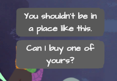
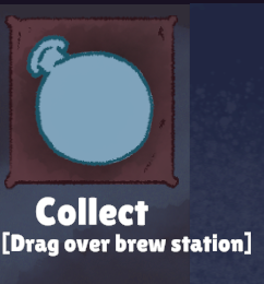
- the font is a bit difficult to read

- after each week, the game displays the initial "getting started" text again, not sure if that's intended

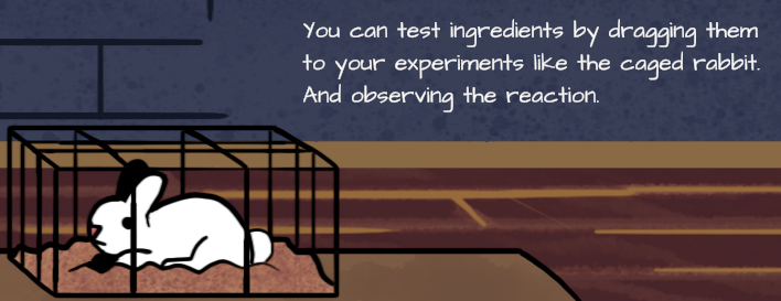
- I tried to use the rabbit for testing ingredients. When it died, I was expecting a new rabbit next week, but instead it just stayed dead. So now I just brew random potions and hope for the right customer requests...

- it's very easy to get enough gold per week for rent and upgrades

- some of the drop areas are a bit wonky, for example dropping potions on the counter could do with a larger "acceptable drop area"

- I liked the whole "don't anger customers or they will snitch on you" concept

Disclaimer: These are just my opinions, so a lot of it is very subjective.

(2 edits) (+1)

Your opinions are very helpful though, thankyou!


Here's what I'll change for the post jam update:


1- Cleanup the tutorial, I'll have an option to redisplay it rather than displaying it be default

2-I did want to make getting enough gold each week easy for the sake of the jam, but its clear I over tuned it (players have reported selling one or two potions is enough to beat the game, whoops!)  I'll progressively increase the rent as the game goes on but give the player a higher starting gold to compensate for beginner friendliness

3-The rabbit will be changed to barely consume the ingredient tested, and will refresh every day

4-Drop area for the stand will encompass the entire area

I hope these changes sound good - We're making an update as I type this.

I'd also like to ask about which font was hard to read, our game uses several.  Also, were you fullscreen or playing in the imbedded version?

Thank you for the response and great to hear that you are already working on these updates.

I was running Fullscreen on a 1920x1080 display. These were the fonts that were (just a bit!) difficult to read for me:

For the fourth, it's the squished together brackets part, not the "Collect" :)

(+1)

We do want to keep the stylized fonts, but we'll reorganize the UI to display more text cleanly and truncate descriptions in some areas to allow for larger font sizes.   Tutorial text will be given its own tab while the dialog options will take more space.  Thankyou for the screenshots, they're very helpful.  Stay tuned!