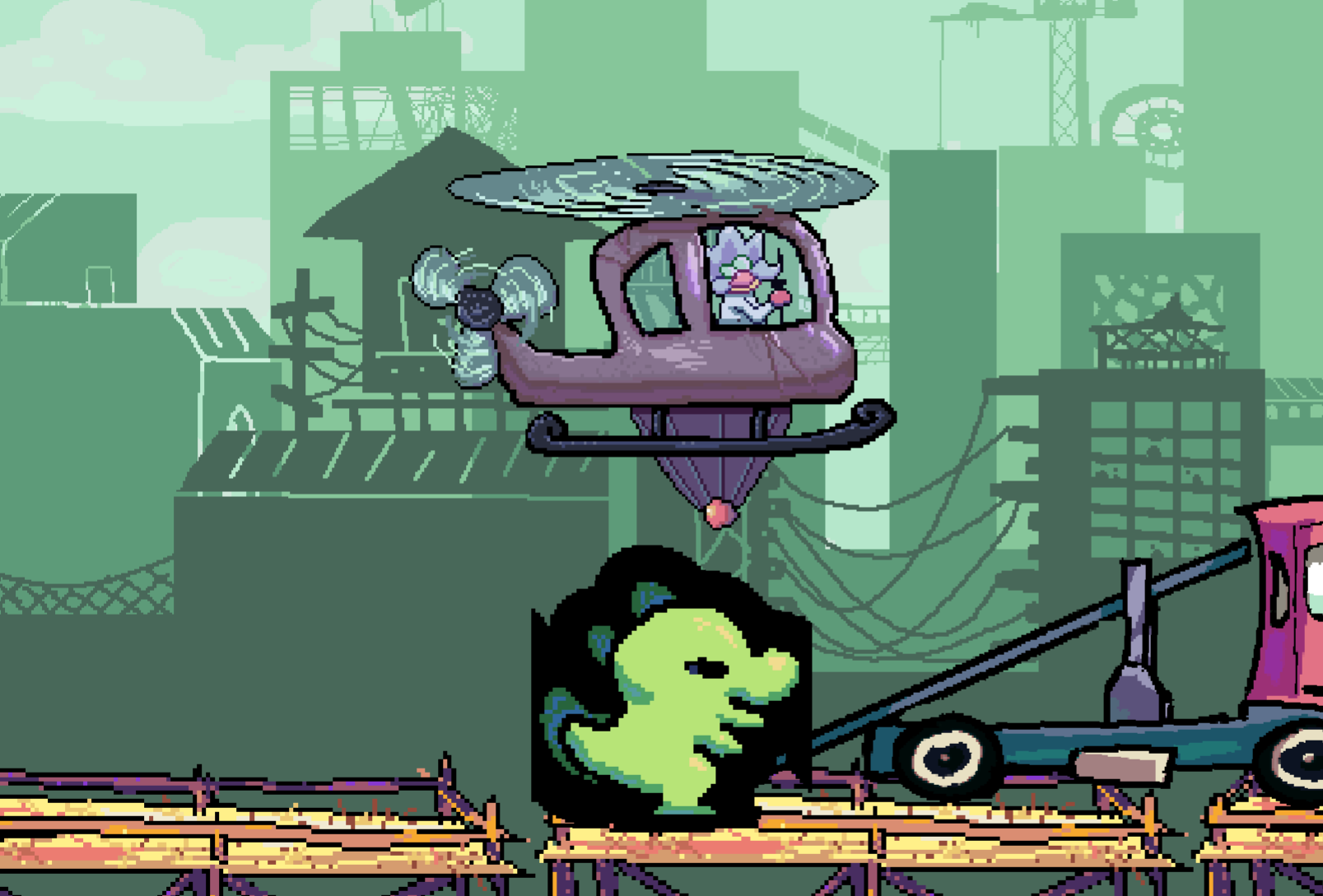
I was super glad to see that you guys went with the Kaiju concept and wrapped it up neatly. The art style is very charming, although the some of the comics were a little hard to follow. The mechanic is definitely nice, but I feel it fell a bit flat in a few places (some of which were simply due to a lack of time I’m sure).
- I think that the levels could be much longer.
- The levels also end rather abruptly with the win screen just popping out of the blue. Some smoothness using a tween and maybe a visual indicator of the level end would be good.
- After the end of each level, it would also be nice if it just launched into the next level instead of the level select.
- From a UX perspective, the scaling mechanic should definitely work on mouse button hold rather than repeated clicks. It gets rather annoying and doesn’t feel like the best way to introduce difficulty into the game.
- The collision hit boxes felt a bit buggy here and there as I got snagged onto stuff that didn’t feel right visually.
- There was also a strange visual bug with a black outline cast on the Kaiju if the helicopter got too close.

- It would improve the game feel if the helicopter lerp-ed behind the mouse cursor with a lag instead of snapping directly onto it.
I think the main gimmick is fun, but the execution could do with some more work. Otherwise, the whole kaiju aesthetic is very cute!

