A lot of potential here. I remember seeing you post the excellent meteor animation in a thread. Really digging the pixel art and animations.
Pretty much all my feedback will be from playing with the melee girl since the wizard seemed a lot more wip.
Hitstun feedback from the basic attack is already pretty satisfying. Something about the timing of performing follow-up attacks with LMB seems a little off though
I think the mouse controlled camera is a little too sensitive. It's easy to accidentally move it around too much making combat a little nauseous to watch. I also don't think there's any reason for it to travel as far as it currently can from the player position since the character's attack range is so small
RMB attack is pretty OP compared to LMB attack. For the wizard, MMB attack would not work for me because the browser would eat the input for scrolling.
It's possible to get stuck onto the blue (water?) tiles in the first room above the spawn area. To reproduce this just move the player as far as you can towards it until they're touching it and try moving left and right.
There probably should be another visual indication on the player when they are out of stamina / energy to do attacks. Maybe make them flash red or something? I agree with Hap.dev that glancing to the left to track it can take a little too much attention away from what's going on the screen.
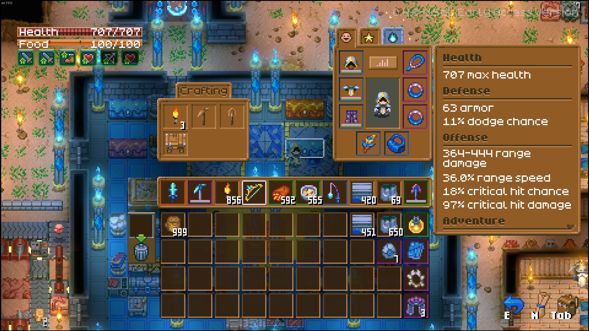
More of a nitpick but the mixing of pixel art assets at different resolutions is bothering me. I'm also noticing a mix of pixel art fonts and smooth anti-aliased fonts. Sticking to one resolution + only pixel fonts would help a lot with visual coherency and more appeal.
Hope you found my feedback helpful. Looking forward to see more from this project. Keep it up.


