
Indie game storeFree gamesFun gamesHorror games
Game developmentAssetsComics
SalesBundles
Jobs
TagsGame Engines
(+1)

I was not talking about your pages, I never visited your pages before. But some of the things you do on pitch are not allowed (in my opinion).

https://itch.io/docs/creators/css-guide

Confirm that you will not alter itch.io’s built in UI with your CSS

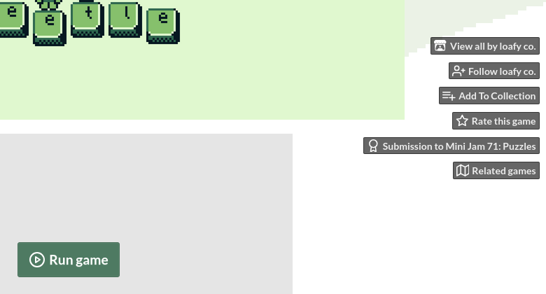
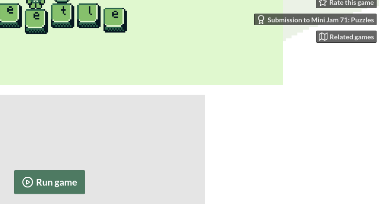
I consider certain things to be part of the user interface. To pick one example, the buttons on the upper right corner. If you exchange the text for icons only, to me, the user interface has changed. A thing you promised to not do when applying for custom css.

Itch staff might have a different opinion about what is the ui and what is not. And what is an alteration and what is not.

I do not approve of Itch in general to give custom css privilege. I am browsing Itch and not the homepage of some developer, so it should look and feel the same on all pages. No exceptions. This is not geocities or some other olden homepage territory. 

And when browsing on the known place "Itch" I expect information at the places I am used to. Everything else is hampering my quick absorption of the information. It is not enhancing a page. It is distracting. Even a seemling simple thing as putting the info box in the middle. I do not care if you exchange an anigif with a css animation. But the whole framework must be the same on every page - the things I consider the user interface. It is not only the existence of buttons but also how they look and where they are. And clever things like exchanging the mouse cursor is also not really a good approach. Again, not talking about your projects, I just have seen some disturbing use of css.

Putting rain or snow as a css effect on a thematically fitting page might be a good use. Shaking buttons right down to the report button that I used to report the seemingly hacked page is not a good use. That really happened.

(+1)

Ah, the Pitch’s collapsible user tools? Yeah, I’ve been questioning whether or not I should include it since I made it. I’ve decided to add it because I’ve seen other people tweak it too, and its obstructing the ‘help’ button of my app on the top right corner. I’ll reconsider.

I try to keep the CSS stuff there to be used only within the project’s description section/column (aside from the user tool tweak).

I’ve definitely come across some crazy (as in not very ideal) CSS use too. You made a good point about consistency, I agree with that, but I also think devs/creators can still have this freedom for their design (within reason). This creative freedom is one of the main reasons I choose itch over other platforms.

(1 edit)
I also think devs/creators can still have this freedom for their design (within reason)

I saw someone hiding the info box...

It should be about content design, not page design. One can of course do design with css, it is a very powerful tool. But in the end, css is meant to format the content, not be the content. So I always kinda wondered, what exactly people want to use "custom css" for. What can they not achieve with the given tools that would not also be tinkering with the ui? That is actually a serious question. I am not versed in web design. So I would not know what limitations there are for crafting a page on Itch. I would not recognise what is missing.

And what would developers do, when they realease the same game on Steam... If their design is in the css, they are out of luck.

If you have full control over a page, a css rotation is surely the more elegant solution to collapse content and still show it somehow. The poor man's version would be an animation I guess.

(Btw, I mistook your pitch web app with the css itself. I randomly opened your projects trying to see if somethign was jumping into my eyes. And then I did not notice the autoplay on the web app. But the example I picked actually was css.)

---

For the user tools I inject

.user_tools { position: static; }

on client side. For reasons I do not quite understand, this pushes it above all else, so it does not overlay with a browser game or other stuff. It is not the best ui element for some pages. When the standard css pushes the tools above the page and flattens them, that might be better. But when this happens, the screenshots scroll sideways in a box and are above the text too. I like the screens to be side by side with text while reading the text.

I saw someone hiding the info box…

The… ‘more information’ section? I’ve read a post about someone wanting to hide it, but never seen it implemented myself. That is frustrating.

Just like with other powerful tools, there’s always great responsibility with it.

And what would developers do, when they realease the same game on Steam… If their design is in the css, they are out of luck.

I guess that’s just the quirks of different platforms. Different layout, different way to present your project.

I haven’t browse Steam in ages, but from what I remember, the designs there (in the project description) mostly relies on raster images (PNGs, GIFs) isn’t it? which is what people without CSS also relies on here.

Nothing beats the absolute consistency of raster images. But I still prefer CSS. CSS loads way faster than images (internet here sucks). And I can update its design whenever, just with text editor, without opening any design software, and then re-uploading the images.

What can they not achieve with the given tools that would not also be tinkering with the ui?

Many things. Though mostly tiny, cosmetic adjustments. You can make a static PNG image jump, without the hassle of making it a GIFs. And even things as simple as changing color of a portion of text.

I’ve seen some game pages, where there’s long, long update logs, from the beginning to the latest. Had to scroll my way way down to the download section and info box. I thought it would be nice to have these massive information condensed into collapsible, toggle-able sections.

(I guess this example is not very fitting, since the proper way should be using devlogs as the update logs.)

And also its just fun tinkering with things (reasonably) :)

(2 edits)

For the user tools I inject

You want to pin it to the top? you can try absolute positioning instead:

#user_tools { position: absolute; }

But when this happens, the screenshots scroll sideways in a box and are above the text too.

That is just itch’s responsive design, I suppose. No spaces to the side to place the screenshots, so on top it is.

When the standard css pushes the tools above the page and flattens them, that might be better.

If you prefer that, but doesn’t want the screenshot sideways, it is possible:

.user_tools {
  position: static;
  margin: 0;
  white-space: nowrap;
  text-align: left;
  padding: 8px 0 8px 10px;
  overflow: auto;
  background: var(--itchio_ui_bg_dark, #2b2b2b);
  width: 100vw;
  box-sizing: border-box;
  box-shadow: inset 0 5px 5px -5px rgba(0,0,0,0.5);
}
.user_tools > li {
  display: inline-block;
  vertical-align: top;
  margin: 0 10px 0 0;
}

That is the CSS from itch’s default mobile layout. But without the media query, so you’ll always have the user tools on top, on desktop too.

edit: removed some duplicate CSS properties.

You want to pin it to the top?

No. It already is pinned on the top. The responsive design on your view is different from mine. Try making the screen smaller or rather increase the zoom %.

I want to move it out of the way. You will find several forum threads about this issue. If a page does not have a banner on top, the user tools obstruct view, which is bad for a web game. The usual client side solution for web games is to play them in full screen. You yourself reduced them to icons so they would not obstruct that help button. The usual publisher side solution is to use a banner on top.

So what kinda works is making the tools static. For whatever reason, it creates a new section with only the tools in it and the rest of the page below.

(2 edits) (+1)

No. It already is pinned on the top.

Ow, I meant on top top. Top of the page, not top of the viewport. Because the user tools is following the viewport, at least on my end.

By default, if I scroll down the page, it'll follow.
Using absolute positioning it'll stays on top.

So what kinda works is making the tools static. For whatever reason, it creates a new section with only the tools in it and the rest of the page below.

The user tools HTML structure is directly on top of the game page. So I guess if it were changed to static position, it’ll be treated as another ‘section’ of the page. Instead of floating buttons, on top-right corner.

User tools' HTML. Under it is the #wrapper element (the project page container).
User tools with its position sets to 'static'.

Though, the second CSS codes I provided should be able to force it to use this layout:

User tools, with responsive styling on desktop.