
I can do Discord, or maybe in a GitHub Discussion. Or anywhere else where the stuff can be discussed.
A member registered Jul 16, 2021 · View creator page →
Creator of
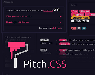
Collection of CSS components & tweaks to spice up your project page.
Run in browser
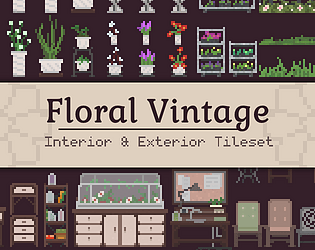
Garden, Greenhouse, Furnitures and Floras


Recent community posts
itch.io Community » itch.io » Questions & Support · Replied to Pop Shop Packs in Why is my dashboard in greyscale?
itch.io Community » itch.io » Questions & Support · Replied to hubol in Why is my dashboard in greyscale?
itch.io Community » itch.io » Questions & Support · Replied to redonihunter in [Solved] How to make a slider in custom CSS ? (Can't use id, radio, textarea...)
No. It already is pinned on the top.
Ow, I meant on top top. Top of the page, not top of the viewport. Because the user tools is following the viewport, at least on my end.
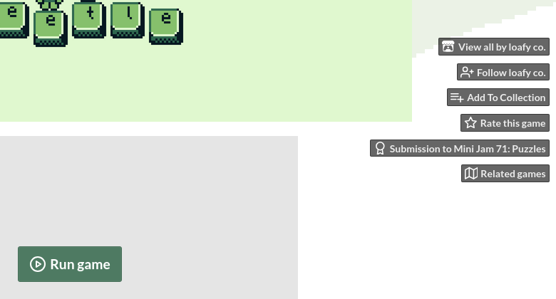
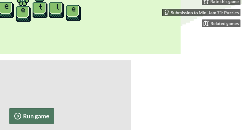
So what kinda works is making the tools static. For whatever reason, it creates a new section with only the tools in it and the rest of the page below.
The user tools HTML structure is directly on top of the game page. So I guess if it were changed to static position, it’ll be treated as another ‘section’ of the page. Instead of floating buttons, on top-right corner.

Though, the second CSS codes I provided should be able to force it to use this layout:
itch.io Community » Game Development » Get Feedback · Posted in 🔥 I'm wondering if there's any things that make my pages hard to read or navigate 🔥
Pretty 🔥
I love the use of the custom CSS.
Some tiny nitpicks:
-
The images could be optimized. The 2 bundle image buttons is displayed at ~300px width, but the actual file is 624px, twice the size as needed. Resizing the images and the bg could helps loading time a little.
-
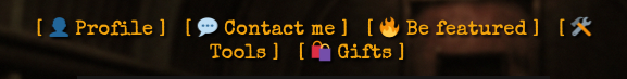
The links at the top could use
inline-blockin the custom CSS. So that it won’t break awkwardly in the middle on smaller screens.Before:
After
inline-block: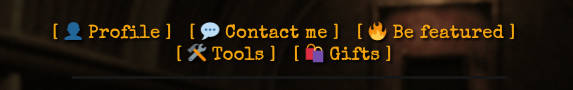
itch.io Community » itch.io » Questions & Support · Replied to No Time To Play in Demo page with placeholder contents
itch.io Community » itch.io » Questions & Support · Created a new topic Demo page with placeholder contents