Hello, how do you think the UI can be improved? Should it be simplified?
34 days ago(+1)
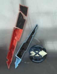
I think the colors are maybe too starutared (In contrast to the games gloomy and unsaturated color pallet), as well as the health and mana UI's being a pretty weird shape and angle?
34 days ago(+1)
Tried to make the user interface similar to Dishonord. I started to look closely and I thought, yes, the colors are too saturated. This probably doesn't suit my game. Thanks for the feedback!