
Indie game storeFree gamesFun gamesHorror games
Game developmentAssetsComics
SalesBundles
Jobs
TagsGame Engines

Just for some ideas, not sure what works best for you: 

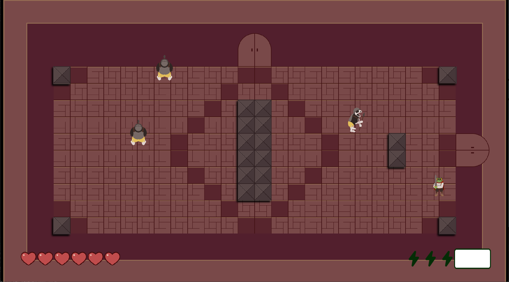
  • Highlight the wall tiles with another color, e.g. in the room on the left, all tiles are in a brown-red tone, maybe make the walls gray-ish
  • Add a drop shadows to indicate that these tiles are higher than the others, something like this

In the end it has to work for you and also be consistent with the art-style you prefer :)

(1 edit) (+1)

I'm not sure what I like better, the fact that you gave pretty good advice or that you back after playing the 3 days ago and giving that advice. 

I think the shadows 100% would be a lot more helpful as well as the color! I really wanted the Trial themes the same color to convey their themes, but after seeing your post I totally should of made those blocks that color. It really pops! Or at least have a shared dark purple between both trials. Would of saved me some time too! 

Next time I'll definitely add a little more color variety not just for looks, but to help the player know what's what. Thank you for taking the time to make that great example!