
Indie game storeFree gamesFun gamesHorror games
Game developmentAssetsComics
SalesBundles
Jobs
TagsGame Engines

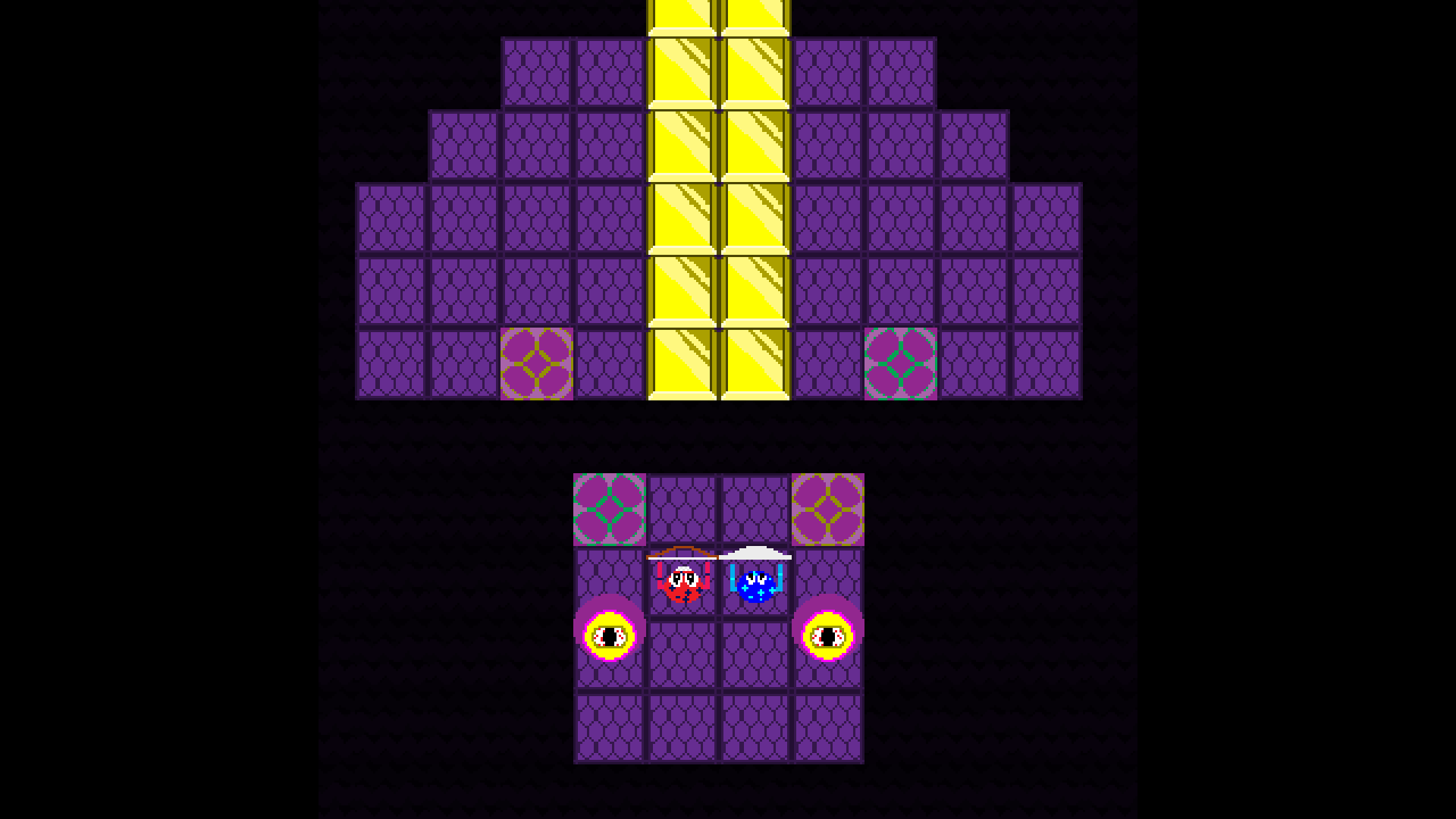
The muted plaid background is way better, makes the screen look less busy.

On your second set, I actually thought the floral tiles looked fine the way they were. In the new version, it'd be better if the cobble-stone tiles were more consistent where one tile seamlessly integrates with the ones next to it. 

Do you think I should get rid of the squares you mean?

Keep the squares, but just use one "cobblestone" pattern to be consistent.

What do you think of this?

Is this what you ment?

Yes, much better! (in my opinion) More consistent this way.