Tell me what you think of these visuals compared to before!
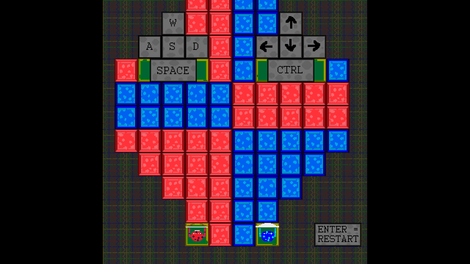
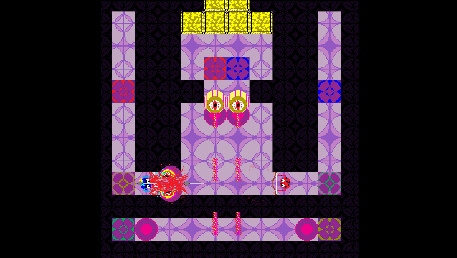
Old
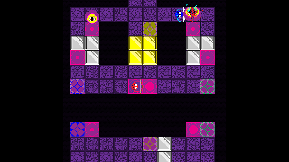
New
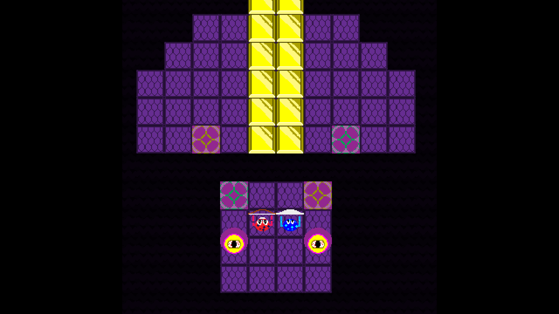
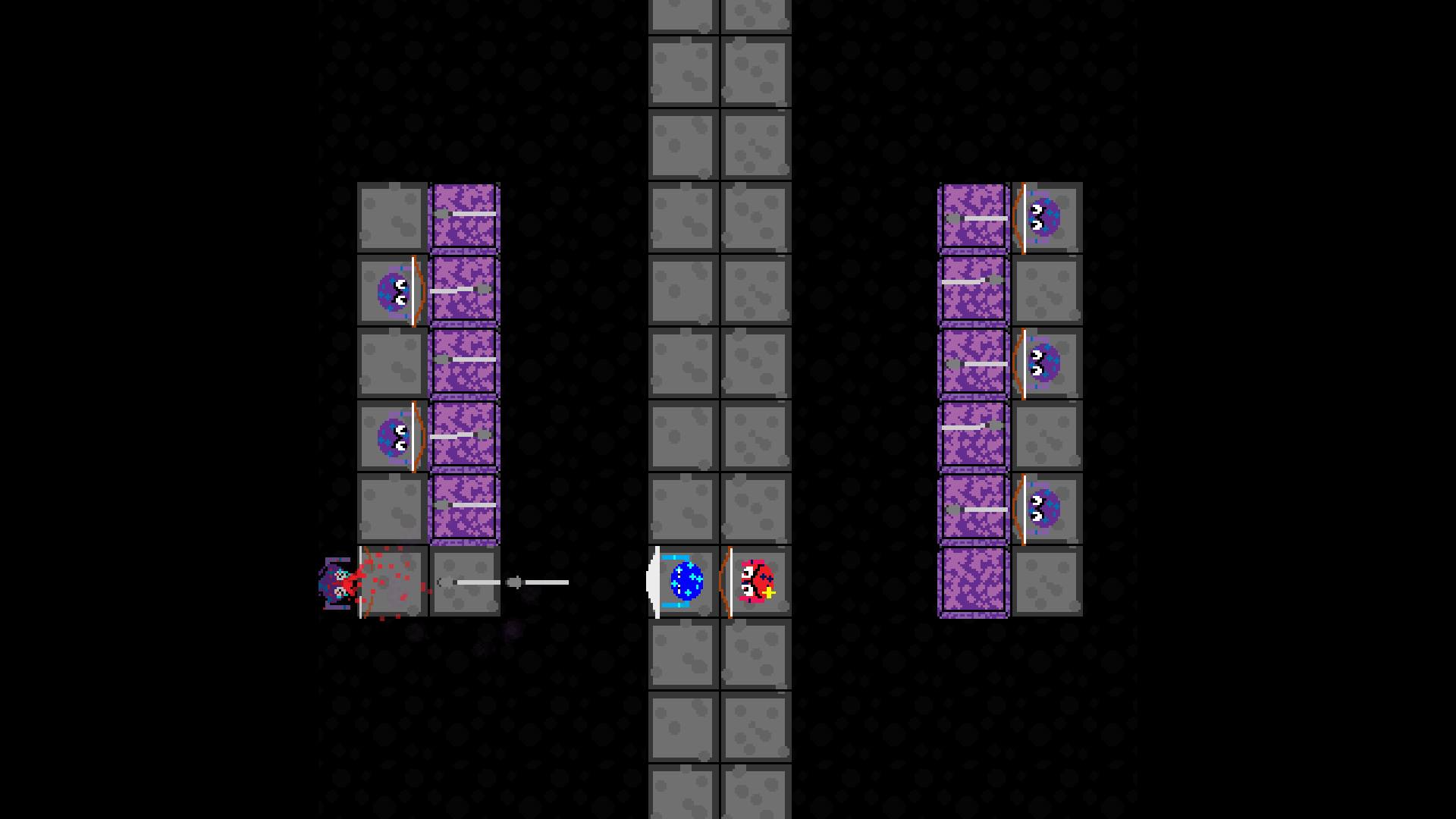
Old
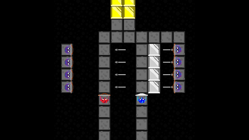
New
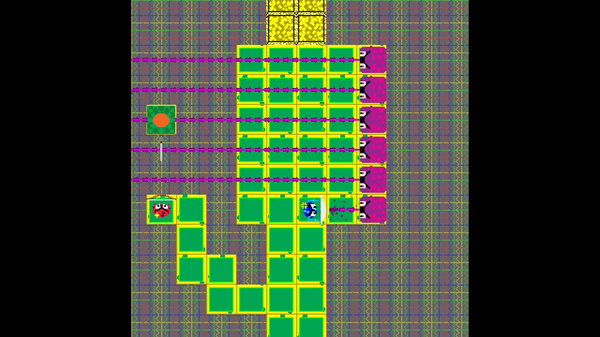
Old
New
Thanks! :)
Tell me what you think of these visuals compared to before!
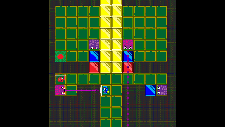
Old
New
Old
New
Old
New
Thanks! :)
i miss the old brick texture but overall the changes are good!muting the plaid background was a wise chioice
The muted plaid background is way better, makes the screen look less busy.
On your second set, I actually thought the floral tiles looked fine the way they were. In the new version, it'd be better if the cobble-stone tiles were more consistent where one tile seamlessly integrates with the ones next to it.