Indie game storeFree gamesFun gamesHorror games
Game developmentAssetsComics
SalesBundles
Jobs
Tags

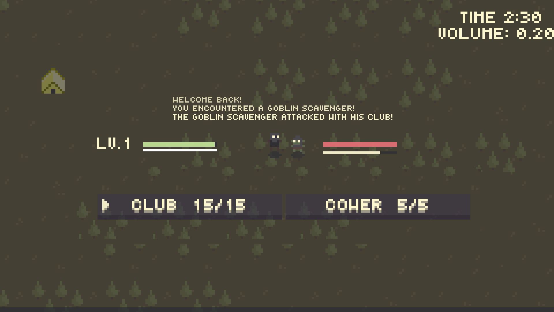
I love the colors! The visuals are really nice, and my only real complaint is that it's hard to tell what's fighting and what's background at night.


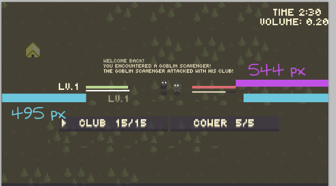
I think something's off with the time placement? It's not aligned with volume and bumps really close to the edge.

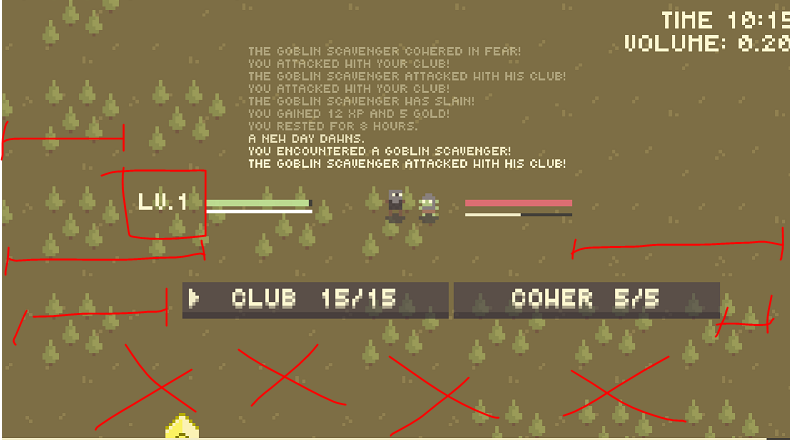
It also feels like everything's piling up on the top of the screen. The buttons are weirdly uncentered, could center them relative to the friendly health bar but it doesn't seem like it? The health bars look kinda off thanks to the level display.

Combat feels nice, sounds nice. I think the game loop is okay? nothing jumps out at me as being off.

i just chose random offsets for volume and time because they were literally offscreen after i added the text explaining what the numbers were. i can probably make it lighter at midnight-ish.

>It also feels like everything's piling up on the top of the screen. 

i mean there are supposed to be four buttons onscreen, i just haven't implemented them

>The buttons are weirdly uncentered, could center them relative to the friendly health bar but it doesn't seem like it?

how's this

>The health bars look kinda off thanks to the level display.

what's wrong with them? not sure what you mean

>Combat feels nice, sounds nice. I think the game loop is okay? nothing jumps out at me as being off.

ty

(+1)

Buttons look fine now.

I mostly meant that the level made it seem lopsided. It turns out it is actually lopsided, but that wasn't the point. Moving the level indicator below or above the health bar could make it look balanced like I did in the pic, or adding some other indicator to the goblin.  Or move the whole thing right slightly. Or do nothing. it's pretty serviceable as it is.

yeah i can move it to be on top of the health bar or just add a level value to the goblin, i get what you're saying now