Some concepts I liked from greatest importance to least importance:
* Controls were explained in game, during play. This is good because it makes it easier to understand the game as I can apply concepts as I am learning concepts, rather than trying to remember a chunk of text of instructions, only to forget it during play.
* Progress in the game is saved. This is good because the game seems to be long and some players might not want to lose progress as repeating the same sections over and over again can be trite and repetitive.
* The soundtrack and graphics of the game fit the lighthearted cutesy mood. The game has a nice soundtrack that is not repetitive. The graphics and animation are decent and the animation has a nice style and makes the protagonist come to life.
* I like how the title of the game in the main menu dynamically moves a little bit. It is a nice touch of polish and it is eye appealing and catchy.
Some concepts that I did not like from greatest importance to least importance:
* Why does the player have to press the E button to go on to the next door? Why not allow the player to just go on to the next level by touching the door? In fact, I forgot for some time that I had to press the E button to go on to the next level when reaching the door in the level that was after the level where the E button's function in the game was explained. Seriously, there are no disadvantages when going to the next level from the door. Therefore, you should allow the player to automatically go to the next level when touching the door as there is nothing for the player to lose if the player goes to the next level . It is not like there are collectibles in the levels or anything, so there is no reason for the player to just stay in the same level.
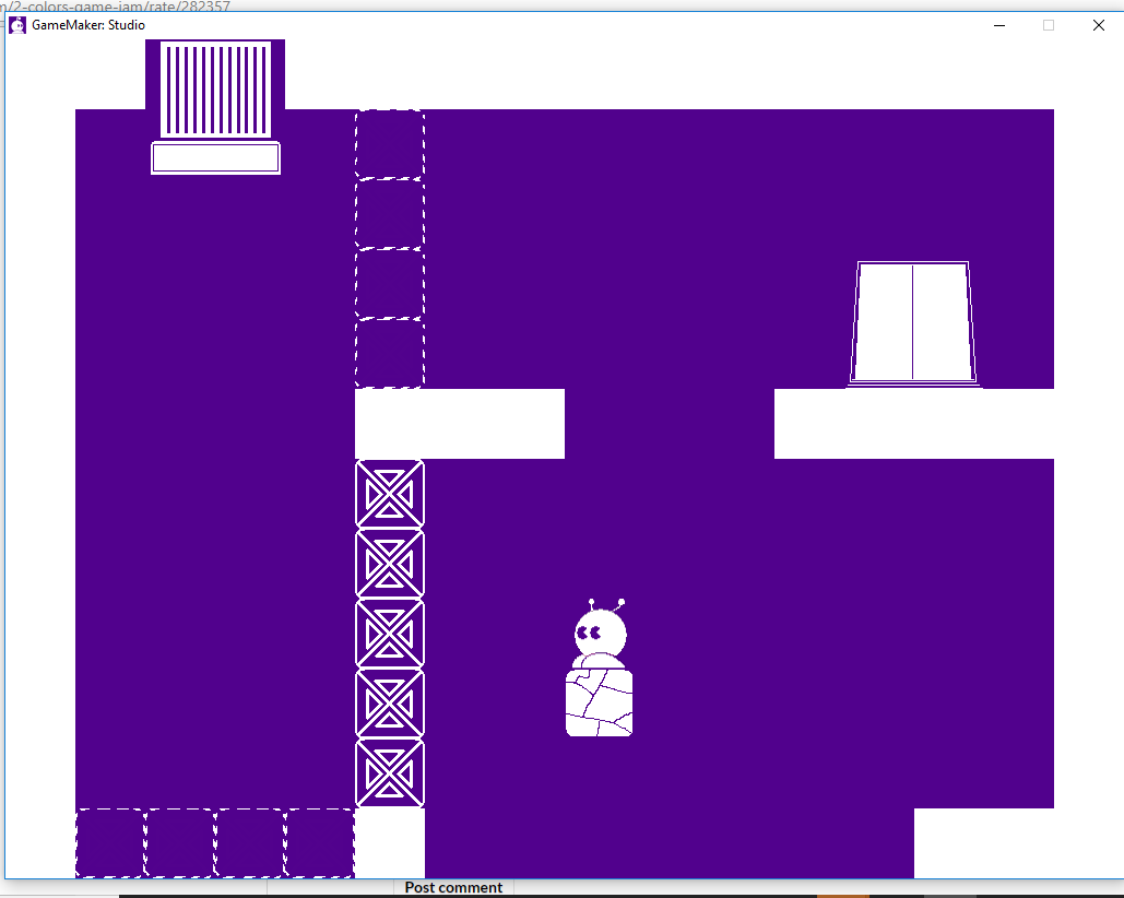
* In this level shown by the image below, there are no good hints telling the player where to go. First of all, destroying the top two blocks was very hard for me. Where do I go from here though? Am I even going through the intended route of the level? I strongly recommend having other people, preferably anyone that does not have any biases like random people on itch.io, playtest your levels as the developer of a game is the worst playtester of that game. Information that might seem obvious to you is not so obvious to the players.

* I think the player should be told that pressing the Escape key will exit the application. I have pressed the Escape key numerous times trying to go back to the main menu, but have accidentally exited out of the application. Speaking of going back to the main menu, I think there should be a way for the player to go back to the main menu anytime during gameplay.
* There should be a proper credits menu for the developers of the game, rather than just writing the names in the main menu. This is because it makes the main menu look unnecessarily a little bit messy, unpolished and unprofessional.

