Indie game storeFree gamesFun gamesHorror games
Game developmentAssetsComics
SalesBundles
Jobs
TagsGame Engines
A jam submission

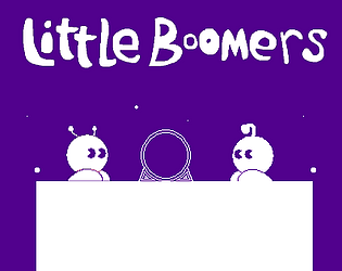
Little BoomersView game page

Go BOOM!
Submitted by Kumaccino — 1 hour, 7 minutes before the deadline
Add to collection

Play game

Little Boomers's itch.io page

Results

CriteriaRankScore*Raw Score
Audio#33.7433.909
Mood#43.8304.000
Gameplay#73.9174.091
Arts#83.9174.091
Theme#124.3524.545
2 Colors#234.4394.636

Ranked from 11 ratings. Score is adjusted from raw score by the median number of ratings per game in the jam.

Assets
Azureflux: https://azuresound.bandcamp.com/
Komiku: http://freemusicarchive.org/music/Komiku/

Leave a comment

Log in with itch.io to leave a comment.

Comments

Submitted (1 edit) (+1)

That's was so funny, challenging and fantastic! Well the gameplay is funny, because i've cried every time i've to kill one of this cute little guy T-T

The arts are lovely and a really good music choice, and the level design is terrific, some parts are quite difficult, but just enough ;D

Good use of the two themes, plus the 2 colors limitation! Bravo it's my favorite entry ♥

Developer(+1)

On the bright side, the little Boomers die as heroes. :P

I'm super happy that you found the game fun~! Thank you so much for playing!  ♥

Submitted (1 edit) (+1)

Some concepts I liked from greatest importance to least importance:

* Controls were explained in game, during play. This is good because it makes it easier to understand the game as I can apply concepts as I am learning concepts, rather than trying to remember a chunk of text of instructions, only to forget it during play.

* Progress in the game is saved. This is good because the game seems to be long and some players might not want to lose progress as repeating the same sections over and over again can be trite and repetitive.

* The soundtrack and graphics of the game fit the lighthearted cutesy mood. The game has a nice soundtrack that is not repetitive. The graphics and animation are decent and the animation has a nice style and makes the protagonist come to life.

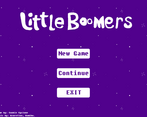
* I like how the title of the game in the main menu dynamically moves a little bit. It is a nice touch of polish and it is eye appealing and catchy.

Some concepts that I did not like from greatest importance to least importance:

* Why does the player have to press the E button to go on to the next door? Why not allow the player to just go on to the next level by touching the door? In fact, I forgot for some time that I had to press the E button to go on to the next level when reaching the door in the level that was after the level where the E button's function in the game was explained. Seriously, there are no disadvantages when going to the next level from the door.  Therefore, you should allow the player to automatically go to the next level when touching the door as there is nothing for the player to lose if the player goes to the next level . It is not like there are collectibles in the levels or anything, so there is no reason for the player to just stay in the same level.

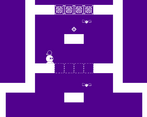
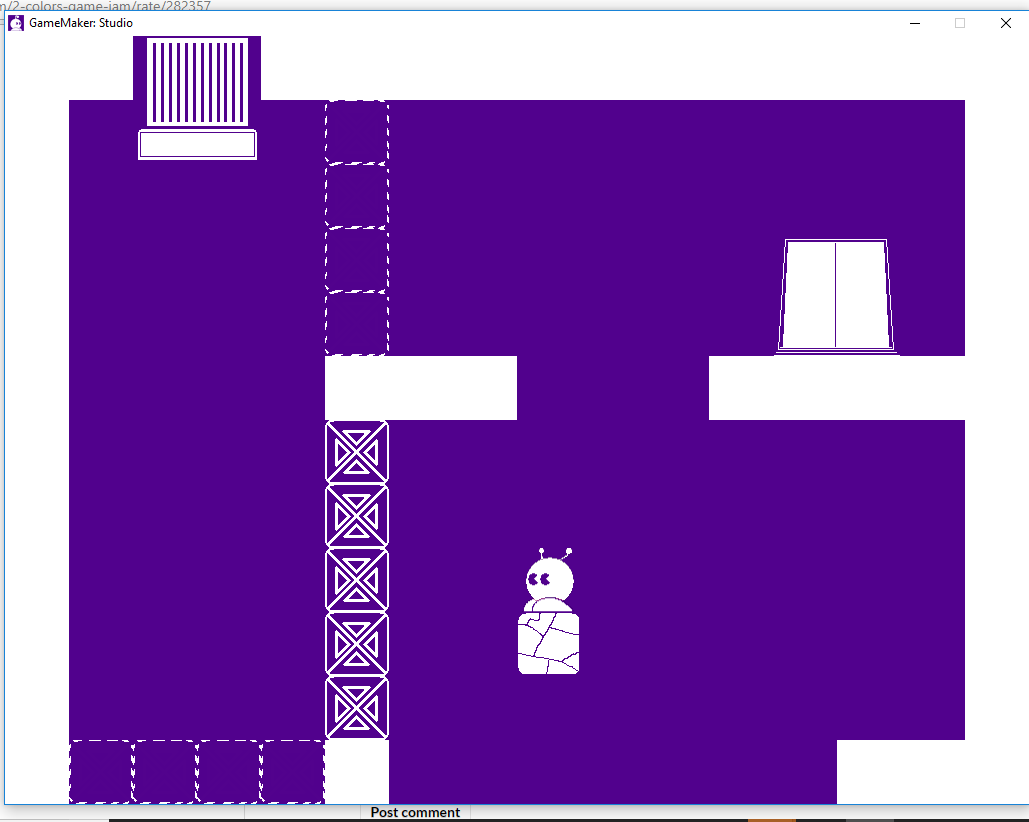
* In this level shown by the image below, there are no good hints telling the player where to go. First of all, destroying the top two blocks was very hard for me. Where do I go from here though? Am I even going through the intended route of the level? I strongly recommend having other people, preferably anyone that does not have any biases like random people on itch.io,  playtest your levels as the developer of a game is the worst playtester of that game. Information that might seem obvious to you is not so obvious to the players.


* I think the player should be told that pressing the Escape key will exit the application. I have pressed the Escape key numerous times trying to go back to the main menu, but have accidentally exited out of the application. Speaking of going back to the main menu, I think there should be a way for the player to go back to the main menu anytime during gameplay.

* There should be a proper credits menu for the developers of the game, rather than just writing the names in the main menu. This is because it makes the main menu look unnecessarily a little bit messy, unpolished and unprofessional.

Developer (2 edits) (+1)

Thank you very much for your constructive feedback! I'm going to address the problems you mentioned:

- Level: I do admit, I should've closed that gap at the top because it's very misleading. But I did have three people play the game, they got stuck on that level for a short time wondering what to do, but they all figured it out by the end, so I thought it wasn't too bad. I'm going to get more people to test next time.

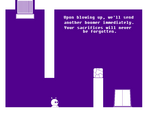
 What you have to do here is take advantage of the spawning mechanic, because when you blow yourself up, another boomer falls down right back at the start. You can then pass the gates if you time your mid-air jump correctly. The original Boomer may have died, but it's the results that matter, and the sacrifices will never be forgotten. ;_;7

Here's a walkthrough I made earlier today, you could use it if you need a small nudge in the right direction: https://www.youtube.com/watch?v=uPg0UrCrxV0 ! :)

- The E button: Now that I think about it, the only reason this feature exists is because I felt it's too sudden to instantly go to the next level right after touching the gate. It has no good functionality. I might have to remove it.

- Esc Key: How didn't I come up with that! I kept accidentally closing the game  while testing myself, too. xP

- Credits: The menu was the last thing I added to the game and I was afraid I'd run out of time, that's why it's pretty messy. 

Again, thank you a lot for playing and giving feedback! I'm going to fix the issues and polish the game a little more in a post-jam update soon!

Submitted(+1)

105 Boomers were sacrificed today.

Like the others have said, the game is fantastic! Fun gameplay, nice style, clever puzzles, the whole shebang! My only complaint is that it was sometimes hard to tell the blast radius of your Boomer, which made that one level where you had to break only certain blocks a bit more challenging than probably intended.

Developer (1 edit)

105 Boomers, that's the least amount I've seen for someone's first try! Most of my friends got around 120.  Congratulations!

As for exploding, I could add an option to enable or disable a circle around the player to make the blast radius visible to allow more accuracy. Thanks for pointing that out!

Submitted(+1)

This game is incredible! Everything about it is great. It was really fun to play. Bravo.

Developer

Ayyy, thanks! I'm very pleased to hear that!

Submitted(+1)

This is easily one of the best level designs of all the jam. Really creative puzzles, fun to discover and experiment. Great game!

Developer

Thank you so much, I'm very flattered! :D

Submitted(+1)

Really enjoyed the game :D
Clever and fun!

Developer(+1)

Thank you! :3

Submitted(+1)

I just love this game, it's not long but i felt really amused with puzzles and the story.

Developer (1 edit)

I'm really happy you like the game, thanks for playing!

Submitted(+1)

Great game! I played all the way through it. The puzzles were challenging and the mechanics were very clever.

Developer

Thank you!!

I'm glad you had a good time with the game. :)

Submitted(+1)

Good game, very complicated for a jam, I'm impressed. This just proves how powerful and fast is GameMaker.
The level design was quite good, but some places were way too demanding in terms of logical leaps, like the moment when the player is expected to figure out they can drop the portal mid air. Yes, it was a logical solution, but I suspect it may leave people feeling cheated.

Developer (2 edits) (+1)

Thank you for your feedback, I appreciate it!
I'll take notes of the logical leaps you mentioned, I thought I took care of them by limiting the options the player could use, but looks like it wasn't done well enough, I'll try to keep that in mind for the future.